Best practice example: grid boxes

We’re often asked for examples of really good websites. The thing is, each site is different, depending on the type of site, their users, and their needs. Websites constantly evolve due to changing user needs, business goals or time-sensitive messaging.

So there’s not really one static best practice example that ticks all the boxes for everyone.

What we can do is point you in the direction of really good content usage to take inspiration from.

Each batch we put through the go live process has examples of excellent content. In this new series of blog posts, we’ll use these to highlight best practice examples.

Here’s a couple of examples of best practice for grid boxes from recent Go Mobile batches.

Grid boxes

Grid boxes are used for homepages and section openers. These are pages that give an introduction for a particular section (eg Research, Study with Us, About Us).

They help create visual hierarchy, so users can easily see where they are in your site. Because of this, they should only be used for top level sections of your site (the pages that appear in the side menu when you’re on the homepage).

boxes on the Study with Us section of the Malaysia campus website

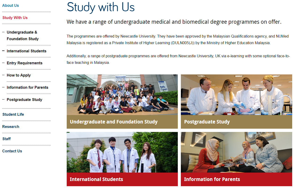
Newcastle University Medicine Malaysia Study With Us section

This example is from Newcastle University Medicine Malaysia. It uses our ‘top task box – dark’ content piece.

This is basically four links, but presented in a visual, structured way. Visitors can immediately see what’s on offer. This is a good option when you want to give a quick overview of different services, for example.

For this Study with Us section, it was important that we had clear pathways signposted for four key groups of users: undergraduates, postgraduates, international students, and parents.

We wanted each group to feel catered for, supported, and have easy access to pages that would help them.

You can have some text above grid boxes. Keep it short, and don’t add any if it’s not needed. The boxes should take centre stage, and do a quick job of moving users on to core pages.

boxes on the Study with Us section of the Mechanical Engineering website

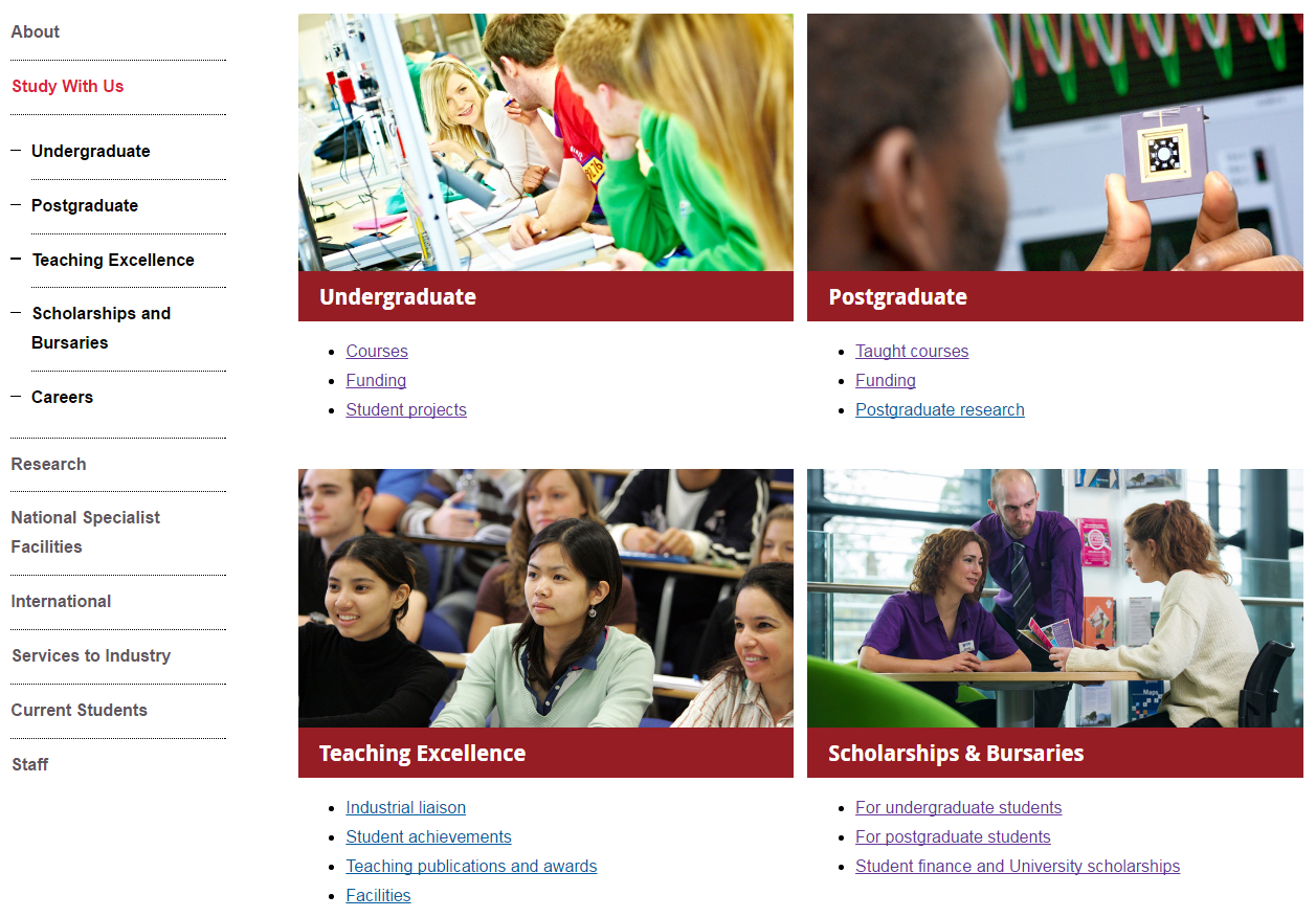
Mechanical Engineering Study With Us section

This example is from the School of Mechanical and Systems Engineering. It uses our ‘top task box – light’ content piece.

This box type gives you the option to include some hyperlinks (max. 4) below the image and main link. It’s a good option for pages where you know there are several core pages that you want to highlight.

In this example, we wanted to signpost prospective students towards the undergraduate pages, but knew that they’re likely to want to know about courses and funding in particular.

Light top task boxes are great for larger sections where you want to direct users explicitly to core pages.

Think about what the key messages for the section are, and what your user is looking for. Work out what are core areas (give them boxes), key pages within these areas (give them links), and what is additional information (don’t link them from your section opener).

Your additional information pages (in this case, the Careers page) will always be available within the section via the menu.

Learn more

You’ll learn how to create and manage these pages in our T4 training sessions. And you’ll find out how to identify your core pages in our training on planning web content.

If you’re stuck, we can help you work out what format will work best for your navigational pages, and help you with setting up grid layouts.

Have a look at :

Share this post:
Share

To Link or Not to Link – When and Where to Use Hyperlinks

We’ve recently had a couple of questions from web editors about hyperlinks – particularly about whether to include the same link more than once on a webpage.

This post will focus on when, and when not, to use hyperlinks and where you should try and place them on a page.

Helpful content

When writing web content your aim should be to help your user find the answer to their question or complete a task.

Hyperlinks help with this because they:

  • give active instructions
  • support scan-reading
  • offer further information or a next step

It’s important to only link to relevant content that supports the messages on your page, or helps your user complete their task or answers their questions.

Careful placement

As well as thinking carefully about what you link to, you should also think carefully about where within your content you should link from.

Think about the primary message – what do you need to convey to your audience before they leave your page? If you add hyperlinks too early then you run the risk of your user leaving before they’ve had a chance to read your content.

Hit targets

Mobile has changed the placement of hyperlinks on a page as you now need to think about hit targets. Don’t have too many hyperlinks together as this will make it harder for the user to select them.

You should also try and add hyperlinks at the end of paragraphs and sentences. Again this helps with hit targets and increases the likelihood of your user reading your content before clicking a hyperlink and being taken elsewhere.

Avoid duplicating links on a page

It can be tempting to duplicate links on a page. Hoa Loranger (Nielsen Norman group) points out that people often think that duplicate links provide “alternative ways to access links” and “safety nets”.

However, too many calls to action on the same page can confuse users.

Each additional link places an extra load on users’ working memory because it causes people to have to remember whether they have seen the link before or if is a new link.

Hoa Loranger Nielsen Norman group (NNg)

In addition, duplicate links can be harmful to the user experience:

Extra links waste users time whenever users don’t realise that two links lead to the same place.”

Hoa Loranger Nielsen Norman group (NNg)

Loranger also points out that that “each additional link depletes users’ attention because it competes with all others.”

So rather than providing a safety net you’re potentially reducing the likelihood of the user spotting the link.

Instead of adding duplicate links on a page, Loranger argues that where you place the link is more important.

Making a link more noticeable by placing it prominently in an expected location on the page can yield better results than duplicating it elsewhere on the same page”

Hoa Loranger Nielsen Norman group (NNg)

Summary

To link or not to link? As always it depends on your content as to whether you should include a hyperlink on a webpage, and where on the page you should place it.

Think carefully about the purpose of your page to help decide whether to add a hyperlink to relevant content, and how early on you should include one.

However, try not to include more than one link to the same content on any webpage as this can be harmful to usability.

Related posts

References and further reading

Hoa Loranger, The Same Link Twice on the Same Page: Do Duplicates Help or Hurt? Nielsen Norman Group (NNg), 13 March 2016

Kathryn Whitenton, Minimize Cognitive Load to Maximize Usability, Nielsen Norman Group (NNg), 22 December 2013

Jennifer Cardello, Nielsen Norman Group (NNg), Four Dangerous Navigation Approaches that Can Increase Cognitive Strain, 28 September 2013

Share this post:
Share

Editing Other People’s Content

So you’ve attended our Writing for the Web training and you know all about the inverted pyramid and writing concise, scannable web content. Now you’re faced with a request to add some new content to the website…

It’s a wall of text – full of long sentences, a lot of jargon and it’s about a topic that you don’t have any subject knowledge of. A feeling of dread washes over you, questions start racing through your mind. How will I prioritise the information? How can I shorten sentences when I don’t really understand them? What are the important points that I need to emphasise with bold or a bulleted list?

In our recent Writing Web Content training there were a few questions about how to edit other people’s content – particularly how to prioritise and edit complex content.

In Corporate Web Development (CWD) we face this challenge on a daily basis. In this post I’m going to share my top five tips for editing other people’s content.

1. Find out the purpose of the content

For any webpage you create you need to know why you’re creating the page and how it fits into your site purpose.

You need to be able to answer the following questions:

  • who am I creating this page for? (your users)
  • what do the users want to find out? (their questions/tasks)
  • what does the organisation want the user to do after reading your content? (business goals)

Without these answers you’ll struggle to edit the content so it’s important to speak to the subject-expert or the person who provided the content.

Discuss with content author

Set up a meeting with, or speak to, the author of the content so that you can find out the purpose of the content.

initial face-to-face or verbal briefings need to give content creators an understanding of where their work will sit in terms of the wider project and give them the chance to ask initial questions

Jackie Kingsley, Sticky Content

Armed with the knowledge of who the users are, their tasks, and what the author wants to achieve, you’ll have the confidence to start prioritising and reconfiguring the content for the web – and deleting any unnecessary words!

It’s also important to get the agreed content purpose in writing and send to all involved. This acts as a written record so that you have something to refer to when editing and it makes it clear and transparent for everyone involved.

2. Agree deadlines

It’s important to agree on specific deadlines.

It’s impossible to keep your content production slick and manageable without well-enforced deadlines

Rhiannon Jones, Sticky Content

There might be deadlines for:

  • completing a first pass edit and sending content back to the author
  • the author and stakeholders to send amends
  • the author and stakeholders to sign off content
  • content to go live on the site

Again getting deadlines in writing (even if it’s just an email) gives you a written record to refer back to. Then, if additional content is needed or if the author misses the deadline for sign-off, the record shows there will be an impact on content going live.

3. Take ownership of the content

When editing other people’s content all the rules of writing for the web still apply. Often as editors we can feel nervous about changing someone else’s words but it’s important not to fall back into the role of a content-putter-upper.

You’re the one publishing the content so it’s important that you take ownership of it. Remember you will probably know more about writing for the web than the author so it’s up to you to edit the information so that it’ll work across devices.

Proofreading

If possible, get someone else to check the content after editing and before sending back to the author.

In an ideal world no one will proof copy they have created. That’s because it’s extremely difficult to see your own mistakes

Jackie Kingsley, Sticky Content

Again, if you’ve got the purpose of the content from the author in writing you can use this at the proofing stage.

Content can also be checked against the written brief during the QA process

Jackie Kingsley, Sticky Content

4. Ask the author to check for accuracy only

When you send the content back to the author for sign off, ask them to check for accuracy only. It’s important that the facts are correct, which may have been misinterpreted through the nature of editing. However, you don’t want lots of opinions about style, tone or format as the content has already been edited for the web.

I often find it helpful to compile a document of any content gaps or questions that I’ve come across while editing the content. You can also use this document to explain any editing choices you’ve made and why the edited content works better for different devices. Again, a written record makes everything clear and transparent.

5. Schedule time to review content

Often content is edited and polished before it’s published but then after it goes lives it’s left to languish on the site. Links become broken and content becomes out of date – resulting in frustrated users and the credibility of the site being questioned.

So whatever the content you’re editing, however small it might be, make sure you schedule in time to review it. Speak to the author about whether it is still relevant to their business goals and their users’ tasks.

Share your tips

And that’s my whistle stop tour of editing other people’s content.

Let us know in the comments if you’ve got a challenging editing situation, or share your tips for editing other people’s content.

Further reading and references

Related posts

Share this post:
Share

How to Improve the Readability of Your Webpages

Readability for websites isn’t just about people understanding the words, although of course that’s a massive part of it.

After all, if you can’t understand what the words are trying to tell you, you’ll just leave the site without the answers to your questions.

We’ve proven it time and time again – the readability of complex information can be improved by using clear, easy to understand English. It’s just making sure more people can understand it.

What I’d like to focus on for this post is some tips about the other elements that can affect readability; prioritisation of content, page layout, the use of design, and ease of navigation.

Prioritisation of content

What is it that people really need to know about on your page? If you identify it, you can prioritise the content to improve readability. Content should always be created and designed with the user’s needs in mind.

For example, here’s a screen shot of the old version of the postgraduate ‘How to Apply’ section. It had low readability; complex information, use of jargon and too many words! Your eye is also drawn to the box in the middle of the page, which was a little distracting.

example of a hard to read page

Old version of the application page (select to view expanded image)

We reviewed the section, identifying the purpose of the content (get people to apply) and  got to work editing.

We use page titles to help accurately introduce the content for people. A change of title from ‘Newcastle University Application Form’ to a very clear ‘How To Apply’ certainly helped…

Also, editing reduced the content from 12 to just four pages.

example of an edited page

New edited version of the application section (select to view expanded image)

Another way we have improved readability is to use introductions on pages. This ensures people can quickly read a descriptive summary of the page. Take a look at Linda’s post about how to write great introductions.

Page layout

We reviewed the page layout or format, quickly deciding a step-by-step guide would be most effective at helping people though the application process. We even added a relevant video to support our primary messages.

content page with tabs

Pages of content were re-worked into a simple step-by-step guide using tabbed content (select to view expanded image)

Use of design

We’ve blogged before about how design can help people navigate around your site, but it can also help draw attention to key content/things you want people to do.  And no…I’m NOT talking about flashing animation here, but more subtle design devices.

I’ll explain – we often use expandable boxes on pages to hold content for specific audiences. It’s so that content can be seen – but doesn’t have to be opened unless it is relevant to you.

We use expandable content on the Undergraduate website for a long list of entry requirements, see the screen shot below. Don’t panic at all the options! Relax and simply choose the content relevant to you…

Image of expandable boxes on the undergraduate website

Using expandable boxes in content to help readability (select to view expanded image)

Test, test and test again

We’ve tested the content on the new postgraduate application pages using Clarity Grader (a website content analysis report) and the results are really positive:

Readability has increased from 48 to 55 (we aim for 60).

Long sentences (harder to read) were at a whopping 19.69% before we re-developed the page and have decreased to 7.97% (we aim for 5%).

This is all the more impressive when you consider the content is mostly complex and detailed information on application procedures.

Final tip

One of the key things to remember – is that you can always go back to pages and improve readability. It might be a slight tweak to a sentence, or a layout change – the main thing is that you can always improve it.

We ran some extensive testing on the postgraduate content. After all, a lot of what we did, not just to the content, but to the layout and design, then formed the master plan for Go Mobile – so it needed to be right. Did we do it?

Oh yes. You can read about the excellent results in an earlier post of mine. A particular favourite is the below word cloud created from user feedback about first impressions of the postgraduate website. The most popular words that users used to describe the site included: easy, simple and clear.

Word cloud showing first impressions of the PG website

Go on, take the challenge – have a go! Choose one of your pages and see how you’d improve readability. I’d love to hear what you get up to!

Related posts

Share this post:
Share

Hide or Not to Hide…When to use Expandable Content

Expandable content, or an accordion as it is sometimes referred to, is a content type that allows you to show and hide information on a webpage.

When the content is collapsed it appears as a heading on the screen.

Expandable content (collapsed)

After the user clicks on the heading it expands to display hidden content.

Expandable content

Expandable content can be used on both desktop and mobile, or simply on mobile.

In our recent Go Mobile training, there were a few questions about when to use expandable content.

Let’s look at some of the advantages and disadvantages of this content type to help you decide when, or if, you should use expandable content on your site.

Helps reduce scrolling and provides an overview

Expandable content makes content more compact so it helps to reduce page length and scrolling. This is particularly beneficial for mobile devices, where reading is more difficult.

Expandable content also provides an overview of content on a page.

“The mini-IA provided by the accordions helps readers understand the structure of the page and lets them focus on the relevant pieces.”

Hoa Loranger Nielsen Norman group (NNg)

This helps your users decide more quickly whether your page contains the information they’re looking for, and again reduces scrolling.

Direct access

As pointed out by Raluca Budiu (NNg), expandable content also gives people direct access to information rather than forcing them to read content that may not be relevant to them.

This is really useful if you have some content that is specific to certain audiences.

For example, we use expandable content on our Open Day website for the travel page. It works well for this content as people only need to expand the information relevant to them. If people are planning to travel to the University by train they’re not forced to read information about travelling by car and parking in the city.

Similarly, expandable content is used on our undergraduate website to display the range of qualifications accepted for undergraduate degrees. Prospective students only need to click to expand the qualifications that are applicable to them.

Extra click to access information

Giving users the choice to view content is useful, but can be problematic as they may choose not to view your content.

This means that content hidden behind an accordion may not be seen by your users.

An extra step is required to see the information. Headings and titles must be descriptive and enticing enough to motivate people to “spend” clicks on them.

Hoa Loranger (NNg)

Since content in an expandable box could be overlooked by your users this demonstrates that essential information should never be hidden.

It’s important that your main messages can still be understood, even if your users don’t click to view your expandable content.

Expandable content can also be frustrating to your users if they need to read all of the information on your page.

Forcing people to click on headings one at a time to display full content can be cumbersome, especially if there are many topics on the list that individuals care about.

Hoa Loranger (NNg)

Visual line on the screen

Another issue with expandable content is that it acts as a visual line on the screen.

We found, through user testing, that people often don’t expect content to follow expandable boxes and stop scrolling.

We therefore recommend using this content type near the end of your page if possible.

Summary

There’s no hard and fast rule about when to use expandable content. It’s use depends on the nature of your content and the audiences you’re writing for.

If content is audience-specific then expandable content is a good way to give users direct access to information that is most relevant to them – on both desktop and mobile.

Expandable boxes are also useful for secondary and supplementary content, particularly on mobile, as they save space and reduce scrolling. However, to encourage users to click expandable content it’s crucial that you’re headings are meaningful.

Use this content type sparingly – remember it’s an extra click for users to access hidden information.

If content is essential information and applicable to all of your users don’t hide it.

References

Hoa Loranger, Accordions Are Not Always the Answer for Complex Content on Desktops, Nielsen Norman Group (NNg), 18 May 2014

Raluca Budiu, Direct Access vs. Sequential Access: Definition, Nielsen Norman Group (NNg), 13 July 2014

Jakob Nielsen, Mobile Content Is Twice as Difficult, Nielsen Norman Group (NNg), 28 February 2011

Share this post:
Share