How to Improve your Website Images and Videos

Images and video are used as supporting content on the University’s websites.
People don’t tend to prioritize our websites specifically for images or videos – they visit for information; your content.

That said, content can be greatly enhanced by using images or video to support your messages if they are used in the right context. So what is the right way to use them?

Choosing an image/video

High Quality

Use only high quality images. Images should not be blurry, stretched or pixelated. There is a range of University photography you can use in the photo library. Always preview your image to check the quality before publishing.

Videos should be selected from an official University YouTube channel and embedded in your site. Don’t upload the original video file directly to your website.

Support the content

Images and videos are supporting messages. They should always make sense to the user, their job is to help to enhance the meaning of your page. Your content should provide the context for the image/video.

It’s important your images and video is relevant to the content on the page. User testing increasingly shows that people are feeling more and more negative towards the use of generic stock images.

Less is more

If you have too many images or videos on a page, you can compromise the effectiveness of your content. They can:

  • slow page load times
  • interrupt the reading experience
  • make pages disjointed and harder to read

Images of text and complex images, like flowcharts or graphs, can also present a barrier for users accessing your content, and should be avoided.

This content in the image is effectively invisible to users of screen readers and anyone viewing the text only version of your site, for example a mobile user with images turned off. It is also impossible for search engines to index this content – so if you want people to find this information, use content!

If you must include a complex image in your site then a text alternative of the essential information contained in the image is required.

Image size and orientation

For sites edited via Contribute the standard image size is 320 x 180 pixels. We recommend that you use landscape images. Specific templates may have alternative sized images for banners and grid layouts.

Sites edited in T4 have many image options. For these size requirements you can view the image guide on our demo site (University login required).

Keep an eye out for a future post on editing images.

As videos are embedded onto your webpage, your website template should automatically provide you with the right size and a preview image for the box. Just look at our support pages to find out how to embed a video (University login required).

Alt text

Alt text provides alternative, textual content when an image cannot be displayed or for users of screen readers. It should be descriptive, but not necessarily a literal description of the image. Think about describing what the image represents.

Linking images

Many of our websites contain pages with grids of images, for example the Open Day landing page. Linking the image used here increases the area a user can ‘click’ or ‘tap’.

This is useful for mobile users who may be trying to select links using their finger or a stylus. Image links should always be supported by links in the text of your page.

Social media

Individual posts and campaigns run on social media are ideal for hosting video content. These channels tend to be seen as more engaging for people, as they can so easily share content – but more importantly, they enable people to talk directly to us.

Consider using social media alongside your website in this way to help your messaging. Social media can help direct people to your website, and your website should connect people to your social media.

Find out more about using social media in this way from the University’s Social Media Team.

Final thoughts

So that’s your whistle stop tour of improving images and videos for your website. These assets should always be used to enhance your pages, to enable people to better engage with your content. Find out more from our guide to images (University login required).

Share this post:
Share

Meet the Supporting Cast for your Core Content

Me: “Hey website, I have a question, help me answer it. How do I get to Newcastle?”

Website: “Before I do that, why not stay a while, look at our pictures; see how they glide by. We’re showcasing our city, our campus, our staff, our facilities, and our cat (oh, you didn’t stick around for that one).”

Me (scrolling quickly): “No really, just directions would do…”

Website: “Could I interest you in this video – it’s actually about the Law School, but you know, it might have a map in it, or perhaps a Virtual Tour? We’ve got a nice one of the Sports Centre: the gym is amazing”.

Me: “Er, no thanks, bye.”

Meet your supporting cast

These image galleries, videos and virtual tours have a lot to bring to your web pages.

They can provide engaging content. They help reinforce reputation and quality. They should act as support for the core content of the page.

Problems occur when they take over and try to be the star of the show.

They interrupt the flow of your carefully crafted content. They butt in. They push the priority messages out of the way.

 “Most people come to the Web because there’s an information gap. Something has cropped up. There’s something they don’t know, something they need to do.”

Gerry McGovern

Prioritise web page content

We should be careful about placing too much emphasis on the supporting content in a page.

Stop this from happening by focusing on the priorities for the page.  Read our blog post on Structuring Content to help you.

All our supporting content flows after the core content. On desktop it floats right or under the core message. On mobile it flows under the core messages.

This means our site users are not interrupted when trying to find the answer to their questions. The supporting content is there if they have time or want to read more, watch or listen.

 “Let us not focus on getting people to spend time with our content but rather on seeing how we can save them time.”

Gerry McGovern

Supporting content examples

Supporting web content includes a whole raft of things from images to interactive virtual tours. As long as it’s relevant to the page and its placement is considered: it’s all good.

Qualifiers

Qualifiers back up our claims. They could be quotes or accolades that reinforce a core message. Partner logos and accreditation can also lend weight to statements within the content.

Images

A picture is worth a thousand words – this can be true. A good, clear, relevant photo can enhance your core content.

But, too many images can start to bring noise and distraction to the page. Consider displaying these as an image gallery. This can group together similar photography: facilities for example.

Video

Add a video if it supports the content of the page – don’t get sucked into adding videos “just because they were made”. This all represents clutter to your end user.

Virtual tours

These are a great way to showcase facilities and can help engage with your users. Again, make sure they support the context of the page.

Calls to action

Supporting content can also provide a next step.

They include calls to action like booking a place at an event. We have styled content buttons for this.

We’ve also got a suite of social media icons that can help increase visits to Facebook or Twitter.

Delete it!

Test if it really is supporting content. If you took it away would your reader still leave the page happy that they found out what they needed?

References

Gerry McGovern. The Challenge for Writers of Web Content. New Thinking. 24 May 2015.

Related posts

Image credit: magic moment by rvoegtli on Flickr

Share this post:
Share

Experts to Inspire You

We like to keep ourselves up to date with the latest developments in the web industry by reading. A lot.

We read books, articles, websites and blogs and thought we’d pick some of the quotes we really, really like. Hopefully you can spot why…

Usability

“When I look at a web page it should be self-evident. Obvious. Self-explanatory.

“I should be able to ‘get it’ – what it is and how to use it- without expending any effort thinking about it.”

Steve Krug
Don’t make me think

“It is very important that your website is visually pleasing. However it is much more important your website is useful.”

Gerry McGovern
Killer Web Content

Your content is important

“Language is at the heart of communication, and the only purpose of a website is to communicate.”

Seth Godin
The First Rule of Web Design

“Your writing is important. At the end of the day, you’re a person communicating with other people.”

Nicole Fenton and Kate Kiefer Lee
Nicely said. Writing for the web with style and purpose

“If the heading is the hook, the summary is the line that pulls you in. The summary gives readers all the information they need to decide whether to read on or not.”

Gerry McGovern
Killer Web Content

“A person who produces content without understanding the tasks the content needs to support is a dangerous person indeed.”

Gerry McGovern
The Stranger’s Long Neck

“With the limitations of the mobile screen as a guideline and a barrier, you’d naturally have to write differently.

  • You’d get to the point.
  • You’d put the most important information up front.
  • You’d remove all the marketing jargon and fluff.
  • You’d write short declarative sentences.
  • You wouldn’t use a long word when a short one would do.
  • You’d make every word earn its place.

Writing this way isn’t just good for writing for mobile. It’s good writing for everyone.”

Karen McGrane
Content Strategy for Mobile

Going mobile

“Use going mobile as a lens to make all our content better regardless of platform.

“It’s a big chance to create a better user experience by improving the quality of our content. Let’s not waste it.”

Karen McGrane
Content Strategy for Mobile

“The work you do now, to structure content for reuse and get it ready for mobile, is going to also make that content more prepared for wherever the future takes it.

“Considering all the different devices on which your content may be displayed forces you to focus – to take stock of what’s really important and to get rid of things that aren’t.”

Sara Wachter-Boettcher
Content Everywhere

Your messaging

“Messaging is the art of deciding what information or ideas you have that you want to give to – and get from- your users.”

Kristina Halvorson and Melissa Rach
Content Strategy for the Web

“Use the mobile screen’s constraints to help prioritise your primary, secondary and supporting messages.”

Karen McGrane
Content Strategy for Mobile

“You must have an ending to your content that is a call to action. Good web content is always task-focused, and the best ending allows your customers to go about completing their tasks.”

Gerry McGovern
Killer Web Content

A final thought…

“Today, many websites are damaging the reputation of the organization. Every time someone finds the wrong content or clicks on a broken link, the brand is hurt.”

Gerry McGovern
Killer Web Content

Feel inspired

So, do you feel inspired? And can you tell why we like these quotes?

These experts all advocate good writing practice to improve the website experience for all.

They all absolutely, utterly agree on one thing: content is king.

You don’t have to be a designer or a developer to create a useful, successful website at the University (we’ll do that for you) but you do have to care about your content.

References

Share this post:
Share

How to Structure Content on a Webpage

Before you can start writing effective web content you need to be clear about what you’re trying to achieve with your site and who your main users are.

For every page you plan, ask yourself:

  • Why am I creating this page?
  • Who am I creating this page for?
  • What do I want the user to do after reading it?

People generally come to a site to find something out so it’s important that you answer their questions with your content.

Once you know the messages you need to communicate and who you’re communicating them to, you can start prioritising content.

The fold

‘The fold’ is a term used in web development to refer to the point on a webpage where people need to scroll.

Amy Schade (Nielsen Norman Group) in The fold Manifesto: Why the Page Fold Still Matters explains that people will only scroll if content ‘above the fold’ appears relevant to them. So it’s essential that web content at the top of your page is an accurate indicator of what information appears further down the page to encourage users to scroll.

This is a really useful concept to bear in mind when structuring content on your webpage.

The inverted pyramid

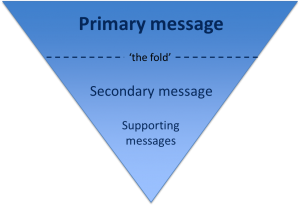
It’s also helpful to think about structuring a webpage in the same way that journalists structure a news article – by using the inverted pyramid.

The inverted pyramid is the idea of turning a story on its head. You start with the key point and then provide more detail further down the page. This ensures that essential information is at the top of the page. This is vital for mobile devices as a smaller screen size means that less content will appear ‘above the fold’.

Inverted pyramid showing where primary, secondary and supporting messages appear (primary at the top, secondary in the middle and supporting at the end)

Karen McGrane in her book, Content Strategy for Mobile, recommends thinking about your primary, secondary and supportive messages to help prioritise content on a page.

Primary message

Your primary message is the main point of the page. This should be communicated through your page title and introduction so that users can quickly see what the page is about.

Page titles should be clear and descriptive so that users can understand them at a glance. Similarly, your introduction should be concise and engaging. It should also contain key words for search engine optimisation. The introduction should summarise the main message in 50 words or less to grab the reader’s attention and encourage them to scroll down the page.

Secondary message

The secondary message is the body copy of your page. It expands on your main message and provides more detail. The body copy should answer your users’ questions and be concise and scannable.

Supporting messages

The supporting messages are qualifiers and additional information to support your main messages. They can include quotes, images and videos. Supporting messages can also provide a next step, such as a call to action like booking a place at an event or taking a virtual tour.

Summary

People spend less time reading online and will only scroll if they think that information further down the page will be useful to them. It’s vital to prioritise content so that your primary message is easily visible. Structuring content effectively is therefore fundamental to ensuring your main message is conveyed to your users.

References

Amy Schade, The fold Manifesto: Why the Page Fold Still Matters, Nielsen Norman Group, 1 February 2015

Karen McGrane, Content Strategy for Mobile, A Book Apart, 2012

Jakob Nielsen, F-Shaped Pattern For Reading Web Content, Nielsen Norman Group, 17 April 2006

Related posts

Share this post:
Share