Making Research Readable for All

Journalists learn early that if you can’t explain your story simply – you don’t know it well enough.

It’s the old adage from experienced editors. It’s a rallying call for plain English and making the complex easy to understand.

Plain English and readability are key in getting your message across, whether your audience are esteemed academics or laypersons.

Fear of ‘dumbing down’

Some research academics break into a sweat over this. It’s as if making research understandable to all is ‘dumbing down’. But researchers often do themselves a disservice with their ‘impenetrable’ web content.

The recent Research Excellence Framework review by Lord Stern recommends research impact case studies provide evidence of public engagement and understanding.

You can achieve this with your website content. It’s also a way to attract non-traditional sources of funding. But explaining your work in 65-word sentences laden with verbose language won’t help.

Have the courage to speak plainly

I’m not saying it’s easy to write about technical research. It’s almost impossible to get away from some subject-specific jargon.

But there are ways of delivering easy-to-read research. And that’s without ‘dumbing down’ and patronising your peers.

Writing actively, in tight concise sentences is a start. Bulleted lists and bold to highlight key messages are also good ideas.

The Art of Scannable Content: How to Write for Today’s Online Readers and our blog are great for writing tips.

Use Hemingway App to help you. It allows you to play around with your words to get the best readability score.

Just doing this, without removing technical jargon, will help anyone read your content.

Don’t hide your research behind vocabulary

Don’t just stop at sentence size, structure and scannable content. You’re only half way there.

“All too often, research is hidden behind a vocabulary that is overly technical and disengaging, but there are ways to avoid that.”

Cracking the code for effective research communication, where this quote comes from, gives excellent advice on steps researchers can take to engage web audiences.

Always put forward how your research impacts on everyday life. Also think about whether you need jargon to tell people what it’s about.

Five minutes with Mark Blyth: “Turn it into things people can understand, let go of the academese, and people will engage” is useful. Academic Mark Blyth gives insight into his success through promoting his research online.

Share this post:
Share

Writing Plain English Does Not Dumb Down Content

The difficulty we face as a University web team is a fear that rewriting content for the web will somehow ‘dumb down’ the message.

 “If we write in ‘plain English’ we’re in danger of making ourselves look stupid. People won’t expect this from a university”


“We’re writing for our academic peers: they understand the terms we use.”

We hear these sorts of comments a lot. If you are writing for a website you need to dismiss them right now.

This is not the content YOU are looking for

Anyone can visit our website. We shouldn’t be excluding audiences based on their understanding of English. Who are we to decide who can or can’t access our ideas?

Think about those students or (high-quality) researchers who may not have English as their first language. Don’t make it hard for them to understand your content.

What about those with dyslexia or those using assistive technologies (like screen readers) to access the site?

And hey, what about you, wouldn’t you rather read something you understood at first glance (even if you are a specialist in that area)?

Remember:

No one will ever complain that you’ve made things too simple to understand.
Ann Handley

Plain English and why it’s important

Plain English at Newcastle University

In our Writing for the Web training we introduce the idea of using plain English. We encourage our content editors to:

  • write clear and direct content
  • be concise
  • reduce (or at least explain) jargon
  • use simple words in short sentences
  • use the language of your reader

All of these things make reading online easier for our audiences. They are how to write plain English.

Plain English Campaign

There’s a campaign for Plain English. The problems of complex words and long sentences are found in all sorts of sectors not just academic circles:

  • marketing
  • business
  • law
  • sciences
  • medicine
  • government

The Plain English Campaign highlights areas where their work has had particular success.

What we don’t want is to be a recipient of the Golden Bull Award  – each year the campaign highlights the worst written communication they’ve seen!

GOV.UK

The public face of government information has been transformed recently. GOV.UK is clear, well-written and helps people understand complex information. They are huge advocates of plain English.

They’ve published a blog post on using plain English:  “It’s not dumbing down, it’s opening up“.

Writing to support plain English

We’ve written lots of blog posts on improving content – most have hints about using plain English in them:

Resources and articles

Share this post:
Share

Decluttering Your Website: How to Prepare for Go Mobile

As we embark on phase 2 of Go Mobile, eager editors across the University are asking when their site will be going through the process. We’re thrilled that our editors are keen to get started.

We’re still finalising the schedule for phase 2. In the meantime, there’s plenty you can do to prepare your site for Go Mobile. In fact, the more you do beforehand the easier the process will be.

Delete, delete, delete

One of the most useful tasks you can do to prepare for Go Mobile is to delete any clutter from your site. Delete old versions of documents, images and logos that you’re no longer linking to in your content.

Similarly, delete old news and events items that are no longer relevant. If this information is still needed, rework it. For example, you could write a review of an event that has already taken place.

Check the currency of your content and consider whether it’s still relevant.

If content is out of date and no longer relevant to your site purpose it’s best to delete it. For more information about how out of date information can harm your website read Jane’s blog post: Why Deleting Old Stuff on Your Website is Good.

Check the accuracy of your content

It might seem like a dull task but ensuring that your content is accurate is crucial to the credibility of your site.

Users will be less likely to trust what you say if your content is littered with spelling and grammar mistakes, or if a link leads to nothing but a dead end. As pointed out by Kara Pernice from the Neilsen Norman Group, a link is a promise.

Tools like Siteimprove can help to find broken links and misspellings on your site.

Improve readability

The easier content is to understand the more accessible your message will be to your target audience.

Online readers are more task-focused and tend to scan content rather than read it all. Smaller screens increase this behaviour. So it’s essential to optimise your content for a smaller screen so that users can understand your content on any device they view it on. Part of this involves deleting unnecessary words.

For advice on optimising content for mobile take a look at our top five tips for writing for the web. An effective tool for identifying the readability of your writing is the Hemingway Editor.

Source new assets

As you’ll find out when you attend our Website Media Management training, images need to be larger in the new template. This is so that they retain their quality across all devices.

The majority of images that currently exist on your site won’t be big enough to work in the new template. Sourcing the original images will therefore give you a head start for when your site goes through Go Mobile. Check our Go Mobile Demo site for an idea of the new image sizes.

Go Mobile is an opportunity to check that your imagery is effectively supporting your messages. For guidance on sourcing imagery read Jane’s blog post on improving your website images and videos. For advice about editing images read Emma’s post: Editing Images for Use on Your Website.

Insights into Go Mobile

Find extra tips from editors who have already been through the Go Mobile process in our series of guest posts. Fiona Simmons from the Institute of Social Renewal talks about her experience of Go Mobile. Ivan Lazarov from the Press Office shares his reflections on the Go Mobile training.

Summary

So that’s a whistle stop tour of how you can prepare your site for Go Mobile. The most helpful thing you can do is to review your content. Make sure it will be readable on a mobile phone and delete old content and assets that are no longer relevant to your messages. Go forth and declutter!

Get in touch

Let us know in the comments if you have any questions about preparing your site for Go Mobile.

Share this post:
Share

Improve Your Content with Help from Hemingway

Hemingway Editor is a great tool for anyone who writes anything. It allows you to assess the readability of your writing before unleashing it on an audience.

How it works

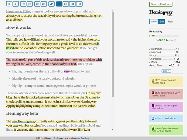
You can paste in a section of text and it will give you a readability score. This tells you how difficult your words are to read – the higher the score, the more difficult it is. Hemingway uses a grade level to do this which is based on the level of education needed to read your text. If you can get your score under 10 you’re doing well.

The most useful part of this tool, particularly for those not confident with writing for the web, comes in the analysis of your text. The app will:

  • highlight sentences that are difficult or very difficult to read
  • identify the use of the passive voice and adverbs
  • highlight complex words and suggest simpler words or phrases

There are other tools out there that do a similar job. For example, on my own blog I have the Jetpack plugin installed which uses After the Deadline to check spelling and grammar. It works in a similar way to Hemingway App by highlighting complex sentences and use of the passive voice.

Hemingway Editor

The Hemingway analysis of this post

Hemingway beta

The new Hemingway, currently in beta, gives you the ability to format your text with basic styles. You can add headings, bulleted lists, bold and links. If you copy this text to another piece of software, like T4 or WordPress, the formatting is copied too.

Concluding remarks

We use this tool a lot within the Corporate Web team when producing copy for the website. It’s an easy way to check how readable your words are, putting your visitors in a better position to understand your message.

Try it out on some text from your website and see what small changes you can make to improve your writing. My greatest achievement is getting some text down from grade 41 (yes, you read that right) to grade 10. See how you get on.

Related posts

Share this post:
Share

Top 5 Tips: Writing for the Web

Screenshot of Prezi - writing for the web

We often get asked about writing for the web as if it’s some mysterious dark art. It’s really not, it’s very simple.

We’ve pulled together our top 5 tips for improving web content.

View our Prezi to find out more: Top 5 tips: writing for the web.

Here’s a summary of what you’ll find there:

1. Be concise

It takes time to edit content and cut words – but it’s worth it – your users are more likely to read what you say.

Tip: try the Hemingway Editor to help you cut your copy and increase readability.

2. Be direct

Use clear, jargon-free language to get your point across to your readers.

3. Make your copy scannable

Use sub-headings, bullet points, lists and bold – all of these things help to get your content noticed.

4. Be conversational

It’s fine to be less formal on the web. Just imagine you’re having a cuppa with your reader and type as you’d talk!

5. Be active

Use hyperlinks to encourage people to read more of your site. Point out content that should interest them – what’s the next step you want them to take?

Feel free to get in touch via the comments – we’d love to hear your thoughts.

Share this post:
Share