The postgraduate (PG) website redevelopment initially began with a focus on improving the content and developing a strategy for content management. Mostly, this was to enable a more coherent user journey through the website – to improve the experience as a whole and encourage applications.
A consistent user experience
As the project got underway it became more and more obvious from our user research that we really needed the website to be optimised for mobile too.
To create a truly consistent experience, users of the website should be able to get the same experience and information no matter what device they use to view the site.
While we were trying to work out how we were going to do that, there was still some debate in the web development world about if you should or could just offer a separate mobile site. Immediately we decided that approach wasn’t helpful at all.
Project creep
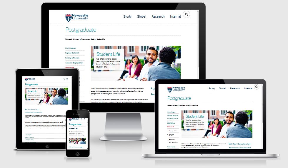
The Postgraduate website goes mobile
Just imagine a user looking at the PG website on a desktop computer. Later they decide to go back and check some information using their phone.
What would their experience be like if we gave them a separate site? With a different structure and content? That really wouldn’t be helpful. Or coherent. Or easy to maintain.
So the work grew from a massive project of improving all the PG content and creating a PG content strategy, to also incorporating the ‘small’ technical demand of a mobile responsive website!
In 2010 Ethan Marcotte coined the term responsive design to describe a flexible, grid-based layout for a website that behaves differently depending on the device used to view it.
… It was a busy year.
Inspiring results
Now we have a really great, mobile responsive website with much improved content that we’re not only proud of, but has inspired the University’s Go Mobile project. Just a quick look at how our users are responding already (we launched at the end of October) shows, for mobile users:
- average time spent on site has increased by a massive 240%. It was less than four minutes, now it is nearly 12
- we’ve increased the number of pages viewed by nearly 22%
Watch this space
There were so many elements to the PG project that they merit separate blog posts, so in the coming months we’ll be sharing about how we:
- wrote content for mobile devices (and improved the desktop reading experience)
- created a tone of voice – and why
- prioritized content layout for mobile optimization
- kept sane (only kidding)
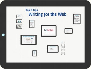
In the meantime you can visit the new PG website and discover the new features by taking a look at our PG case study presentation (PDF: 849KB) from the NU Digital event.
We’d love to hear your views about the new PG website, so feel free to leave a comment.
Update: 16 Nov 2015
Since this article was published, we’ve completed some user testing on the PG website. Check out our blog post about the great user testing results (hint: they love it).