Web Manager and Web Content Officer Jobs

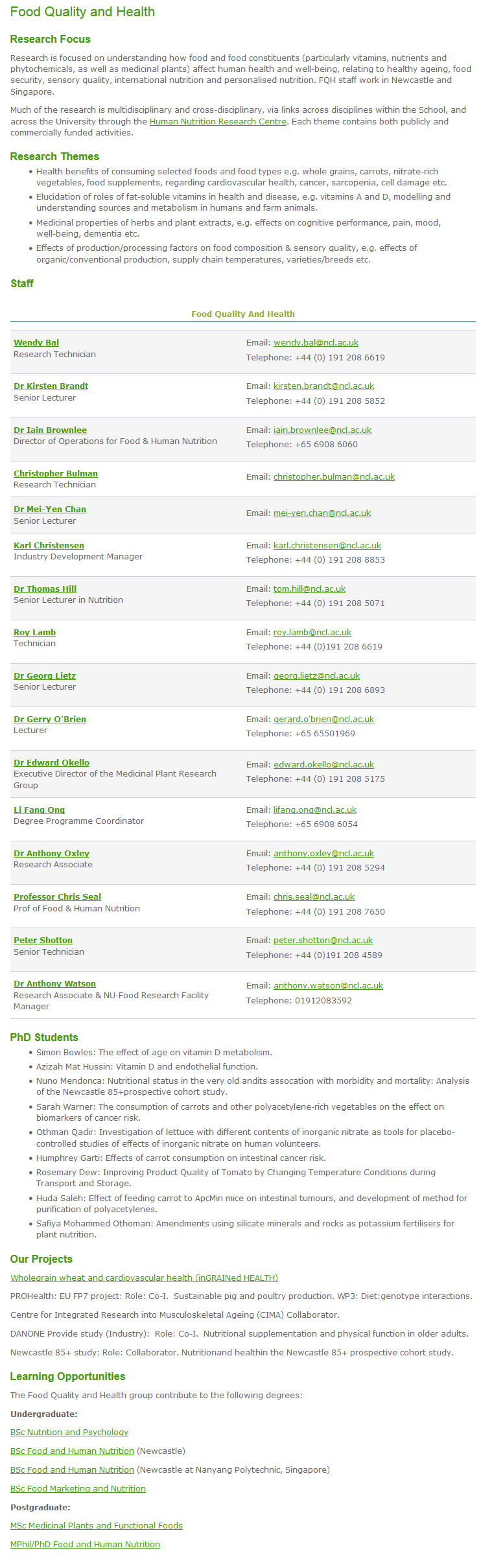
Regular readers will know that we’ve completed the first phase of a University-wide website transformation programme called Go Mobile.

This is to make all Newcastle University websites mobile responsive and to move them into our content management system (T4).

These are exciting times for Newcastle University’s Web Team – we’re looking for some digital content experts to join us in our quest for high quality web content that is mobile responsive.
Scrabble - hiring

We’ve secured funding for five posts to help us get through Phase 2 in a tightly run, year-long programme of work.

All posts are fixed term for 12 months.

Faculty Web Manager vacancies

We have two F grade posts available: one for the Faculty of Medical Sciences and one for the Faculty of Humanities and Social Sciences.

Let us know in your application which Faculty would best suit your experience and background.

These jobs require excellent project management skills (Agile experience would be ideal) and digital copywriting expertise. You will also line manage a Faculty Web Content Officer.

Apply for the Faculty Web Manager jobs now. The closing date is 25 January 2016.

Faculty Web Content Officer vacancies

We have three E grade posts available:

  • Faculty of Medical Sciences Content Officer
  • Faculty of Humanities and Social Sciences Content Officer
  • Faculty of Science, Agriculture and Engineering Content Officer

Let us know in your application which Faculty would best suit your experience and background.

You will be involved in planning, creating and editing effective and innovative digital content. You will provide key editorial support for Go Mobile projects and manage content workflow.

Apply for the Faculty Web Content Officer jobs now. The closing date is 11 January 2016. Interviews will be held on the the 22 January.

Image credit: Scrabble – Hiring by Flazingo on Flickr

Share this post:
Share

Introducing Our New Website Media Management Training

In our team update from 1-14 October you will have seen a mention of a new module we’ve added to our Go Mobile training: Website Media Management. We developed this in response to requests from the first cohort of Go Mobile editors for more help managing images.

Our training on planning and writing web content, and using the T4 content management system, cover some of the ways images can be used in the new template. The new media training takes things a step further. It covers:

  • when to use images
  • sourcing images
  • selecting images
  • preparing images for publication
  • best practice for documents
  • uploading assets to T4’s Media Library

Sourcing and selecting images for your website

The primary source for images for your website should be the University photo library. In the library you can:

  • browse or search for photos
  • save relevant images to your lightbox so you can easily find them again
  • download the approved University logos
  • access student profiles

In the training we cover some tips for getting the most out of the photo library. These include using multiple lightboxes, browsing by keyword and viewing all photos from a selected photographer.

When it comes to selecting images, we provide guidance on how to select images for the four core themes identified in the University branding guidelines; student experience, sense of place, teaching and learning, and research.

The most important thing for image selection is to choose photos that are natural or appear to be observed, rather than staged. That means nobody looking directly into the camera!

Editing images for use on the web

We recommend that our editors use the free, online photo editing tool, Fotor. Its clean user interface makes it easy to upload, crop and resize images to the required dimensions.

Even if you have access to Photoshop, if you’re not a regular and proficient user it can be overwhelming. Fotor is a straightforward alternative.

I wrote a post earlier in the year that includes advice on editing images for use on your website.

Feedback from attendees

There have been three sessions so far, with more to follow in December. The feedback has been very positive:

‘Great information on the use of appropriate images in terms of context on the web page’


‘Really useful advice on when to use images and how to select the most appropriate ones’


‘Good to get practical, hands-on opportunity to edit and save images’


Further information

For Go Mobile editors, you’ll find lots of guidance on using images on our demo site.

Not yet part of the Go Mobile programme and want to improve the imagery on your website? Get further information from the image guide on our website (University login required). This includes a step-by-step guide for using Fotor.

And I’m always happy to take questions in the comments.

Share this post:
Share

Decluttering Your Website: How to Prepare for Go Mobile

As we embark on phase 2 of Go Mobile, eager editors across the University are asking when their site will be going through the process. We’re thrilled that our editors are keen to get started.

We’re still finalising the schedule for phase 2. In the meantime, there’s plenty you can do to prepare your site for Go Mobile. In fact, the more you do beforehand the easier the process will be.

Delete, delete, delete

One of the most useful tasks you can do to prepare for Go Mobile is to delete any clutter from your site. Delete old versions of documents, images and logos that you’re no longer linking to in your content.

Similarly, delete old news and events items that are no longer relevant. If this information is still needed, rework it. For example, you could write a review of an event that has already taken place.

Check the currency of your content and consider whether it’s still relevant.

If content is out of date and no longer relevant to your site purpose it’s best to delete it. For more information about how out of date information can harm your website read Jane’s blog post: Why Deleting Old Stuff on Your Website is Good.

Check the accuracy of your content

It might seem like a dull task but ensuring that your content is accurate is crucial to the credibility of your site.

Users will be less likely to trust what you say if your content is littered with spelling and grammar mistakes, or if a link leads to nothing but a dead end. As pointed out by Kara Pernice from the Neilsen Norman Group, a link is a promise.

Tools like Siteimprove can help to find broken links and misspellings on your site.

Improve readability

The easier content is to understand the more accessible your message will be to your target audience.

Online readers are more task-focused and tend to scan content rather than read it all. Smaller screens increase this behaviour. So it’s essential to optimise your content for a smaller screen so that users can understand your content on any device they view it on. Part of this involves deleting unnecessary words.

For advice on optimising content for mobile take a look at our top five tips for writing for the web. An effective tool for identifying the readability of your writing is the Hemingway Editor.

Source new assets

As you’ll find out when you attend our Website Media Management training, images need to be larger in the new template. This is so that they retain their quality across all devices.

The majority of images that currently exist on your site won’t be big enough to work in the new template. Sourcing the original images will therefore give you a head start for when your site goes through Go Mobile. Check our Go Mobile Demo site for an idea of the new image sizes.

Go Mobile is an opportunity to check that your imagery is effectively supporting your messages. For guidance on sourcing imagery read Jane’s blog post on improving your website images and videos. For advice about editing images read Emma’s post: Editing Images for Use on Your Website.

Insights into Go Mobile

Find extra tips from editors who have already been through the Go Mobile process in our series of guest posts. Fiona Simmons from the Institute of Social Renewal talks about her experience of Go Mobile. Ivan Lazarov from the Press Office shares his reflections on the Go Mobile training.

Summary

So that’s a whistle stop tour of how you can prepare your site for Go Mobile. The most helpful thing you can do is to review your content. Make sure it will be readable on a mobile phone and delete old content and assets that are no longer relevant to your messages. Go forth and declutter!

Get in touch

Let us know in the comments if you have any questions about preparing your site for Go Mobile.

Share this post:
Share

Content Governance: People, Processes and Policies

I’m not sure why I’ve drawn the short straw here: I get to introduce you all to the idea of content governance. Wait, don’t leave yet!

2005: we had websites with no direction

We only have to roll back about 10 years to see what our website was like with minimal governance. We had duplicated content all over the place. There were sites that didn’t follow our branding. We had a team of content-putter-uppers who just did but didn’t ask why.

What’s changed?

We still get asked to “just build a website” or “stick some content on this page”. But, nowadays, the answer is just as likely to be “no” as “yes”.

This is because we have content policies, style guides, training and the right people: our content governance.

Going mobile is helping us with content governance

We’re using the Go Mobile programme to reinforce the importance of governance. There are some elements to making it a success: people, lifecycle, style guides and training.

People

With each new project we’re making sure we have at least one named editor. This means we’ve got a person in post whose job it is to manage the website and its content.

We’re still not 100% there. Web editor roles are often part of another post at the University. We are getting some accountability. And we’re working on making sure content editors have enough time to edit.

Content life cycle

Each Go Mobile site development isn’t just a project with an end date. We’re planning reviews of site content to make sure we’re maintaining quality.

We’re working with editors to introduce content management tools. These include editorial calendars, analytics and Siteimprove.

Style guides

We’ve had a set of web content standards from day one. We’ve just not been good at letting people know about them or enforcing them.

Go Mobile is raising awareness not only that our standards exist but also of their importance. These are not rules for the sake of it. They’re there to help our site users access the content they need on all devices.

If content doesn’t meet our standards, we have the authority to say it doesn’t go live.

Training

We can’t write a style guide, leave it hidden in a cupboard somewhere and then moan if people don’t use it! So we’ve developed training to help communicate our standards. We’ve produced a demo site that presents our new content design in the context of our standards.

Beyond Go Mobile

Through Go Mobile, we’re developing a skilled group of content editors. They are responsible for our web content and will be ambassadors for maintaining quality websites.

We’ve bench-marked our sites. We know how well they score for readability and whether they follow our new standards.

We’re planning to review sites around 6-8 months after they’ve launched. This will help us make sure we’re maintaining quality.

Content governance covers much more than I’ve outlined here – if we can get this right though, we’re well on our way to managing our web content effectively.

Let us know in the comments how you keep on top of content quality. Do you have any formal content governance?

Share this post:
Share

Streamlining Structure and Systems: Case Study of Academic Unit Sites

This is the second of our Go Mobile show and tell posts. Jane has already introduced some features of the new design using examples from central sites. Now, I’m going to look at some design changes on academic unit sites.

Tabbed pages

Our school sites are large. They’re complex and in some cases six or seven levels deep. Through Go Mobile we’re improving the structure of our sites and this includes making them shallower. One way of doing this is to introduce tabbed pages. Tabbed pages also allow us to split up long pages into shorter sections.

Take this example from the School of Agriculture, Food and Rural Development (AFRD).

Screenshot of cropped research group page on old Agriculture, Food and Rural Development website

Click on the image to display the full, uncropped version of the Food Quality and Health page on the old AFRD website.

Their research groups previously had a single page that included:

  • an overview of their research interests
  • a list of research themes
  • a staff list
  • a projects list
  • information about their teaching and learning activities

The new tabbed page allows this information to be split out into three or four much shorter pages with the tabs showing across the page on desktop.

Screenshot of tabbed research group page on new Agriculture, Food and Rural Development websiteOn mobile the tabs appear in a drop-down menu:

Screenshot of research group page on mobile with drop-down menu collapsed        Screenshot of research group page on mobile with drop-down menu expanded

Staff lists

In both the old and new design staff lists are generated from MyImpact data. The main difference, as you’ll see below in the example from the Schools of Architecture, Planning and Landscape (APL) is that profile images are now displayed in staff lists on desktop.

Screenshot of staff list on old Architecture, Planning and Landscape website

Old APL staff list

Screenshot of staff list on new Architecture, Planning and Landscape website

New APL staff list

On mobile the images disappear so that more information can be displayed on the smaller screen.

News

News lists appear in a very similar format in the old and new designs. The biggest change is behind the scenes. Previously our editors had to use a separate system to generate news for their site. News is now incorporated into the content management system (CMS) that we use to publish all content on a website.

Screenshot of latest news page on the new Institute of Sustainability websiteThe new CMS allows you to syndicate news into a feature news grid on your site’s homepage. This requires high quality imagery for every news item. As an alternative, some academic units have opted to display a simple news ticker on their homepage.

Screenshot of homepage news grid on the new Institute of Sustainability websiteTell us what you think

As always, we’re interested to hear your feedback. All the new sites have a link to our feedback form in their footer. You can also leave us a comment on this post.

Related posts

Share this post:
Share