The difficulty we face as a University web team is a fear that rewriting content for the web will somehow ‘dumb down’ the message.
“If we write in ‘plain English’ we’re in danger of making ourselves look stupid. People won’t expect this from a university”
“We’re writing for our academic peers: they understand the terms we use.”
We hear these sorts of comments a lot. If you are writing for a website you need to dismiss them right now.
This is not the content YOU are looking for
Anyone can visit our website. We shouldn’t be excluding audiences based on their understanding of English. Who are we to decide who can or can’t access our ideas?
Think about those students or (high-quality) researchers who may not have English as their first language. Don’t make it hard for them to understand your content.
What about those with dyslexia or those using assistive technologies (like screen readers) to access the site?
And hey, what about you, wouldn’t you rather read something you understood at first glance (even if you are a specialist in that area)?
Remember:
No one will ever complain that you’ve made things too simple to understand.
Ann Handley
Plain English and why it’s important
Plain English at Newcastle University
In our Writing for the Web training we introduce the idea of using plain English. We encourage our content editors to:
- write clear and direct content
- be concise
- reduce (or at least explain) jargon
- use simple words in short sentences
- use the language of your reader
All of these things make reading online easier for our audiences. They are how to write plain English.
Plain English Campaign
There’s a campaign for Plain English. The problems of complex words and long sentences are found in all sorts of sectors not just academic circles:
- marketing
- business
- law
- sciences
- medicine
- government
The Plain English Campaign highlights areas where their work has had particular success.
What we don’t want is to be a recipient of the Golden Bull Award – each year the campaign highlights the worst written communication they’ve seen!
GOV.UK
The public face of government information has been transformed recently. GOV.UK is clear, well-written and helps people understand complex information. They are huge advocates of plain English.
They’ve published a blog post on using plain English: “It’s not dumbing down, it’s opening up“.
Writing to support plain English
We’ve written lots of blog posts on improving content – most have hints about using plain English in them:
- Follow our top tips on writing for the web
- Improve your content with help from Hemingway
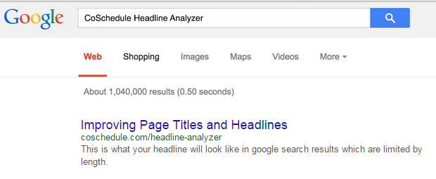
- Improve page titles and heading (use familiar words and phrases)
Resources and articles
- GOV.UK list of words to avoid
- A-Z Alternative Words, Plain English Campaign
- Guest Post: Clarity is king – the evidence that reveals the desperate need to re-think the way we write, Government Digital Service post on research into language used on the Department of Health website
- Dumbing Down, Sarah J Richards (Former Head of Content Design at GOV.UK)