How to Describe Images for Accessibility and Findability

The University’s template for external websites gives great flexibility in the use of images. From visual grid layouts to mastheads and galleries.

Many users of our websites don’t see these images. They may have chosen not to download images, or might be using a screen reader to turn visual information into audio. This means it’s important to provide contextual information about our images.

Alternative text, or alt-text, is used to describe images to screen readers used by visually impaired people. It is also a useful aid for search engine optimisation, as search bots can crawl this field to get information about the image.

Good practice for alt-text

In T4 when you add an image to the media library, whatever you put in the description field is output as alt-text.

To make your alt-text effective, keep it short and descriptive. For all our web content, we recommend you write naturally and clearly – alt-text is no exception.

Long alt attributes will disrupt the flow of the content on your page. If you have a lot to say about the image, eg for a chart or graph, add a caption or describe it in the text on the page. Don’t cram this into the alt-text.

It’s good to think about including key words in your alt-text to aid findability, but they must be relevant to the image. Don’t fill your alt text with a string of random keywords just to help search optimisation. This will be confusing for users of screen readers. As we recommend for all content – write for people, not search engines.

We recommend that you avoid using text in an image as it can’t be seen by screen readers or search bots. Therefore it’s not accessible or findable. But, if you do have text in an image, make sure you also include that text in the alt attribute.

Exceptions

Alt text is not needed for:

  • purely decorative images, eg the masthead images on the NICA website
  • where there is also link text, eg top task boxes on homepages

However, there still needs to be an alt tag in the code of the page. If the alt tag is missing, a screen reader will try to add context by reading the image name, and this is often unhelpful.

An empty alt tag indicates to the screen reader that the image is meaningless. This means it’s simply ignored by the screen reader. The good news is that in T4 if the description field is left empty then the alt text field is left empty and still appears in the code.

Find out more

This video, created by Mike West, gives a great overview of what I’ve covered in this blog post. It includes examples of exactly what a screen reader picks up from images with and without alt-text.

Share this post:
Share

Our Most Popular Posts of 2016

We’ve published another year’s worth of blog content and now is my chance to take a look back and see how far we’ve come since this blog was just an idea in my head.

In 2016 we nearly doubled our editorial team. For me, that meant fresh ideas for posts, and new approaches and styles of writing. As a result, I think we’ve increased the variety of content we’ve produced during the past year.

Top five of 2016

  1. Go Mobile Web Editor Community Event (guest post by Anna Jenner)
  2. Breaking Bad When It Comes to Links
  3. Team Update: 14 – 24 March
  4. Tips for Surviving Go Mobile (guest post by Kate Austin)
  5. Team update: 29 March – 8 April

We had two guest posts on the blog this year, and they both made it in to the top five.

That’s a clear sign that you’re looking to hear from other editors about their experiences. That’s something that’s supported by the positive response we’ve had to our web editor community events.

To build on this, my goal for the blog for 2017 is to get more guest posts on the blog – so if you’ve got an idea, get in touch.

I’m interested to see a couple of our team updates in the list. I took a look to see if I could spot what managed to hook people’s interest for those two weeks in March.

The first introduced our new members of staff; Andrew, Emily and Fen. The latter covered the launch of the new Careers website.

Popular evergreen content

Not all of our popular posts in 2016 were written the same year. In fact, the top performing post on the blog during 2016 was written the year before.

It’s popular because it remains relevant to all our editors and presents practical tips for using Siteimprove to find content and assets on your website.

My favourite post

There were quite a few contenders for my favourite among the 62 posts we wrote last year. High up the list was one from Fen on the use of bold, but I figured I couldn’t just give it to her for the Star Trek reference.

Instead, I’ve chosen a post on another topic that’s close to my heart – clarity. In Making Research Readable for All, Andrew looks at why using Plain English and producing scannable content are the key to communicating your message.

Share this post:
Share

An Introduction to Information Architecture

In my post about our minimalist approach to the web, I said that you should respect your users’ time by only providing them with essential information, and by guiding them through your website in a helpful way.

The best way to do this is by having good information architecture.

Information architecture is about deciding how something is organised. It’s not just about where your content is, it’s about the placement and design of that content, and what message that sends to your users.

I think the best way to explain this is with an example…

Example

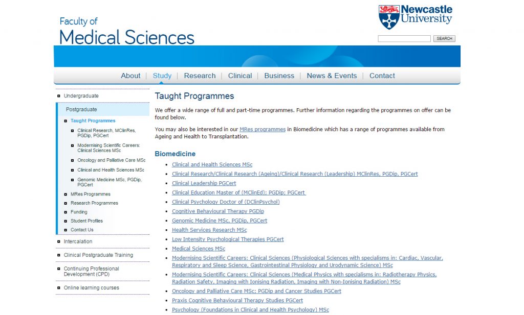
In this example from the old Faculty of Medical Sciences website, five postgraduate taught programmes appear as sub-menu items in the sidebar, while the rest appear as bulleted list items on the page.

An example of bad information architecture, from the Faculty of Medical Sciences website.

Some degree programmes appear as menu items in the left-hand navigation, others appear as links in the main body of the page.

In reality, there is no significant difference between these programmes, but the way they’re organised gives a false impression of hierarchy. It ascribes importance to the ones in the sidebar. Users could leave this page with the impression that the faculty values the programmes in the sidebar more highly than the ones in the list.

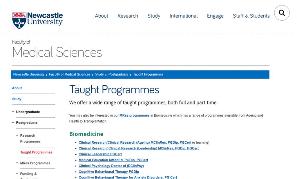
Here is the same page on the new Faculty of Medical Sciences website.

An example of good information architecture, from the Faculty of Medical Sciences website.

All degree programmes appear as links in the main body of the page. The list is separated by subject and ordered alphabetically.

All of the taught programmes are now listed in alphabetical order in the main part of the page. They all look equally important and they’re easier for the user to navigate.

The links take the user to the central postgraduate website. This fits in with our university-wide web strategy; creating a seamless browsing experience and ensuring that the user will receive the most accurate and appropriate course information.

For another example of how information architecture works, read Understanding information architecture via my bookshelf.

Benefits of good information architecture

Good information architecture aids the user journey. It helps people to navigate through your site in a way that makes sense, before arriving at the information they’re looking for.

Bad information architecture hinders the user journey. It confuses people by providing the wrong information at the wrong time, in the wrong place.

Information architecture also helps control the interpretation of your content, and communicate what you intend.

Websites with good information architecture are better for users because:

  • content is presented in a more useful and meaningful way
  • information is given at the appropriate point in the browsing experience
  • the browsing experience easier, more enjoyable and more intuitive

Websites with good information architecture also makes it easier to keep your website up to date, because new content can find a sensible home.

Next time

In my next post, I’ll be looking at the three elements of information architecture, and how they work together to create a great user experience.

I’ll also outline how you can create and maintain good information architecture using the tools we’ve given you.

Share this post:
Share

Use Siteimprove to Find Which Sites You’re Linking To

We’re asking our editors to make sure that all links in web content link to the correct destination page. This will reduce the number of broken links in our websites

You can check what links are on your website and where they are linking to with Siteimprove’s Inventory module. You can also use the section link in T4 to link to web pages within the content management system.

Section links in T4

In T4 using a section link reduces the number of broken links on your website. If the page being linked to moves within a site structure the link is maintained. If the page being linked to is deleted the link will be removed from content.

Over 50% of our websites are now in the content management system, so you can link to most central and school websites with a section link.

Find out which sites your website links to

Before you can update your website links you need to find out what links are in your web pages.

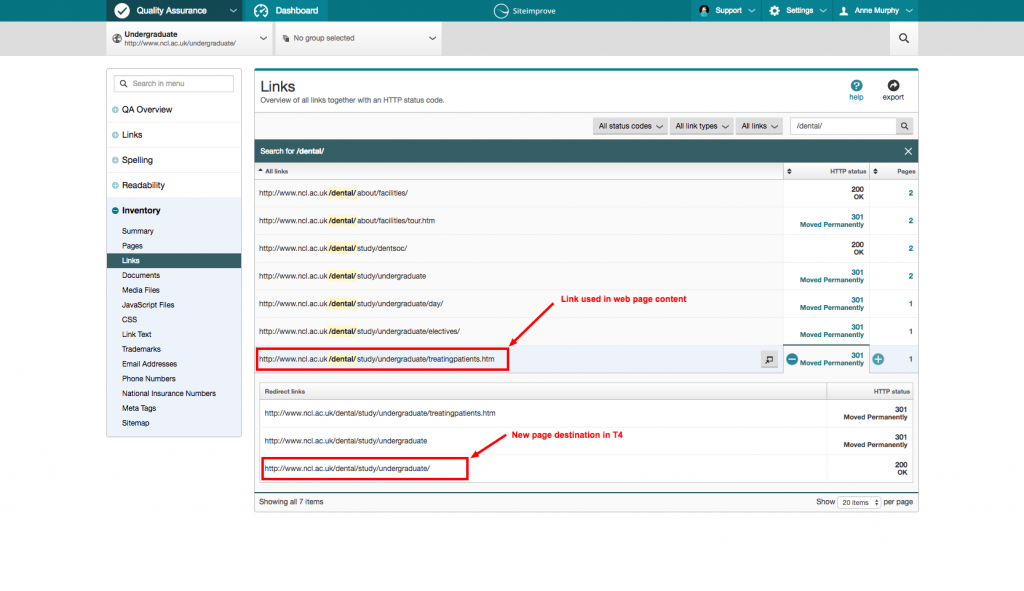
You can use Siteimprove’s Inventory module to see a list of all links used in your website. The inventory also helps you find the page where a particular link is used.

The inventory also shows you links that use a redirect and the correct destination for that link.

To help you work through your website and update your links you can also export a list of links as a spreadsheet.

How to use Siteimprove’s Inventory module

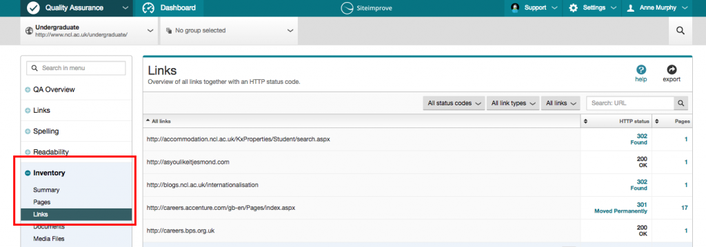
You’ll find a link to the Inventory in the left-hand panel of your Siteimprove report.

Click to expand the menu and select ‘Links’ to see the list of links used in your website content:

Siteimprove Menu panel and inventory tab

Siteimprove Inventory Tab

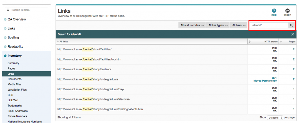
Then search for the link or part of the link you want to review, eg http://www.ncl.ac.uk/dental/:

Siteimprove - search for a link

Hovering the cursor over the ‘Pages’ column and clicking ‘+’ opens a sub-list showing the location of all pages where the link is used:

link-locations

In this example the link http://www.ncl.ac.uk/dental/about/facilities/ can be found in two pages. Using the inventory makes it easy to identify the sections in T4 which contain the link.

Having found the link in T4 you can re-link the content to the destination page using a ‘Section link’.

Find and replace redirected links

When a website moves into the content management system, its address may change. Pages can move within the site structure or be removed from the site.

To avoid creating broken links across our websites we may use a redirect. This takes you from the old page address to a new location within a site structure. But when a redirect expires the links in content will break.

Use the inventory to identify which links use a redirect and update the links so that they point to the correct destination page.

A link which redirects is marked in the Links overview list as 301 Moved Permanently. 

Clicking to the right of a link shows you where the link appears in content. Clicking to the left of the link displays the redirect destination page:

Redirect links destination address

In this example, the link in the content is http://www.ncl.ac.uk/dental/study/undergraduate/treatingpatients.htm but the new destination is http://www.ncl.ac.uk/dental/study/undergraduate/.

As the new destination page is located in T4 you can use this information to help you find the link in the content management system. You can then change it to a ‘Section link’.

Keeping on top of broken links

Broken links on your site cause frustration for the user, and can damage your reputation. It’s important therefore that you keep on top of fixing existing broken links, and pre-empt any future broken links that might occur when redirects expire.

Using Siteimprove to do this makes the task much easier. We’ll also help you out by sending lists of sites to our editors, after each batch is moved into T4.

Access to Siteimprove

Request access to Siteimprove (University Login required).

Share this post:
Share

Less is More: Our Minimalist Approach to the Web

Since we started the Go Mobile process, we’ve deleted nearly 5,000 pages from university websites.

Many of these pages were out of date or duplicated content from elsewhere on the web. They were confusing our users by presenting information that had no currency or relevance. They were, essentially, digital clutter.

We have a minimalist approach to the web. We like simple websites that provide information quickly and efficiently by using clear language and an effective, uncluttered design.

“Some web designers mistakenly regard minimalism as a primarily aesthetic choice. They neglect the fact that the ultimate goals of minimalism are usability and economy – the ability to do more with less.”
Alan Smith, Usability Geek

This minimalist approach is better for users because it helps create websites that are helpful and easy to use. It’s also better for you, our editors, because it offers a formula for creating good content and a framework for prioritising information.

Here are some tips to help you approach your website with a more minimalist mindset:

Be simple and clear

In terms of both design and language.

Check our editorial and content guidelines for advice on how to write and edit for the web. Use readability tools (like Clarity Grader and the Hemingway app) to ensure your language is clear.

Focus on the essential

Your users want answers to specific questions. They should be able to find things quickly and easily, without being distracted by lots of unhelpful or irrelevant information.

“Essentialism is not about how to get more things done; it’s about how to get the right things done. It doesn’t mean just doing less for the sake of less either. It is about making the wisest possible investment of your time.”
Greg McKeown, Essentialism: The Disciplined Pursuit of Less

Treat your users’ time with respect – give them what’s essential so they can move on.

Eliminate the unnecessary

Everything on your website should serve a purpose.

The purpose could be anything from informing someone of a key date, to inspiring them with a great story. If you can’t figure out what the purpose is, it probably shouldn’t be there.

Images, videos and quotes should only be used when they support the core content of a page.

Foreground functionality

Bells and whistles can be great, but they should never compromise the functionality of a website. Design choices should help people navigate your site, not impede their journey by bombarding them with attractive but unnecessary elements.

Visit the demo site for advice on how to use content types and design new pages.

Make deliberate choices

As a web editor, you’ll receive lots of requests to add new content to your site. You need to make strong, thoughtful choices about what belongs there.

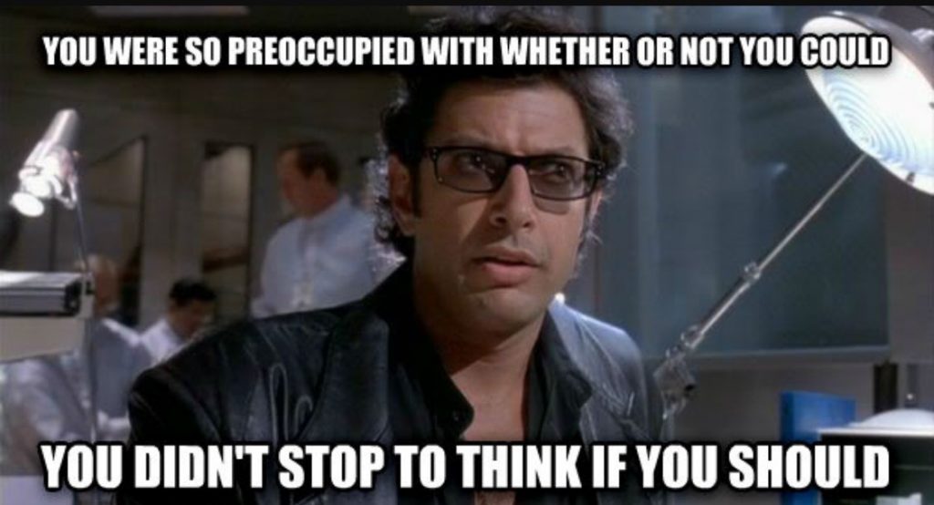
Lots of exciting things are possible in T4, and it’s easier than ever to upload new content to the web. But – to paraphrase Jeff Goldblum in Jurrasic Park – think more about what you should do, not what you can do.

Jeff Goldblum as Ian Malcom in Jurassic Park.

Fortunately, T4 is not able to recreate dinosaurs.

Share this post:
Share