As part of the recently launched Exploring 3D Anatomy MOOC, two video presentations were created. These presentations involved explaining diagrams and pictures. One of these recordings had a moving cursor which the presenter had used to explain various parts of the screen, and the other was recorded without a cursor. To improve the clarity of the explanations, we had a request to display a larger cursor over the recorded material, using it to ‘point’ to the various significant areas shown.
When you’re planning a virtual presentation it’s worth checking if and how the software handles the cursor – some software will use a glowing highlight as you present, some will show and hide the cursor automatically depending on when you move it. The videos were recorded in ReCap, which automatically hides the cursor unless it is moving. The end of the post has links to various guides to help you choose your settings. The rest of this post details the animation process for how a larger cursor was added after the presentations had been recorded. This technique could be applied to other added graphical elements too if needed.

Creating the New Cursor
As the cursor is used in a lot of animations, there was already a scalable vector graphic image of a cursor available to use. This had been drawn in Adobe Illustrator. The next step was to use After Effects to add the cursor to the video and animate it.
Tracking the Cursor

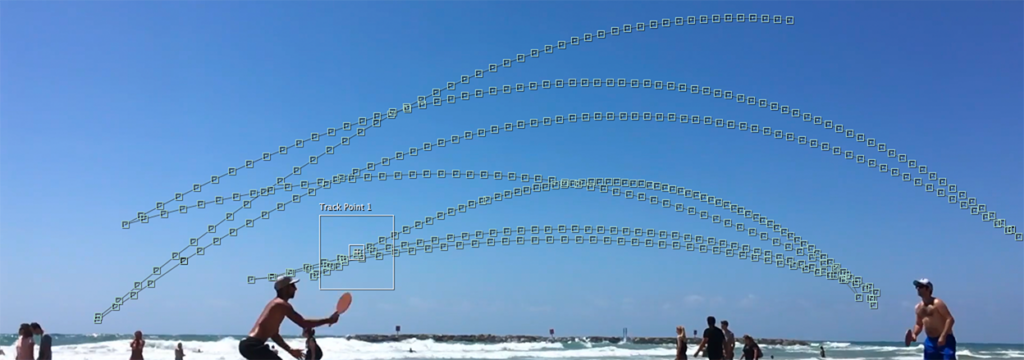
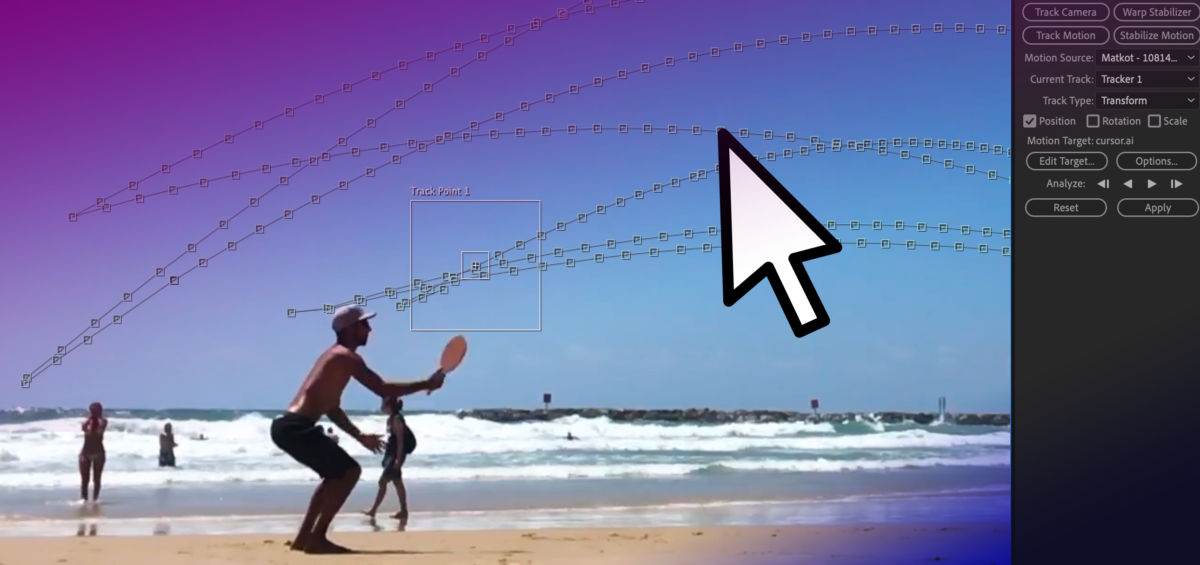
For the video with the cursor visible, the motion tracking function of After Effects was used. After identifying the original cursor, the new larger cursor was set to track it. Here and there the original cursor changed colour to remain visible over different backgrounds. It wasn’t necessary to replicate the colour change with the larger cursor, but this colour change did add extra steps when setting up the motion tracking as it needed to be started afresh each time the original cursor had changed colour. For the video without the cursor, the process was simpler as there was nothing to hide or track. As such the animations could be set up from scratch. Based on the clear explanation from the presenter, it was possible to add a cursor to trace the areas being explained.
Adding the New Cursor
The animations were set up to take place between certain moments of the video – like scenes. Key points in the video were identified and ‘key frames’ added which allow us to set up when certain animations should take place, and how long for. Simple animations such as changing size, position or rotation can be done relatively quickly using these linear key frames.
Once the start and end points are set, further customisation can be done to change the feel of the animation. For example, in this case, the speed of the cursor should somewhat mimic a natural movement rather than a precisely uniform speed. Using ‘ease in’ and ‘ease out’ (combined as ‘easy ease’) allows for the animation to look a little more natural, and less jarring, as the cursor starts to move more slowly before speeding up and gradually slowing to a stop.
When moving from point to point it’s very rare that a straight line is the best path to take, usually a slightly curved path can help add a more natural-looking movement. This might be used to instruct a viewer to click a series of buttons, for example. The ‘spatial interpolation’ in After Effects allows for the path of the moving object to be linear (a straight line) or Bezier (curved). The temporal interpolation tool allows for variations to the speed of the movement – a more customisable version of easing. Adjusting these allows for a nice natural pace and movement, and for more creative effects. For example an item moving from A to B may move slowly at first, then speed up towards the middle of its journey, then slow down again before arriving at its final destination – imagine a train travelling between stations!).
Approximating Gesture
The final videos allowed for a clear approximation of gesture to be added to the presentations, mimicking how a presenter might usually point to a screen or demonstrate a movement. While this is something very natural to do in person, you may need to think more about how you use and move your cursor in online presenting. Often it can be tricky to see the cursor, so you may wish to consider moving it more slowly than usual if you are using it to indicate processes or changes. Selecting some form of pointer or cursor highlighting in your chosen software can improve the visibility of the cursor during your presentation, whether recording or in person. On the other hand, you may wish to put your mouse out of reach so that random or accidental cursor movements don’t detract from your content.
Motion Tracking Demonstration
This video demonstrates the full motion tracking procedure, showing how you can track an object and then map the position of a cursor to it.
Resources
- Cursors on Panopto – remember that only the slides are captured if you add a PowerPoint, so to capture your cursor, you should record your screen instead.
- Activating the Pointer in PowerPoint
- Keeping the cursor on-screen in PowerPoint


