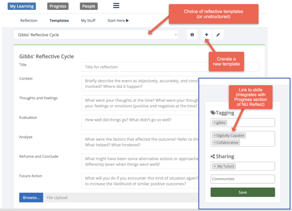
The Placements system has a focus on supporting assessment, reflection, and three-way communication and file-sharing during placements (students, external supervisors & NU tutors/staff). For 2023/4, the system was extended to support evidencing of individual competencies/outcomes, with a student dashboard and ability for ad-hoc assessors to provide assessment without the need to log-in.
Background
The Placements system was developed by FMS TEL as a sub-system of NU Reflect. It has been used by PGCE Programmes (ECLS) since 2017/18. The system absorbed established practice from the PGCE programmes, but was designed to be configurable for potential use by other programmes. It has been available to all programmes at the University from September 2019. It has been used by DClinPsy and other programmes.
Governance of NU Reflect (including Placements) is via a management team (academic lead, LTDS lead & FMS TEL lead), which reports to Digital Education Sub-Committee (DESC). A ‘baseline’ for the Placements system was developed following a period of consultation in 2022/23:
| Baseline requirement | Description | Purpose |
| Custom forms | Manage/create custom forms for a placement scheme | The ability to develop context specific bespoke forms for student completion in line with programme requirements, supporting a range of functions e.g., assessment, reflection, placement evaluation etc. |
| Rubric-based assessment | Including scheme-specific skills/competencies and level identifiers | The ability to assess student work against skills/competencies in line with programme context |
| Three-way file sharing | Between student, external supervisor & University tutor | The ability to share forms with relevant users to support scheme requirements |
| Competency sign-off | Sign-off of skills/competencies/ outcomes, including by external supervisors. | To support sign-off by external supervisors and other third parties. |
| Reporting | Data feeds or data download | Required for reporting to funding/regulatory bodies. |
| Admin access | Tools to monitor placement cohort/assign to placement, location & supervisor etc. Set automated deadlines relative to placement dates. | Scheme specific control to amend information as/when required, delegated to school/programme teams. |
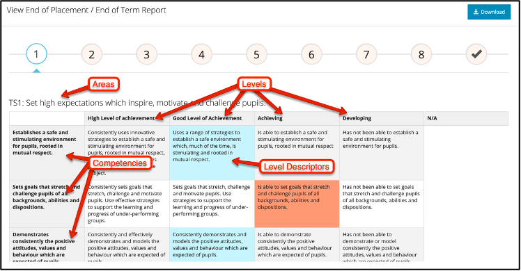
PGCE students spend the bulk of their time on placements in schools around the region, with school-based supervisors who support and assess the students. A rubric-based assessment tool was developed and configured so that these supervisors can assess progress and provide feedback against national Teaching Standards (see Screenshot). They click on the desired Level Descriptors and can also add qualitative feedback.
Additional forms (e.g. weekly progress) were set up; these were designed to be customisable as there were different requirements for Primary and Secondary PGCE programmes. A key design feature was to reduce the burden on admin teams, in particular by automating deadlines – in particular, forms are configurable with deadlines set relative to placement start and end dates, and set to who will complete these (supervisor, student, University tutor etc).
Students are automatically imported into the system, based on their programme or module registrations with the University. Programme administrators manage external accounts for placement supervisors, who do not have University logins.
Initially rubrics and forms were set-up by the development team; however, over time, the team in ECLS generally self-manage their use of the system in creating new forms and making old forms inactive. Form and rubrics data can be exported for reporting purposes and University tutors can view supervisors marks for the main Teaching Standards collated across the students (2 or 3) placements, before entering a final overall assessment. When there have been major changes to the professional frameworks, support was needed from the development team.
The DClinPsy programme (Psychology), where students spend the bulk of their time on placements, followed a similar model to the above PGCE programmes.
Developments for 2023/4
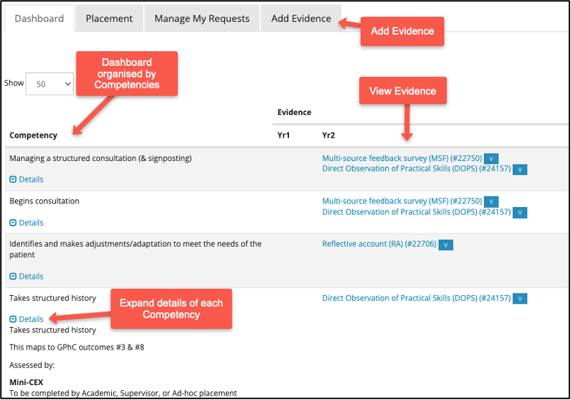
Pharmacy began using the Placements system in 2023/4. Requirements were significantly different to those of existing programmes using the system. These required extending the software, which was resourced by FMS. In particular, the focus is on evidencing individual competencies (rather than all competencies being assessed in the same rubric). Also, rather than a set-supervisor competing forms, there was a requirement for sign-off of competencies by ad-hoc supervisors, without the need to log-in. Established practice in MBBS was applied, with students entering the assessor’s Email address, which generates an Email with a secure link to the required assessment form. A ‘dashboard’ was developed for students and their tutors to see evidence by competency by year of the programme.
The assessment tools and processes are indented to closely match those which students’ will need to use after graduating and using professional vocational ePortfolio. The new features of the software were designed to be configurable, to support the competency/skills frameworks of other programmes.
Further work will be undertaken, including developing a process for students to select a sub-set of items from their portfolio for each competency, for their end-point assessment.