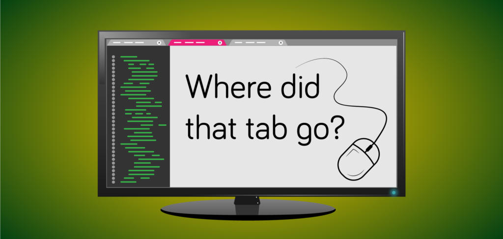
We’ve all been there. That tab that we had open ten minutes ago has just disappeared! Luckily, theres a solution for that.
The Solution
Pressing Ctrl + Shift + T(Command + Shift + T on a mac) will reopen crashed or closed Chrome tabs. You can repeat this shortcut until it runs out of tabs and closed windows to restore from your history.
Last month we welcomed Nick Jensen to the FMS TEL team, as Senior Digital Skills Demonstrator.
Nick has joined the FMS TEL team to cover the role of Senior Demonstrator. Nick is co-ordinating a group of PGRs who assume the role of Digital Skills Demonstrators. As part of the wider remit of the department he delivers our digital skills provision, teaching students digital skills and techniques.
Nick brings insider knowledge with him, having previously been a Digital Skills Demonstrator himself for a four-year period from 2019 to 2023.
Using a problem based approach to help students help themselves, Nick and our team offer digital capabilities instruction in sessions that both directly and indirectly support student work (from undergraduate course assignments to PhD theses). We offer more than 100 sessions, serving over 2000 students each year. We deliver sessions both on campus and online.
“Having worked with the FMS TEL Digital Skills team for more than 4 years, applying to the Senior Demonstrator role was the perfect progression. I have previous managerial experience in the Further Education sector, and with my long-term career goals of procuring an academic support role in Higher Education, this role seemed like a logical next step. Since commencing the role some highlights have been running a staff training session for new and returning demonstrators, being involved with a Senior colleague in their interviewing processes and getting to put my own stamp on the teaching resources through re-vamping the content.”
A piece of research I have recently been involved in has been published in the BMC Medical Education online journal and is available to read now. It can also be accessed via the University library here.
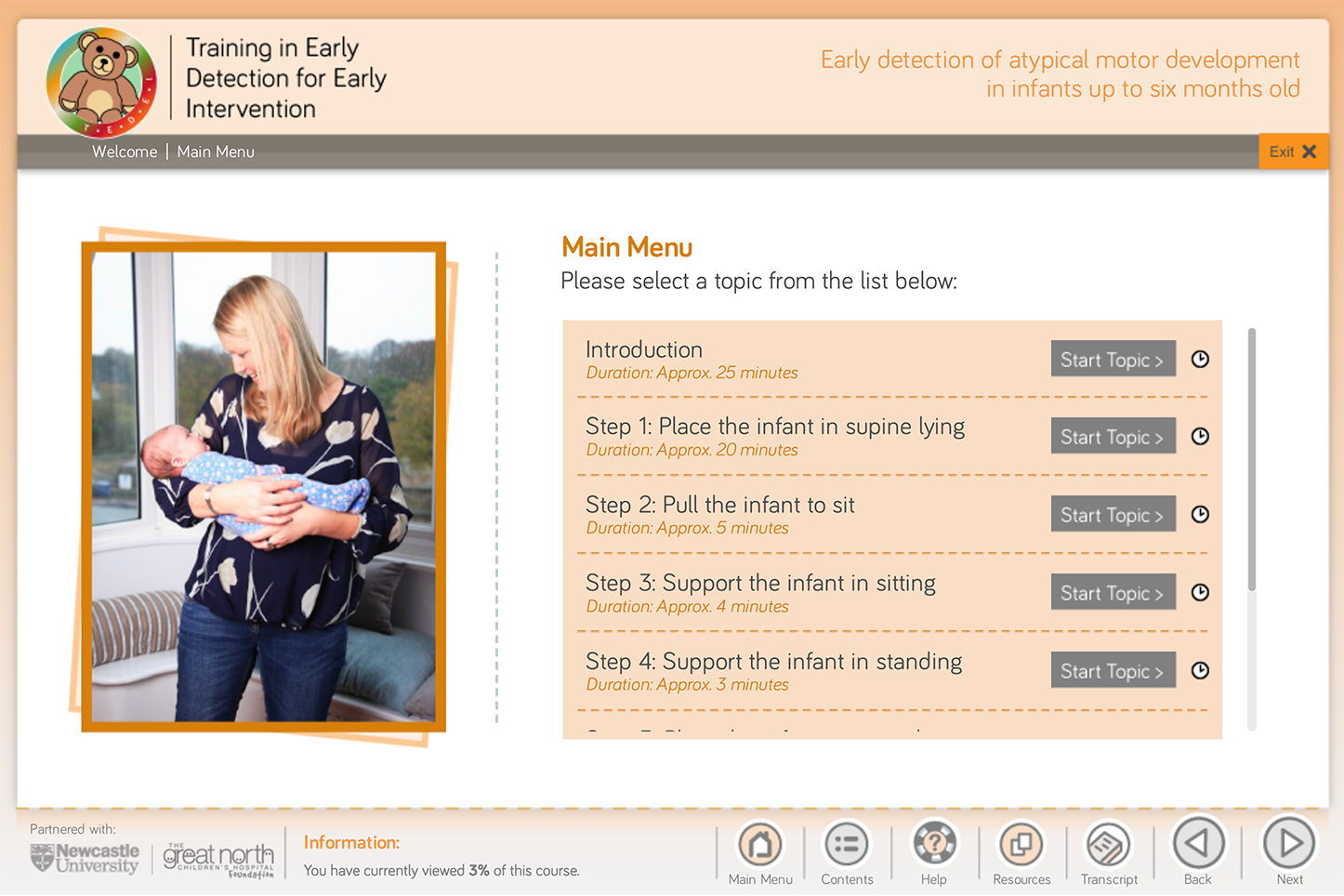
The paper, titled ‘Evaluation of the Training in Early Detection for Early Intervention (TEDEI) e-learning course using Kirkpatrick’s method‘ focuses on the need for training of healthcare professionals in early detection of atypical motor development (cerebral palsy) in infants up to six months old.
Working in collaboration with Dr Anna Basu and Janice Pearse as Subject Matter Experts (SMEs), I developed a video-based e-learning course to address this need, with results from a pre-course and post-course quiz being analysed to evaluate whether participation in the course had improved knowledge and changed the behaviour of healthcare professionals.
TEDEI Course User Interface
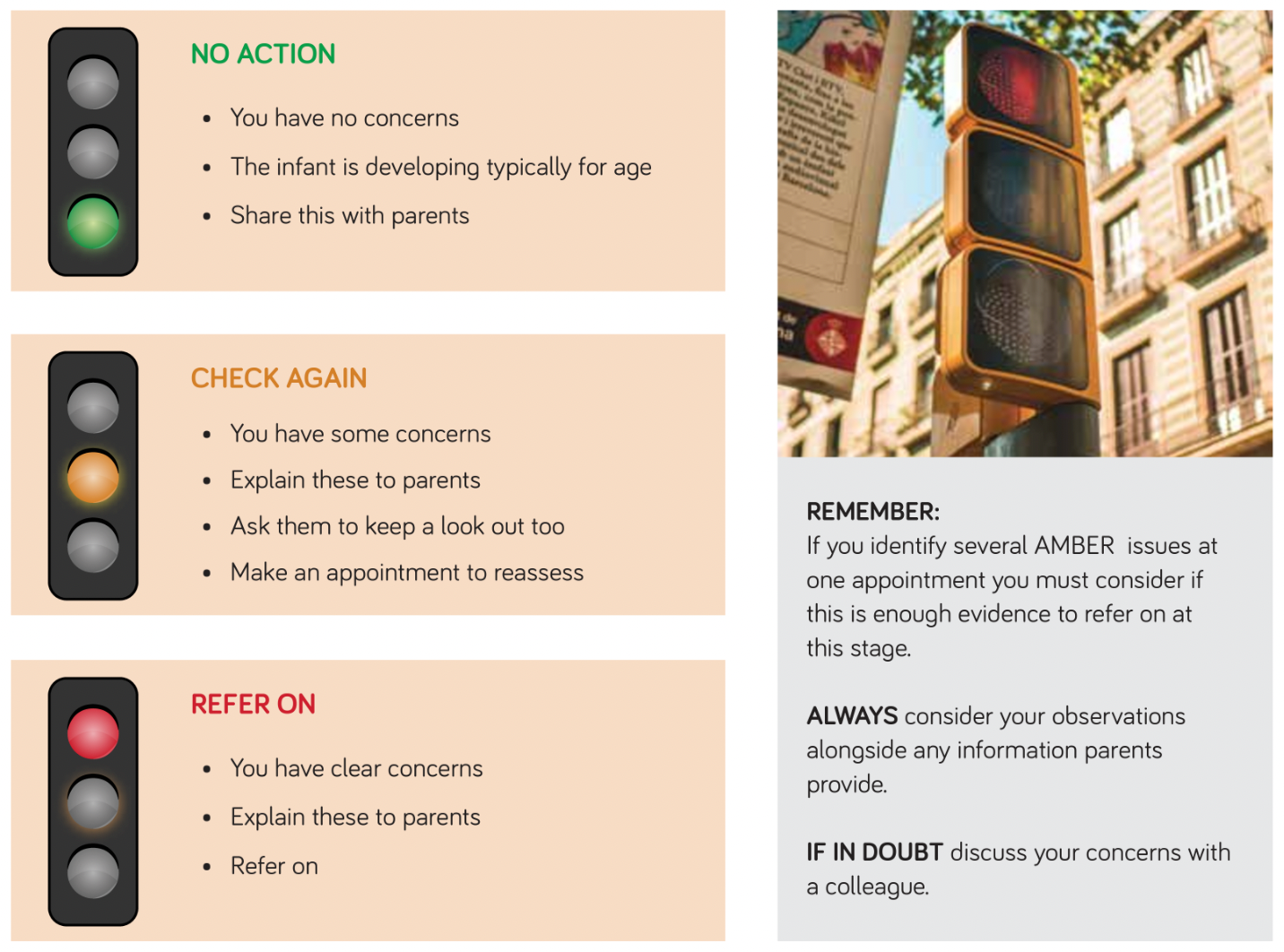
The two-hour course used a Traffic Light System to both demonstrate abnormalities and also quiz users on their understanding of them, and the potential need to monitor/refer.
Traffic Light System
As demonstrated by the research, the course received positive responses from all stakeholders. Healthcare Professionals (HCPs) who have taken the course have improved their knowledge and confidence in this area, leading to better outcomes for families.
The course is available free to staff from Newcastle upon Tyne Hospitals NHS Foundation Trust. More information about the course, including access and booking, can be found on the University Website.
References
Officer, E., Johnson, M., Blickwedel, J., Reynolds, A., Pearse, R., Pearse, J. & Basu, A.P. (2023) ‘Evaluation of the Training in Early Detection for Early Intervention (TEDEI) e-learning course using Kirkpatrick’s method’, BMC medical education, 23(1), pp. 129–129.
The team shares success at the Learning and Teaching Conference – find out more about how DIY and bespoke animations can help boost learning in your course.
Several members of the FMS TEL team attended the NU Teaching & Learning Conference on Thursday 31st March giving strong representation of the team.
It was a great day with some very insightful presentations on a broad range of topics and a very interesting keynote from Professor Paul Ashwin. It was also the first time in years that the conference has been able to be run ‘in person’ and with around 300 attendees it felt like a slight return to normality.
Members of the FMS TEL team had both ‘posters’ and ‘video presentations’ entered into the competitions. Attendees were sent a link to view them and were able to vote for their favourites both in the week leading up to the conference and also on the day itself.
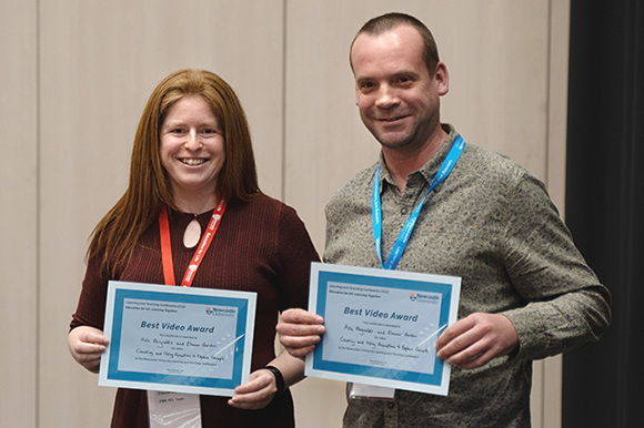
Eleanor Gordon (left) and Ashley Reynolds (right)
Ashley Reynolds and Eleanor Gordon from the FMS TEL team were delighted to be announced winners of the ‘Best Video Award’ for their video presentation titled ‘Creating and using animations to explain concepts’ which highlighted how animations could be used to enhance teaching, and techniques that will both improve memory retention and also increase learner engagement. The video presentation entry can be seen below.
Video submission
If you would like to know more about animations and the services that the team can offer, please get in touch.
We would like to say ‘Thank you very much’ to the LTDS team for organising a great conference. Can’t wait for next year!
A video explanation and demonstration of how animations can be used to explain concepts, and when this is most effective.
Teaching and Learning Conference Presentation
Ashley Reynolds and Eleanor Gordon
This video demonstrates how animations can be used to enhance teaching. Some animations require specialist experience to create, but a great deal can be achieved by adding purposeful animations in PowerPoint, or utilising H5P.
Animated diagrams are a rich resource for explaining processes and relationships. Online teaching sometimes means that gestures such as pointing, highlighting and demonstrating motion are lost. Including these dynamic elements in presentations boosts understanding of concepts and processes when compared with static images. (Goff et al., 2017).
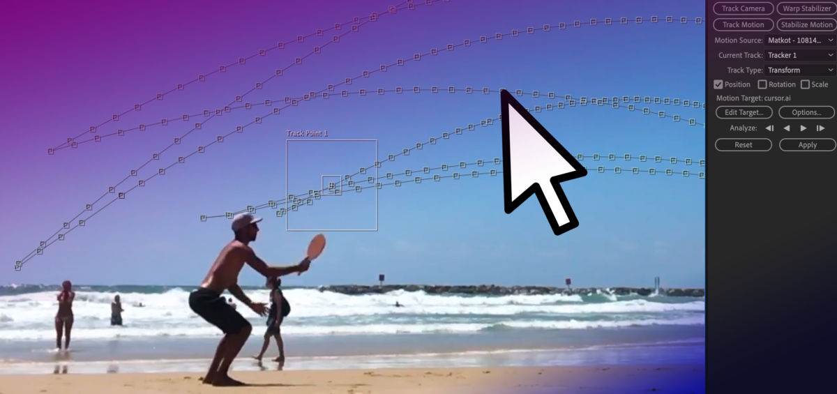
This post shows how cursor movement can be used in online presentations to show gesture, and the skills needed to add motion tracked items to video.
As part of the recently launched Exploring 3D Anatomy MOOC, two video presentations were created. These presentations involved explaining diagrams and pictures. One of these recordings had a moving cursor which the presenter had used to explain various parts of the screen, and the other was recorded without a cursor. To improve the clarity of the explanations, we had a request to display a larger cursor over the recorded material, using it to ‘point’ to the various significant areas shown.
When you’re planning a virtual presentation it’s worth checking if and how the software handles the cursor – some software will use a glowing highlight as you present, some will show and hide the cursor automatically depending on when you move it. The videos were recorded in ReCap, which automatically hides the cursor unless it is moving. The end of the post has links to various guides to help you choose your settings. The rest of this post details the animation process for how a larger cursor was added after the presentations had been recorded. This technique could be applied to other added graphical elements too if needed.
Creating the New Cursor
As the cursor is used in a lot of animations, there was already a scalable vector graphic image of a cursor available to use. This had been drawn in Adobe Illustrator. The next step was to use After Effects to add the cursor to the video and animate it.
Tracking the Cursor
For the video with the cursor visible, the motion tracking function of After Effects was used. After identifying the original cursor, the new larger cursor was set to track it. Here and there the original cursor changed colour to remain visible over different backgrounds. It wasn’t necessary to replicate the colour change with the larger cursor, but this colour change did add extra steps when setting up the motion tracking as it needed to be started afresh each time the original cursor had changed colour. For the video without the cursor, the process was simpler as there was nothing to hide or track. As such the animations could be set up from scratch. Based on the clear explanation from the presenter, it was possible to add a cursor to trace the areas being explained.
Adding the New Cursor
The animations were set up to take place between certain moments of the video – like scenes. Key points in the video were identified and ‘key frames’ added which allow us to set up when certain animations should take place, and how long for. Simple animations such as changing size, position or rotation can be done relatively quickly using these linear key frames.
Once the start and end points are set, further customisation can be done to change the feel of the animation. For example, in this case, the speed of the cursor should somewhat mimic a natural movement rather than a precisely uniform speed. Using ‘ease in’ and ‘ease out’ (combined as ‘easy ease’) allows for the animation to look a little more natural, and less jarring, as the cursor starts to move more slowly before speeding up and gradually slowing to a stop.
When moving from point to point it’s very rare that a straight line is the best path to take, usually a slightly curved path can help add a more natural-looking movement. This might be used to instruct a viewer to click a series of buttons, for example. The ‘spatial interpolation’ in After Effects allows for the path of the moving object to be linear (a straight line) or Bezier (curved). The temporal interpolation tool allows for variations to the speed of the movement – a more customisable version of easing. Adjusting these allows for a nice natural pace and movement, and for more creative effects. For example an item moving from A to B may move slowly at first, then speed up towards the middle of its journey, then slow down again before arriving at its final destination – imagine a train travelling between stations!).
In this video the cursor was hidden from screen for most of the video so it was animated manually.
In this video the cursor was tracked (while visible), note the more erratic movement.
Approximating Gesture
The final videos allowed for a clear approximation of gesture to be added to the presentations, mimicking how a presenter might usually point to a screen or demonstrate a movement. While this is something very natural to do in person, you may need to think more about how you use and move your cursor in online presenting. Often it can be tricky to see the cursor, so you may wish to consider moving it more slowly than usual if you are using it to indicate processes or changes. Selecting some form of pointer or cursor highlighting in your chosen software can improve the visibility of the cursor during your presentation, whether recording or in person. On the other hand, you may wish to put your mouse out of reach so that random or accidental cursor movements don’t detract from your content.
Motion Tracking Demonstration
This video demonstrates the full motion tracking procedure, showing how you can track an object and then map the position of a cursor to it.
Resources
Cursors on Panopto – remember that only the slides are captured if you add a PowerPoint, so to capture your cursor, you should record your screen instead.
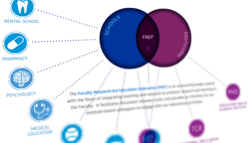
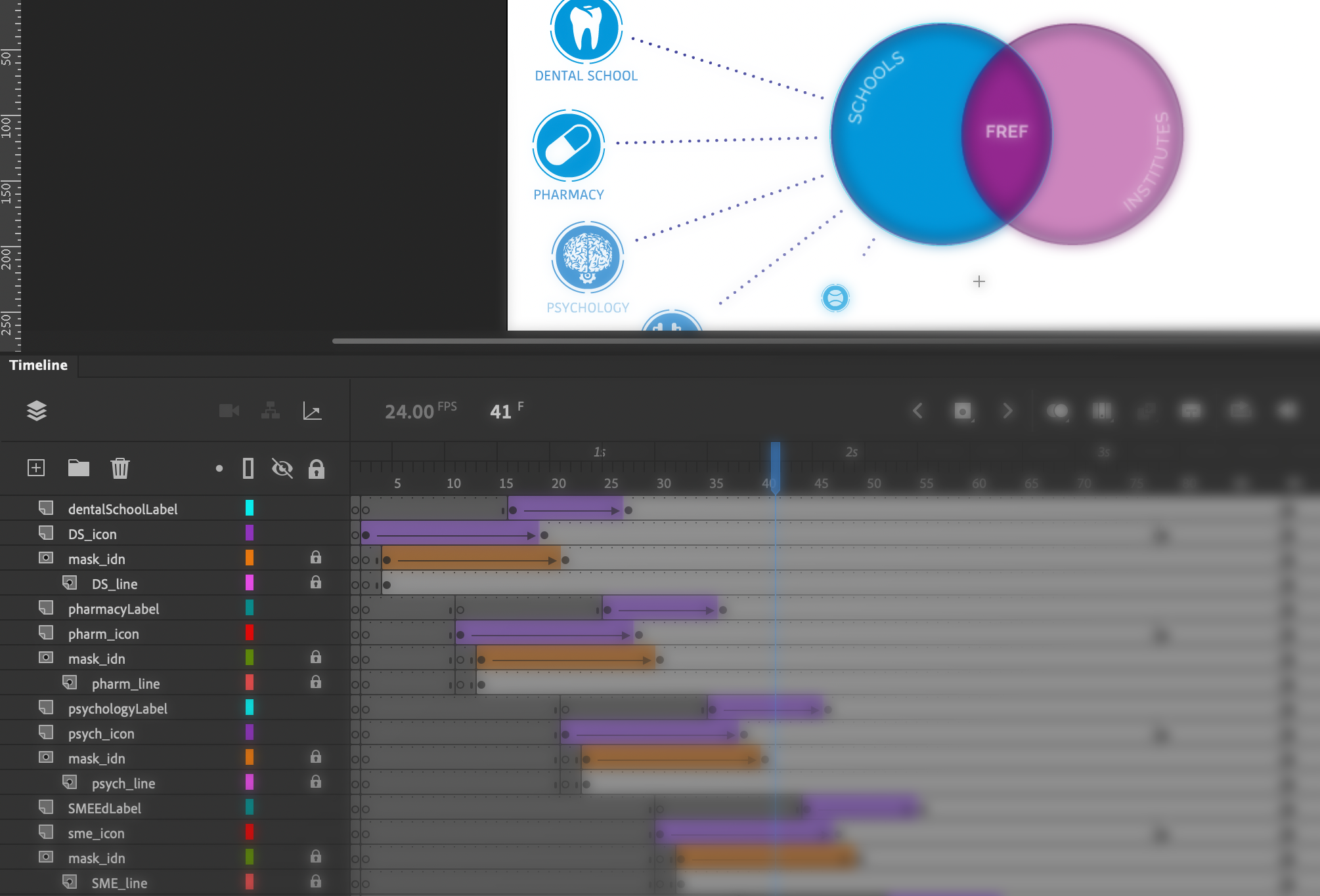
The Learning and Teaching Team contacted us to request an animated diagram showing the relationship between various areas of work, including faculty schools, institutes, and the Faculty Research-led Education Federation (FREF). The resulting page is visible to Newcastle staff here – take a look before reading the rest of the post.
The initial brief included a PowerPoint with the required information, as well as a mock-up of how the final animation could look. As this content was being built within SharePoint, there were certain technical restrictions on what could be done. For example, the site template has a fixed width, and animations cannot be created natively within it. The interactive diagram also needed buttons and links added that would both display additional item information, and also take users to different areas of the site when clicked, such as school and institute homepages.
These requirements meant that the animation needed to be created separately and then shared, and an HTML 5 canvas based animation was the best choice (not to be confused with our VLE Canvas!).
Working from the requirements for the layout, icons were designed/created to match each school and institute. These icons were designed in Adobe Illustrator. Once these had been approved, they were then imported into Adobe Animate where the animation and programming processes began.
Some elements of the animation, such as moving an object or changing its size can be done very simply in Animate with its inbuilt tools and timeline-based animation, however extra coding is needed in some cases, for example when checking variables or adding links and hotspot areas.
After a second round of consultation and changes, the final animation could be uploaded to our teams e-learning repository and then an embed code provided to enable it to be placed on the SharePoint site. The resulting diagram shows how the many organisations inter-relate and allows for a large amount of information to be shared in a relatively small space. Showing everything at once would not be practical. The animation itself cannot be easily understood by accessibility software, however the information is easily accessible via alternative menus on the page.
sample animation of interactive diagram
In this animation, the first stage shows the building of the initial stages of the diagram, and an animated cursor encourages viewers to interact with each section. Next, the three key areas of the Venn diagram become interactive (changing colour as users’ mouse over with a pointer cursor) and users can click around the diagram to explore the further information and link out to the various school/faculty pages. The use of the cursor pointer and the colour change clearly highlights the interactivity to the user.
There are a wide range of alternative uses for this type of diagram, which is commonly used for categorising. Adding the interactive hotspot elements opens up further possibilities, where each individual item can be further explored.
Are you confident that you know when you should use a specific type of image format?
Within FMS teaching and research there is a great demand for clear and detailed images – this could be for purposes such as sharing diagnostic images or microscope views in high clarity, photographs of real cases and examples, or designing something eye-catching to promote your initiative. The detailed guide below explains the types of image formats you may find useful for different purposes.
There are several image formats that you are likely to come across, but what you may not know is that they can be separated into two ‘families’. This guide will help you understand the characteristics of each format, and which situation lends itself best to each.
Before we go into the details of each specific format, let’s talk about the two key families. These are VECTOR images and RASTER images, and while at certain sizes they could look almost exactly the same, their construction is fundamentally different.
Vector Images
Vector graphics are based on mathematical formulas that define geometric shapes such as polygons, lines, curves, circles and rectangles. Because vector graphics are composed of geometric constructions, they are best used to represent more structured images such as icons, line-art graphics and illustrations with flat uniform colours.
File extensions EPS, AI and SVG are examples of this type and are perfect for creating graphics that require frequent resizing such as logos and icons.
Vector-based images are much more versatile than raster-based images, with their most obvious advantage being that vector images are infinitely scalable. This means that the same image could be printed out the with the same clarity at both advertising billboard and postage stamp size. Another advantage is that as they are images that you create from scratch (as opposed to photographic images) they have a transparent background to them by default. If you need a white or coloured background in your file you can simply add a coloured box under your artwork.
Vectors do have a few limitations, such as not handling effects such as blurs, and poor handling of gradients.
Raster Images
Also known as Bitmap images, Raster images are composed of individually coloured square pixels which build up the complete image. As an example – all photographic images are captured as raster images, with TIF,JPG, PNG, and GIF all being examples of raster image file extensions.
Pixels have a defined proportion based on their resolution (high or low), and when the pixels are stretched to fill space they were not originally intended to fit, they become distorted, resulting in blurry or unclear images. When you resize raster images by scaling up you will be compromising their resolution, as a result, it is important to remember to save raster files at your required dimensions. Once you make a source image smaller than its original size there is no going back – unlike vector images!
This example demonstrates the different affects that scaling has on both a vector and raster image (logo). Notice how they both look fine at first, but then pixelation occurs.
A note about ‘Resolution’ and ‘Effective Resolution’
Image resolution for raster images is measured in DPI (dots per inch) and this refers to the density of pixels in an image. Websites display images at 72dpi which is a relatively low resolution. By contrast, images that will be used for printing are required to be no less than 300dpi at the size they will be printed.
You can’t just take an image and scale it up dramatically, as it would stretch out and lose quality, as the dots per inch would effectively have been lowered, i.e. the ‘effective resolution’ would be lower.
What is compression and why does it matter?
When you save an image, some files need to be ‘compressed’ to keep file sizes down, as the files themselves would be far too large if this didn’t happen. Some formats are ‘lossy’ and some are ‘lossless’. If image compression is lossy, this means that every time you make an amendment and save, you may lose some quality, sharpness or colour data. The quality of the image decreases in proportion to file size.
Here are details of some of the most common file types you’re likely to encounter:
Raster File Formats
1. JPEG – Joint Photographic Experts Group
JPEGs are an extremely common image file type and as a result they can be used both on websites and in most desktop applications. It is a lossy file format.
Your file may have either the .JPG or the .JPEG extension, don’t worry it’s exactly the same type of file, and the .JPG extension is the most commonly used.
Note: This type of image does not support an alpha channel, therefore can’t have a transparent background.
2. TIF (or TIFF) – Tagged Image File
Mainly used in the print industry, these files tend to be very large high-quality photographic images that feature “lossless compression” meaning the original image data is maintained regardless of how often you might copy, re-save, or compress the original file.
If you have access to Adobe Photoshop, then you have the ability to retain a layering structure within the file. This means that if you put a text layer at the top, you could then move that text around without being destructive to the layer below. The same is true for a native Photoshop file.
Note: Due to the low compression and high file sizes, this type of image should not be used online as it will take forever to load!
3. PNG – Portable Network Graphics
PNG’s are probably the second most common image type after JPGs. They offer lossless compression, so don’t lose quality when resaving or editing, resulting in a sharper image.
If you are preparing an image for a website then this format will probably be your best option as it allows for everything a JPG does but with a much sharper image. It can also handle transparency, enabling the use of a transparent background which is great for placing logos on to images, for example. These are not suitable for professional print purposes though, and are usually of a lower resolution for use online.
When saving these images in Photoshop you can choose between an 8 Bit, 16 Bit, or 32 Bit colour palette however this will be reflected in file size.
4. GIF – Graphics Interchange Format
There was a time when these and JPGs were pretty much the only image formats that you needed to know about however times have changed.
In their standard form GIFs are a pixelated image made up of a colour palette of up to 256 colours. Due to the limited number of colours, the file size is drastically reduced.
An example where these may be used could be some navigational icons on a site or app that require a quick load time.
The rise of social medial has contributed to the use of Animated GIFs, which are essentially a series of frames embedded within the GIF file. This can give an almost video like impression and typically only last a few seconds.
Vector File Formats
5. EPS – Encapsulated Postscript
An EPS file is a vector format that has been designed to produce high-resolution graphics for print. Almost any kind of design software can create/open an EPS.
The EPS extension is a universal file type that can be used to open vector-based artwork in almost any design editor, not just the more common Adobe products.
This safeguards file transfers to designers that may be using different software.
6. SVG – Scalable Vector Graphics
Although all vector graphics are scalable, the SVG file type is specifically named Scalable Vector Graphics because this format can be easily used online with newer technology and higher screen resolutions being introduced.
An SVG file would ensure that the quality of the image is not compromised no matter what device it is viewed on. This could be particularly appropriate for a logo or statistical chart. However, this image format is not intended for professional print purposes.
Note: SVGs can also be used in SVG animations.
7. AI – Adobe Illustrator Document
Adobe Illustrator is used for creating and editing images, rather than for sharing or uploading. Adobe Illustrator documents are the preferred vector graphics format used by designers for creating images for use in all types of projects from web to print.
Adobe Illustrator is the industry standard for creating vector artwork from scratch. It can also be used to export to pretty much any other file type.
Note: Think of these as being the “Source” file. Access to Adobe Creative Cloud is required to open this type of file.
It can be pretty complicated to fully understand the different image characteristics, much more so than it seems at first glance, but this brief guide has provided a better understanding of the standard file types and which are most appropriate for your project.
Conclusion
PNGs are very useful for most purposes – they are not lossy, and you can have a transparent background for easy integration to any document.
GIFs can be animated, and can also handle transparency.
Resolution is only relevant to raster images.
Vector images can be scaled up and down infinitely without loss of quality, which is great for logos, graphs and charts.
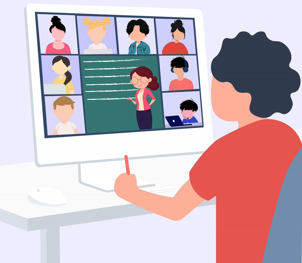
The move to online learning and subsequent staff development of synchronous online teaching skills has created opportunities for increased links, and sharing of resources, between physically separated campuses. This means that cross-campus, transnational teaching, could be utilised to enhance teaching provision. This session will discuss some examples of cross-campus teaching on the MBBS degree between the UK and NUMed Malaysia, and explore the feasibility and opportunities for adopting cross-campus teaching in other courses within the University.
Boundary Setting and a Shared Code in the Era of Digital Delivery
Joanna Matthan, Director of Academic Studies, School of Dental Sciences
This session focuses on the teaching of Head and Neck Anatomy within the School of Dental Sciences, and how the move to online teaching necessitated the development of a specialised Digital Code around the use of cadaveric imagery. An excellent way to see how expectations can be set for even the most challenging of online teaching situations.
Day 2 Recordings: Tuesday 7th September
Enhancing your Content: Basic HTML
Emily Smith, FMS TEL Team
In this session you will be introduced to easy changes you can make to divide up your content, add colour and make areas of your content pop! You will learn how to work around any accessibility issues and how to make your content look great on any device. No prior coding experience is required!
This session introduces efforts to teach students how to use built in tools in Word, PowerPoint, and Adobe Reader to make their work accessible to users with a variety of disabilities. Addressing both the how and why to broaden digital literacy knowledge. Attendees will learn how create accessible documents for themselves, too!
See NU Reflect (previously ePortfolio), redesigned to emphasise support for reflective practice and awareness and evidencing transferable skills across the University. Presentation and demonstration plus time for your questions.
Day 3 Recordings: Wednesday 8th September
Confidence and Resilience for Teaching with Technology
Paul Hubbard, Associate Dean of Academic Affairs, NUMed
Join Colleagues from NUMed and FMS for a discussion of how to build confidence and resilience when experimenting with new technological teaching methods. Examples of good practice and success stories will be shared, and there will be plenty of time to chat, ask questions and discuss your own plans.
Many of us – staff and students – have struggled with the feeling of losing the human connections we would normally have in face-to-face teaching spaces. This webinar concentrates on how to regain some of that connected feeling. The webinar will include plenty of examples and quick tips that can help reduce the awkwardness of teaching online.
In the first half of this session, medicine-focused examples of H5P content will be shared to get your creative juices flowing. In the second half of this session you will be let loose on the H5P platform to create your own content with members of the FMS TEL team on hand to assist with any queries.
Getting Your Work Out There – Using Canvas Commons to Share and Promote Your Teaching
Michelle Miller, FMS TEL Team
This session will introduce Canvas Commons as a digital repository for your Canvas Content that can be used to store and share your material within your own courses, within Newcastle University, and/or with all Canvas institutions.
This session aims to increase the help we give to students to improve their academic writing with an emphasis on academic integrity. After a short refresher on how Turnitin scores work, we will discuss reasons for high scores, and how we can provide students with online activities to improve their writing.
Introduction to Authentic Assessment
Ruth Valentine, Dean of Taught Programmes; Chris Penlington, Clinical Psychologist; Eleanor Gordon, FMS TEL Team
This session introduces the principles behind Authentic Assessment, with real examples from FMS presented by practitioners. A range of examples and ideas will be shared, with frank discussion around challenges and benefits of this approach, and space to discuss how you might implement this in your own teaching.
Planning for the Future
David Kennedy, Deputy Dean of Taught Programmes & Deputy Head of School of Medical Education
One of the services I offer as part of the FMS TEL team is the creation of bespoke 2D animations. These are most commonly used as small parts of a bigger project, but they can also be stand-alone projects themselves.
Types of animation and choosing the right tool for the job Depending on the nature of the animation required, and also the context in which it will be used, there are three different types of animation that we can produce.
These are:
Video based animation
HTML5 (web based) animation
Animated GIFs
When looking at the source material I will first plan the animation in my head, and will usually know right away which type of animation will be most appropriate for the job. For example, if there are any user interactions to be included then an HTML5 animation would allow for that, but if there is the need for some organic shapes then that would suit a video based animation better.
Planning and Storyboarding When visualising an animation, I plan the animation as a whole from the start, rather than tackling it scene-by-scene as this gives a more natural and entertaining feel to the end result.
Once I’m happy that I have a good understanding of the content I will then create a series of illustrations as a storyboard and send this as a PDF for review.
Storyboarding example
I then discuss with the subject specialist which techniques will work best for the application, and raise any concerns. I can then start the animation process.
Creating the animation Getting things right at the concept and storyboard stage is critical and can save a lot of time, compared to how much of a time investment it can be if you have to re-do a large part of the animation.
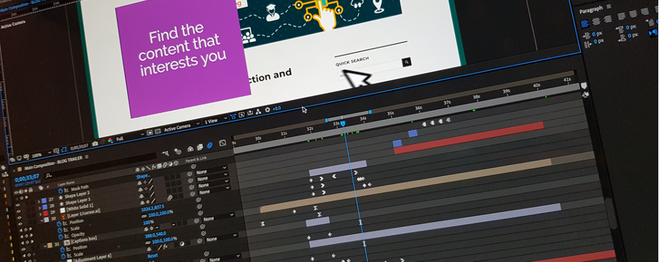
However, understanding that I may not get the content perfect in the first draft every time, I structure my files in a way that changes can be made with minimal disruption to the rest of the timeline. This is achieved by both layering up the source Illustrator files and also separating the key points of the main composition timeline into separate sub-compositions. That way I can work on a small section without knocking everything else out of sync.
Obviously, every project is different but by focusing on the movements involved, the flow between the scenes and the basic animation principles I begin the sequence (as you may have guessed) from the start and work on each stage in sequence. This is important because elements will often carry through from one scene to another so duplication can be avoided.
I use Adobe After Effects to create video-based animation and animated GIFs, and Adobe Illustrator to create any graphic and illustration assets needed for the animation. After Effects is an extremely powerful timeline-based tool that can make almost anything possible – think of it as being a kind of Photoshop for video!
If there is to be audio narration or a musical soundtrack on the video, then I arrange for that to be recorded early on in the development rather than being added at the end, as the content and movements should be timed to fit with events in the audio.
Most of the development time actually lies in creating the assets for the storyboard (which are later used in the animation), so when it actually comes to the animating stage things tend to move along pretty quickly.
I usually render out (export) the animation after every new section is complete and upload it our Vimeo account for approval and to check that I’m on the right track before moving on to the next one.
The review process
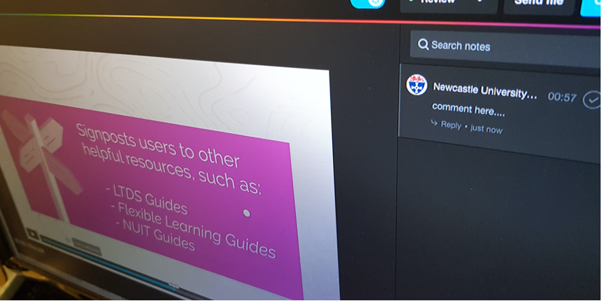
The Vimeo Review platform we use lets the users add time-stamped comments directly onto the video and sends me a notification email immediately thus providing a good communication channel for each specific issue.
When the first draft of an animation is complete, a shareable, password-protected link to the video can be sent out for a wider review to gather comments and feedback. From there we can address any comments and fine-tune the animation for further revisions, which will in turn be sent out for review.
While there is no standard for this, normally after a first (alpha) release and review, changes are made if required and a second (beta) release is then sent for review, with any further required changes reflected in a final (gold) release.
The finished product The final render from After Effects will be a simple video file, usually in the .H264 codec (MP4) that can either be hosted on our Vimeo account and an embed code supplied, or, depending on file size restrictions, this could be uploaded directly to your target system. It can also be supplied as a file to be included in a PowerPoint presentation or other teaching material. The type of output required is discussed before we start the project to make sure we are taking the best approach.
Past examples I’ve worked on a wide variety of projects during my time at the university, including multiple MOOCs, marketing materials, and work on modules across both FMS and Engineering courses. The showreel below includes just a small sample of the projects I have been involved in.
FMS TEL Animation Showreel
Can we help you with your project?
If you have a project that you would like to see come to life in an animation, or a smaller component of your teaching materials that could benefit from some animated content, then please get in touch via FMSTEL Enquiries. I would be very happy to discuss options with you to see what we can do to help.