

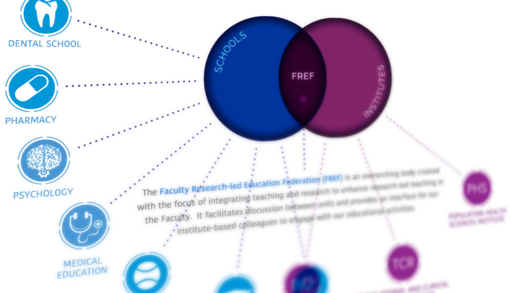
The Learning and Teaching Team contacted us to request an animated diagram showing the relationship between various areas of work, including faculty schools, institutes, and the Faculty Research-led Education Federation (FREF). The resulting page is visible to Newcastle staff here – take a look before reading the rest of the post.
The initial brief included a PowerPoint with the required information, as well as a mock-up of how the final animation could look. As this content was being built within SharePoint, there were certain technical restrictions on what could be done. For example, the site template has a fixed width, and animations cannot be created natively within it. The interactive diagram also needed buttons and links added that would both display additional item information, and also take users to different areas of the site when clicked, such as school and institute homepages.
These requirements meant that the animation needed to be created separately and then shared, and an HTML 5 canvas based animation was the best choice (not to be confused with our VLE Canvas!).
Working from the requirements for the layout, icons were designed/created to match each school and institute. These icons were designed in Adobe Illustrator. Once these had been approved, they were then imported into Adobe Animate where the animation and programming processes began.
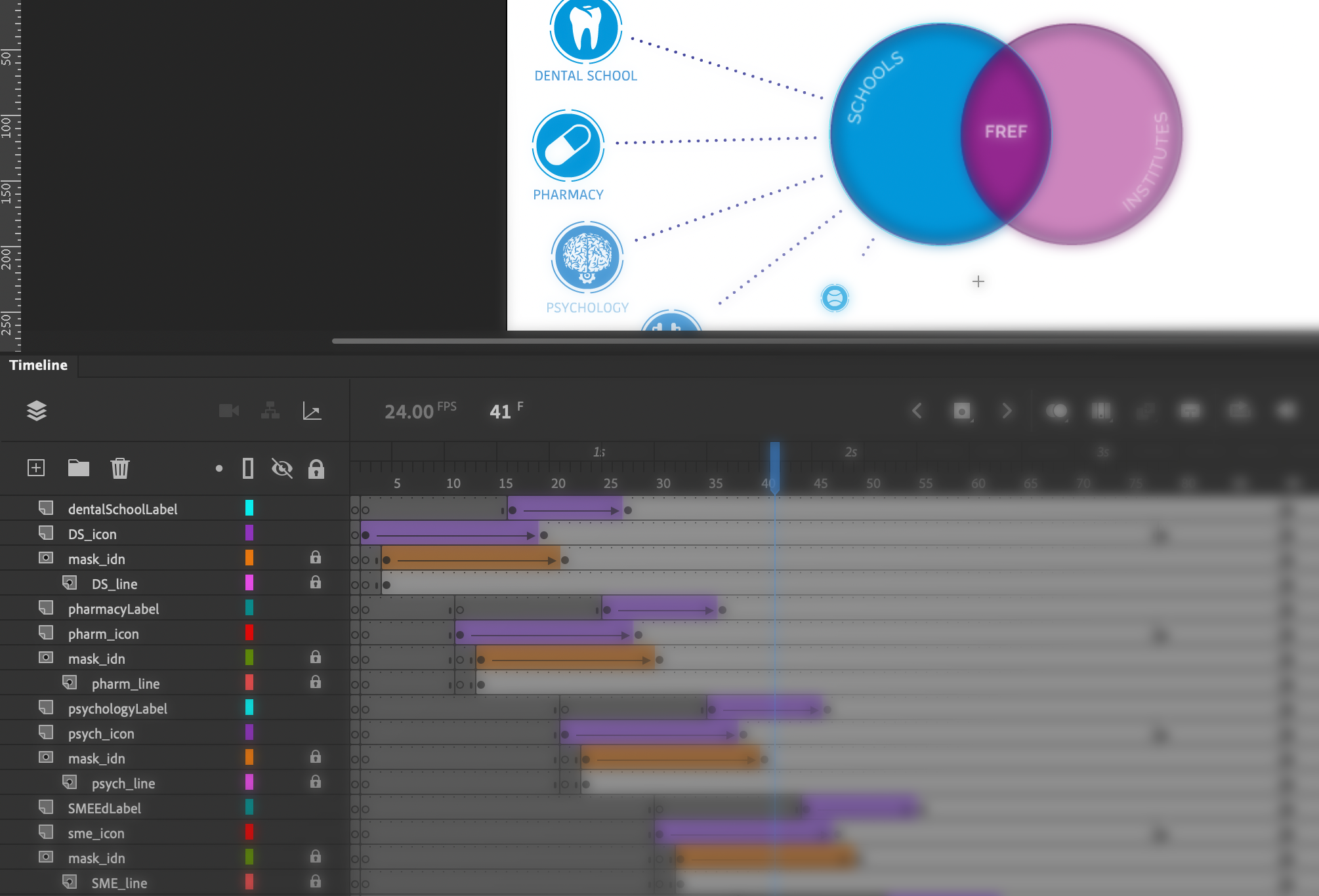
Some elements of the animation, such as moving an object or changing its size can be done very simply in Animate with its inbuilt tools and timeline-based animation, however extra coding is needed in some cases, for example when checking variables or adding links and hotspot areas.
After a second round of consultation and changes, the final animation could be uploaded to our teams e-learning repository and then an embed code provided to enable it to be placed on the SharePoint site. The resulting diagram shows how the many organisations inter-relate and allows for a large amount of information to be shared in a relatively small space. Showing everything at once would not be practical. The animation itself cannot be easily understood by accessibility software, however the information is easily accessible via alternative menus on the page.

In this animation, the first stage shows the building of the initial stages of the diagram, and an animated cursor encourages viewers to interact with each section. Next, the three key areas of the Venn diagram become interactive (changing colour as users’ mouse over with a pointer cursor) and users can click around the diagram to explore the further information and link out to the various school/faculty pages. The use of the cursor pointer and the colour change clearly highlights the interactivity to the user.
There are a wide range of alternative uses for this type of diagram, which is commonly used for categorising. Adding the interactive hotspot elements opens up further possibilities, where each individual item can be further explored.
Resources
Introduction to HTML 5 Canvas
Adobe illustrator: https://www.adobe.com/uk/products/illustrator.html
Adobe Animate: https://www.adobe.com/uk/products/animate.html
Link to animation: https://elearning-repo.ncl.ac.uk/uploads/assets/59/Assets/FREF.html