

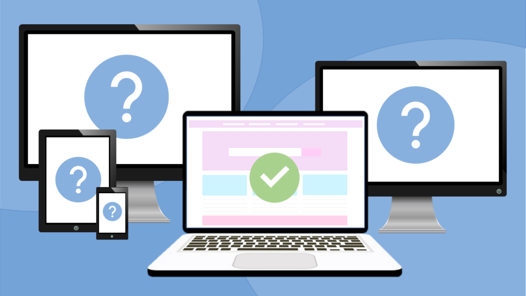
The Problem
When you’re putting together course materials, it’s important to think about how it’ll look to your students. Laptops and monitors come in all shapes and sizes, so what looks good on your screen might not on someone else’s.
It is also becoming increasingly common for students to access content on their mobile phones and tablets. How can you efficiently ensure that everything appears visually pleasing and functional across these diverse devices?
The Solution
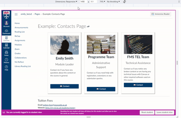
Windows: F12
Mac: Cmd + Opt + I
This opens the developer tools, which includes a ‘device mode’ where you can see how your content will look and function on different devices. The below example is using Chrome on a windows machine:
Learn more: Chrome Documentation
Enjoy this post? Check out the others in our Taking Ctrl series.