Running an Online Event via Teams – Northern and Yorkshire Rheumatology Meeting 2021

Janet Herdman, Marc Bennett, Eleanor Gordon

This case study covers the running of The Northern and Yorkshire Rheumatology Meeting 2021 (NYRM) using Microsoft Teams. The 170 attendees included a wide range of healthcare providers and students involved in Musculo-Skeletal disease specialisms. These included academics, clinical academics, PhD students, Allied Healthcare Professionals (AHPs) such as podiatrists, nurses and physiotherapists, and other Healthcare Professionals (HCPs), as well as corporate sponsors. The following discusses how the event was set up and run, as well as sharing reflections on the process. Technical guides for the setup are available at the end of the text.

Building Skills, Confidence and Resilience

This event has allowed for the development of skills in IT generally and specifically with running a Team and meetings. Though the initial setup may be a little technical if requirements are complex, after that it is simple to keep things running on the day.

It may seem intimidating to run this type of event as things go wrong sometimes, but this is true for live in-person events as well, it’s just that the solutions are different. It definitely helped that there was an extra pair of eyes to help manage the busier periods when a lot of people were joining sessions.

As with many things, sometimes it’s easiest just to jump in and get started! Though it was a bit of a baptism of fire running such a large and important event as a first try, with the support beforehand and the time to test, the running of the event on the day wasn’t too difficult. Time to practice with the tools and knowing who to ask for help was key in getting confidence to try out the process. Presenters and attendees were patient with the snags, and this is almost always what we find when trying something new. Confidence and resilience have now been developed, and lessons were learned that can be applied to future events.

From Offline to Online

Normally this meeting is held in York as a face-to face conference and it has been running annually since 1994. Attendees can gain CPD points from the Royal College of Physicians (RCP) for attending. As with the offline event, a registration process is undertaken to ascertain who will be joining. While this may seem less important for an online meeting, it is relevant to how roles are set up, and confidentiality.

Requirements for the Conference

Key requirements for the event were:

  • Persistent online space for chatting and housing resources prior to, and for 2 weeks after the event (RCP requirement)
  • Recording attendance (RCP requirement)
  • Session recording and sharing (RCP requirement)
  • Ability to adequately control access to and the flow of restricted information (sponsors’ requirement)
  • Multiple presenters in one call
  • Multiple simultaneous sessions
  • Ability to handle internal and external attendees and speakers

A Single Access Point

The requirement to have an online space outside of the meetings themselves meant that using Teams made more sense. While it would have been possible to run the live sessions via Zoom and have other information on Teams, keeping this all within one app meant the experience was smoother for both attendees and hosts, as they only needed to worry about one login. This is key for our partners in NHS trusts who may not have Zoom on their work computers and may also be dealing with multiple guest logins on multiple services. Attendees with different feature sets available were still able to access everything, as only the basic features of Teams were used. Teams also allows for attendance and session recording built into each meeting, so this requirement could be satisfied without adding Zoom.

Confidential Information

One key aspect of the conference is that the sponsors’ information needed to be kept private to HCPs only, and not be downloadable. In an online setting, access to non-contextualised information in an unmonitored fashion could quickly lead to misunderstanding. To facilitate sponsor participation, a separate SharePoint document library was created, and access was only granted to those who needed it using a SharePoint permissions group. The only people who could download any of the files were the Team owners.

Setup and Testing

The first stage was to set up a ‘sandbox’ or testing area to trial the settings and see how things would work in practice. Various solutions were trialled, including the confidential area and test meetings to try out the software. This was especially important as Janet did not have prior experience of running Teams meetings. Once the setup was decided upon, Marc and Janet built the real Team, ready to invite attendees.
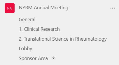
Team Space

Links to individual sessions were posted in their respective areas and sent to participants via email. There was also an overview post with the full day’s agenda available in the ‘General’ channel for all attendees to see.

A test meeting with presenters was run, in which Teams features were tested out with the speakers. This allowed them to become familiar with the software, and also allowed Janet to try using the features ‘live’ – doing simple tasks such as changing speakers’ roles from guest to presenter and managing the lobby.

On the Day

The bulk of work was at session changeovers, particularly at the start of each session. While there was a short handover time to allow for people to take a quick break and join the next call, having more staggered start times for simultaneous sessions would have taken the pressure off, even if this was just 5 minutes or so of difference. It’s worth noting that while Eleanor is experienced with Teams no technical solutions were needed on the day – it was more a case of directing people and sharing links in the right places – anyone could do this with a practice run beforehand.

Some attendees didn’t log in to the meetings with their invited accounts, which meant their presenter settings hadn’t carried over. Thankfully, this could be quickly changed in the meeting itself by updating the meeting options. It’s also worth noting that people do not need to be elevated to presenter in order to respond to questions – the main difference is that presenters can share their screen. Sometimes when people entered the lobby, all of the presenters would get a notification to allow them in – making them seem to disappear from the waiting list because they had already been admitted by someone else. This caused a little confusion for us but didn’t affect the attendees’ experience. In future instances it may be easier to allow everyone into the meeting (managed by one host) and elevate the required speakers’ permissions after the bulk of attendees have entered – this is a good backstop should issues arise with logins too.

After the Event

Meeting recordings were stored automatically to Stream, and then downloaded and uploaded moved to the SharePoint space. This is currently the smoothest way for guest access to video, though Microsoft are making changes to this process for 2022.

Because the meetings were automatically recorded, there was no risk of forgetting to press record. However, because anyone entering the meeting room was able to effectively ‘start’ the meeting, a lot of meeting instances and therefore recordings and attendance lists, were created. Once this was understood, it was easy to find the correct recordings and attendance lists and download them. Next time, meeting settings could be adjusted to only allow few people to start. There is always a debate between auto and manual recording – generally auto minimises risk, but if you do want to use manual recordings, try including a “the meeting will be recorded; recording will begin now” message on an early housekeeping slide to serve as a reminder to yourself to press the record button.

Feedback and Reflections

Generally, feedback for the online event was very good. Speakers’ presentations were praised, and attendees overwhelmingly found the event useful and informative. Though many people did say they prefer to meet face-to-face, having the sessions online meant that some people were able to join when they may not have been able to travel, and some attendees mentioned this as a positive in their feedback. Some attendees did mention that a downside of the online format was the lack of networking opportunities usually associated with the meeting. On reflection, having a social lobby area didn’t quite work, as some attendees weren’t sure of its function – perhaps the online environment makes us feel that we need to have a specific ‘goal’ to join a session, rather than the more casual bumping into one another during break time at a face-to-face event. Some attendees also stayed in the social lobby for a while instead of joining their session. This was alleviated by interventions by Eleanor and Janet. As it was not well-used, and didn’t seem to add to the experience, next time this social area would be left out.

Though the meeting was running through teams, some people found it more convenient to receive email links to the meetings as they were starting. This can be set up in advance by scheduling delivery in Outlook.

As with all innovations, now that the meeting has been run once, it would be less difficult to follow the same format again as hosts and attendees have more familiarity with the process and the software and have gained skills and confidence.

If you are interested in running a similar event, you can find a range of guidance below, and contact FMS Enquiries for further advice.

Resources and Guides

Interactive Animated Venn Diagrams

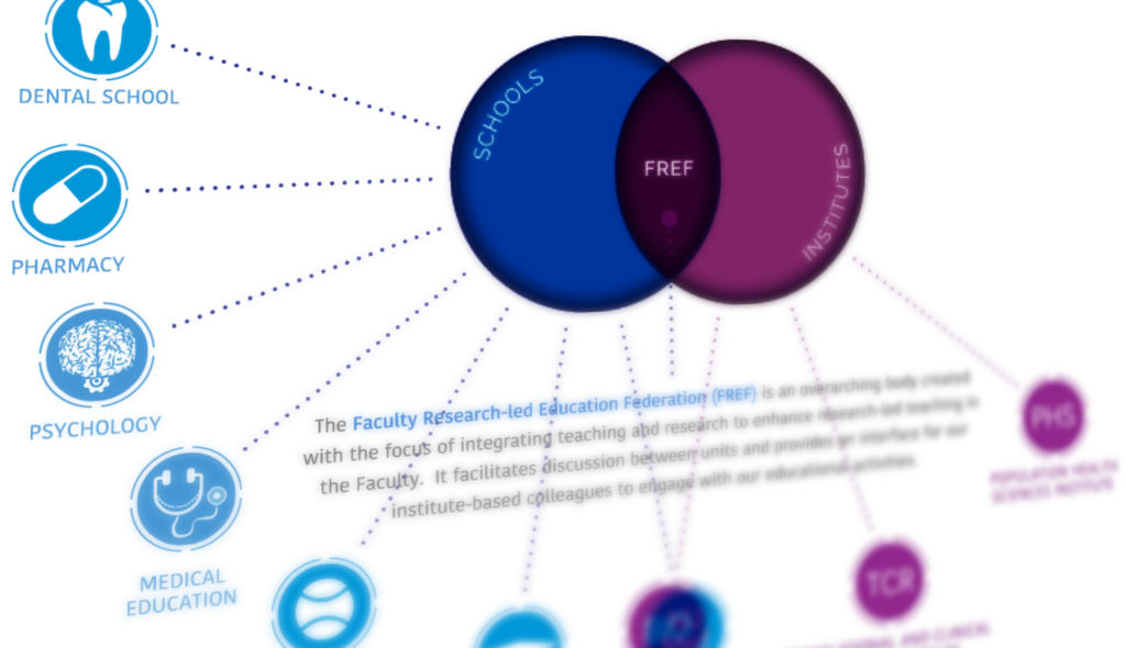
The Learning and Teaching Team contacted us to request an animated diagram showing the relationship between various areas of work, including faculty schools, institutes, and the Faculty Research-led Education Federation (FREF). The resulting page is visible to Newcastle staff here – take a look before reading the rest of the post.

The initial brief included a PowerPoint with the required information, as well as a mock-up of how the final animation could look. As this content was being built within SharePoint, there were certain technical restrictions on what could be done. For example, the site template has a fixed width, and animations cannot be created natively within it. The interactive diagram also needed buttons and links added that would both display additional item information, and also take users to different areas of the site when clicked, such as school and institute homepages.

These requirements meant that the animation needed to be created separately and then shared, and an HTML 5 canvas based animation was the best choice (not to be confused with our VLE Canvas!).

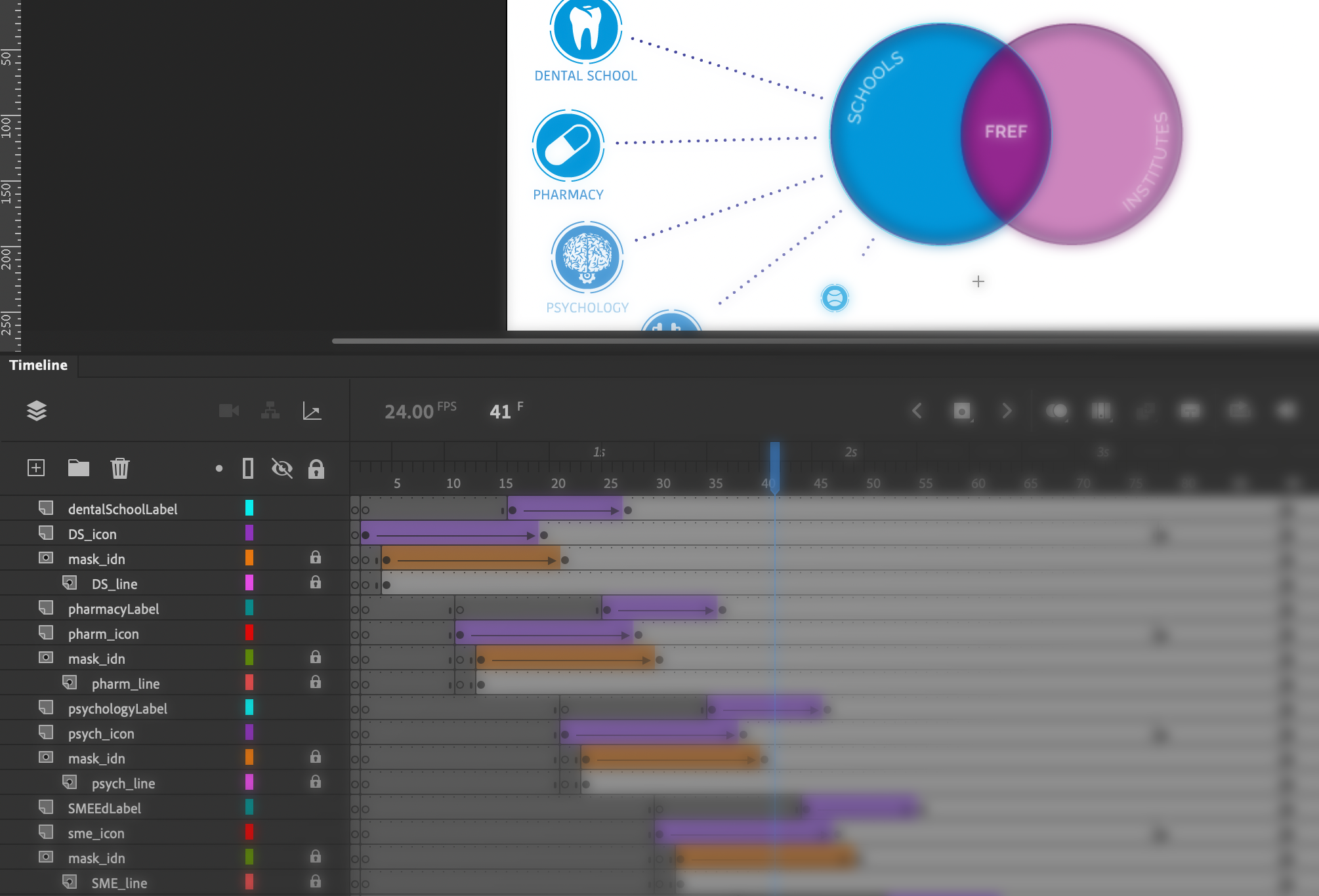
Working from the requirements for the layout, icons were designed/created to match each school and institute. These icons were designed in Adobe Illustrator. Once these had been approved, they were then imported into Adobe Animate where the animation and programming processes began.

Some elements of the animation, such as moving an object or changing its size can be done very simply in Animate with its inbuilt tools and timeline-based animation, however extra coding is needed in some cases, for example when checking variables or adding links and hotspot areas.

After a second round of consultation and changes, the final animation could be uploaded to our teams e-learning repository and then an embed code provided to enable it to be placed on the SharePoint site. The resulting diagram shows how the many organisations inter-relate and allows for a large amount of information to be shared in a relatively small space. Showing everything at once would not be practical. The animation itself cannot be easily understood by accessibility software, however the information is easily accessible via alternative menus on the page.

sample animation of interactive diagram

In this animation, the first stage shows the building of the initial stages of the diagram, and an animated cursor encourages viewers to interact with each section. Next, the three key areas of the Venn diagram become interactive (changing colour as users’ mouse over with a pointer cursor) and users can click around the diagram to explore the further information and link out to the various school/faculty pages. The use of the cursor pointer and the colour change clearly highlights the interactivity to the user.

There are a wide range of alternative uses for this type of diagram, which is commonly used for categorising. Adding the interactive hotspot elements opens up further possibilities, where each individual item can be further explored.

Resources

Introduction to HTML 5 Canvas

Adobe illustrator: https://www.adobe.com/uk/products/illustrator.html

Adobe Animate: https://www.adobe.com/uk/products/animate.html

Link to animation: https://elearning-repo.ncl.ac.uk/uploads/assets/59/Assets/FREF.html

Cropping Video: Removing the date from Screencasts

Over the last year or so most of us will have taken the plunge and recorded a lecture or tutorial to share with students. You may be considering reusing this content for years to come, however the date and time on your screencast will give the game away.

I don’t know if some students would have a problem with a video from last year being used again this year… I would prefer the date (which is visible at the bottom left of my laptop screen) to not be visible

FMS Module Leader

We can do this with video editing software such as Adobe Premier Pro or Final Cut Pro, but what if you do not have access to such software?

At this point most of us usually head to Google to find a free alternative. Trying to find a free online tool can be a little daunting and it’s always worth double-checking the usage terms and privacy policies are reasonable.

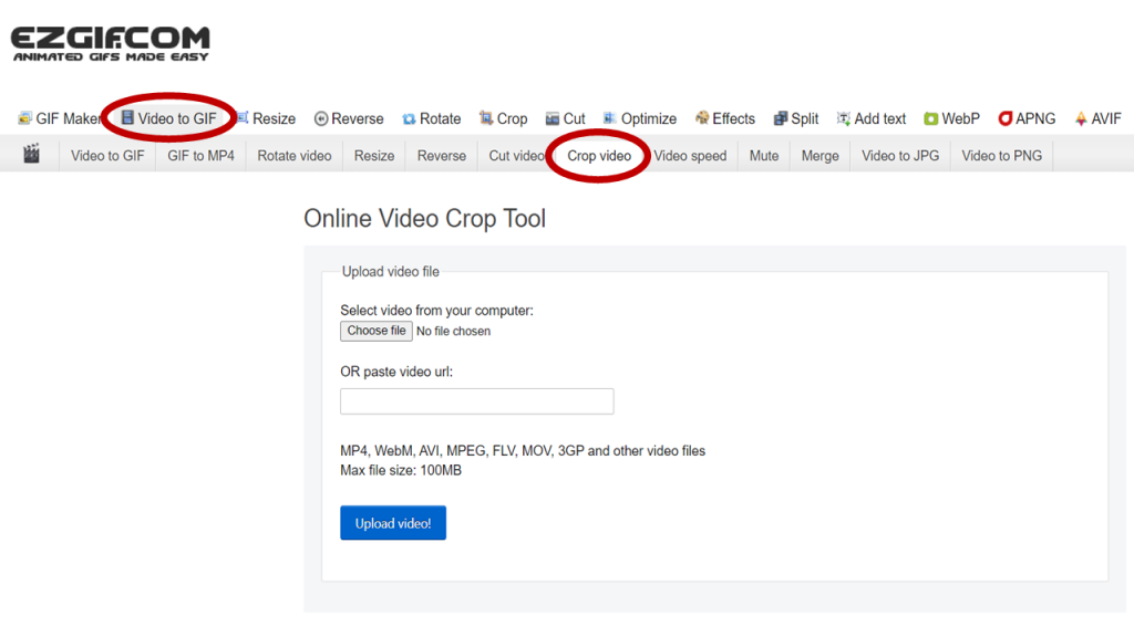
We have previously recommended ezgif.com to be used to create animated gifs for instruction and demonstrations. Ezgif don’t store your files or claim any intellectual property rights over anything you upload, and your file is removed from their servers in an hour.

This free content editing website can be used for so much more than just creating gifs. They have a designated area for editing videos, including an easy to use cropping tool.

Digital Image File Formats, and When to Use them

Are you confident that you know when you should use a specific type of image format?

Within FMS teaching and research there is a great demand for clear and detailed images – this could be for purposes such as sharing diagnostic images or microscope views in high clarity, photographs of real cases and examples, or designing something eye-catching to promote your initiative. The detailed guide below explains the types of image formats you may find useful for different purposes.

There are several image formats that you are likely to come across, but what you may not know is that they can be separated into two ‘families’. This guide will help you understand the characteristics of each format, and which situation lends itself best to each.

Before we go into the details of each specific format, let’s talk about the two key families. These are VECTOR images and RASTER images, and while at certain sizes they could look almost exactly the same, their construction is fundamentally different.

Vector Images

Vector graphics are based on mathematical formulas that define geometric shapes such as polygons, lines, curves, circles and rectangles. Because vector graphics are composed of geometric constructions, they are best used to represent more structured images such as icons, line-art graphics and illustrations with flat uniform colours.

File extensions EPS, AI and SVG are examples of this type and are perfect for creating graphics that require frequent resizing such as logos and icons.

Vector-based images are much more versatile than raster-based images, with their most obvious advantage being that vector images are infinitely scalable. This means that the same image could be printed out the with the same clarity at both advertising billboard and postage stamp size. Another advantage is that as they are images that you create from scratch (as opposed to photographic images) they have a transparent background to them by default. If you need a white or coloured background in your file you can simply add a coloured box under your artwork.

Vectors do have a few limitations, such as not handling effects such as blurs, and poor handling of gradients.

Raster Images

Also known as Bitmap images, Raster images are composed of individually coloured square pixels which build up the complete image. As an example – all photographic images are captured as raster images, with TIF, JPGPNG, and GIF all being examples of raster image file extensions.

Pixels have a defined proportion based on their resolution (high or low), and when the pixels are stretched to fill space they were not originally intended to fit, they become distorted, resulting in blurry or unclear images. When you resize raster images by scaling up you will be compromising their resolution, as a result, it is important to remember to save raster files at your required dimensions. Once you make a source image smaller than its original size there is no going back – unlike vector images!

This example demonstrates the different affects that scaling has on both a vector and raster image (logo). Notice how they both look fine at first, but then pixelation occurs.
A note about ‘Resolution’ and ‘Effective Resolution’

Image resolution for raster images is measured in DPI (dots per inch) and this refers to the density of pixels in an image. Websites display images at 72dpi which is a relatively low resolution. By contrast, images that will be used for printing are required to be no less than 300dpi at the size they will be printed.

You can’t just take an image and scale it up dramatically, as it would stretch out and lose quality, as the dots per inch would effectively have been lowered, i.e. the ‘effective resolution’ would be lower.

What is compression and why does it matter?

When you save an image, some files need to be ‘compressed’ to keep file sizes down, as the files themselves would be far too large if this didn’t happen. Some formats are ‘lossy’ and some are ‘lossless’. If image compression is lossy, this means that every time you make an amendment and save, you may lose some quality, sharpness or colour data. The quality of the image decreases in proportion to file size.

Here are details of some of the most common file types you’re likely to encounter:

Raster File Formats

1. JPEG – Joint Photographic Experts Group

JPEGs are an extremely common image file type and as a result they can be used both on websites and in most desktop applications. It is a lossy file format.

Your file may have either the .JPG or the .JPEG extension, don’t worry it’s exactly the same type of file, and the .JPG extension is the most commonly used.

Note: This type of image does not support an alpha channel, therefore can’t have a transparent background.


2. TIF (or TIFF) – Tagged Image File

Mainly used in the print industry, these files tend to be very large high-quality photographic images that feature “lossless compression” meaning the original image data is maintained regardless of how often you might copy, re-save, or compress the original file.

If you have access to Adobe Photoshop, then you have the ability to retain a layering structure within the file. This means that if you put a text layer at the top, you could then move that text around without being destructive to the layer below. The same is true for a native Photoshop file.

Note: Due to the low compression and high file sizes, this type of image should not be used online as it will take forever to load!


3. PNG – Portable Network Graphics

PNG’s are probably the second most common image type after JPGs. They offer lossless compression, so don’t lose quality when resaving or editing, resulting in a sharper image.

If you are preparing an image for a website then this format will probably be your best option as it allows for everything a JPG does but with a much sharper image. It can also handle transparency, enabling the use of a transparent background which is great for placing logos on to images, for example. These are not suitable for professional print purposes though, and are usually of a lower resolution for use online.

When saving these images in Photoshop you can choose between an 8 Bit, 16 Bit, or 32 Bit colour palette however this will be reflected in file size.


4. GIF – Graphics Interchange Format

There was a time when these and JPGs were pretty much the only image formats that you needed to know about however times have changed.

In their standard form GIFs are a pixelated image made up of a colour palette of up to 256 colours. Due to the limited number of colours, the file size is drastically reduced.

An example where these may be used could be some navigational icons on a site or app that require a quick load time.

The rise of social medial has contributed to the use of Animated GIFs, which are essentially a series of frames embedded within the GIF file. This can give an almost video like impression and typically only last a few seconds.


Vector File Formats

5. EPS – Encapsulated Postscript

An EPS file is a vector format that has been designed to produce high-resolution graphics for print. Almost any kind of design software can create/open an EPS.

The EPS extension is a universal file type that can be used to open vector-based artwork in almost any design editor, not just the more common Adobe products.

This safeguards file transfers to designers that may be using different software.


6. SVG – Scalable Vector Graphics

Although all vector graphics are scalable, the SVG file type is specifically named Scalable Vector Graphics because this format can be easily used online with newer technology and higher screen resolutions being introduced.

An SVG file would ensure that the quality of the image is not compromised no matter what device it is viewed on. This could be particularly appropriate for a logo or statistical chart. However, this image format is not intended for professional print purposes.

Note: SVGs can also be used in SVG animations.


7. AI – Adobe Illustrator Document

Adobe Illustrator is used for creating and editing images, rather than for sharing or uploading. Adobe Illustrator documents are the preferred vector graphics format used by designers for creating images for use in all types of projects from web to print.

Adobe Illustrator is the industry standard for creating vector artwork from scratch. It can also be used to export to pretty much any other file type.

Note: Think of these as being the “Source” file. Access to Adobe Creative Cloud is required to open this type of file.


It can be pretty complicated to fully understand the different image characteristics, much more so than it seems at first glance, but this brief guide has provided a better understanding of the standard file types and which are most appropriate for your project.

Conclusion

  • PNGs are very useful for most purposes – they are not lossy, and you can have a transparent background for easy integration to any document.
  • GIFs can be animated, and can also handle transparency.
  • Resolution is only relevant to raster images.
  • Vector images can be scaled up and down infinitely without loss of quality, which is great for logos, graphs and charts.

Exploring 3D Anatomy – A New MOOC Developed with FMS TEL

Over the past few months, the FMS TEL team have been working on bringing a Massive Open Online Course (MOOC) to life. The course, Exploring 3D Anatomy, is an active, hands-on, and engaging online course now available to Newcastle students and staff! The course was designed by Dr Iain Keenan of Newcastle University and Mr Leonard Shapiro of the University of Cape Town.

3D spatial awareness is a cognitive function. Improving it improves students’ 3D visualisation ability and spatial skills in anatomy learning.

In our experience, medical, dental, and other healthcare students can experience significant challenges in 3D spatial anatomy. Because of the three-dimensional arrangement of the human body, student spatial awareness can be a major influence on their anatomical education. In this online course, students can practice several  easy-to-follow, hands-on exercises that we have designed to address and improve 3D spatial awareness. Video demonstrations by Iain and Leonard guide students through each activity, which involve the use of  readily available household objects such as a piece of fruit, a jar, or a fork.

As simple as these exercises are to follow and carry out, the effect of such activities on improving 3D spatial awareness can be notable. What’s more, the exercises can be enjoyable too!

The Fruit Exercise: a guided dissection of this 3D object can improve 3D spatial understanding of the anatomical planes.

The practical exercises in the course are demonstrated by Iain and Leonard on video, allowing students to access the content at their own pace. These videos show the exercises in detail and allow students to hear the conversation as the exercise unfolds. Videos are short and simple to follow, and have been captioned by the team to ensure clarity.

Leonard Demonstrating the Fruit Exercise with a Lemon
Iain Starting the Fruit Exercise with a Lime

All Newcastle University staff and students can join the Canvas course, which is structured in three parts and requires around 4 hours of activity in total. We hope to expand access to an extended version of the course in 2022/23. For further information, please contact Dr Iain Keenan.

Contacts 

Dr Iain Keenan, Senior Lecturer in Anatomy, School of Medical Education, Newcastle University 

Mr Leonard Shapiro, Observation and Spatial Awareness Teacher, Department of Human Biology, University of Cape Town 

Further Reading 

This course is supported by the following research: 

Backhouse, M., Fitzpatrick, M., Hutchinson, J., Thandi, C.S. and Keenan, I.D. (2017), Improvements in anatomy knowledge when utilizing a novel cyclical “Observe-Reflect-Draw-Edit-Repeat” learning process. Anat Sci Educ, 10: 7-22. https://doi.org/10.1002/ase.1616

Ben Awadh, A., Clark, J., Clowry, G. and Keenan, I.D. (2021), Multimodal Three-Dimensional Visualization Enhances Novice Learner Interpretation of Basic Cross-Sectional Anatomy. Anat Sci Educ. https://doi.org/10.1002/ase.2045

Branson TM, Shapiro L, Venter RG. Observation of Patients’ 3D Printed Anatomical Features and 3D Visualisation Technologies Improve Spatial Awareness for Surgical Planning and in-Theatre Performance. Adv Exp Med Biol. 2021;1334:23-37. Available at https://pubmed.ncbi.nlm.nih.gov/34476743/

Reid, S., Shapiro, L. and Louw, G. (2019), How Haptics and Drawing Enhance the Learning of Anatomy. Anat Sci Educ, 12: 164-172. https://doi.org/10.1002/ase.1807

Shapiro, L., Bell, K., Dhas, K., Branson, T., Louw, G. and Keenan, I.D. (2020), Focused Multisensory Anatomy Observation and Drawing for Enhancing Social Learning and Three-Dimensional Spatial Understanding. Anat Sci Educ, 13: 488-503. https://doi.org/10.1002/ase.1929