OpenAI: Free Resources

The following list of free resources has been compiled by OpenAI and offers free training courses, lesson plans and student resources that can be shared with learners.

Online training and guidance on the use of AI in education

  • Wharton Interactive’s Faculty Director Ethan Mollick and Director of Pedagogy Lilach Mollick offer a free five-part online course for educators on how the latest large language models, including ChatGPT, can be used to enhance teaching and learning.
  • aiEDU hosts free webinars on the use of AI in education. Educators can sign up here for their upcoming webinars in the fall.
  • The International Society for Technology in Education (ISTE) offers a 15-hour, instructor-led online course to train educators on how to help their students learn about AI and a guide for school leaders that provides practical tips on how to promote the responsible and ethical use of AI in schools.
  • Microsoft offers a free online course for educators on how they can use AI to improve learning outcomes, reduce educator workload, and increase learner engagement.
  • Code.org, ETS, ISTE and Khan Academy offer a free online learning series for educators interested in learning about AI and how it can be leveraged to improve student outcomes.

Lesson plans and learning activities about AI

  • aiEDU provides a wide variety of free lesson plans and learning activities that any teacher, regardless of their level of AI expertise, can use to spark their students’ curiosity and engage them in lively discussions about AI capabilities, challenges and ethics.
  • MIT’s Day of AI offers free curriculum and activities that teachers can use to introduce K-12 students to AI and how it shapes their lives.
  • Stanford Graduate School of Education, Stanford Accelerator for Learning and Institute for Human-Centered AI offers CRAFT, a free online collection of research-based AI literacy resources developed with high school teachers that they can use to help students explore, question, and critique AI.

Education products built on top of OpenAI’s models

We’re also excited by the early promise of AI powered education tools that our partners are building on our platform. Here are just a few illustrative examples.

  • Khan Academy, a nonprofit that offers online lessons to students of all ages, uses GPT-4 to power Khanmigo, a tool that functions as both a virtual tutor for students and a classroom assistant for teachers.
  • Canva, an online design platform, uses OpenAI’s large language models to power Magic Write. It offers Magic Write for free to educators, who use the tool to create presentations, classroom activities and lesson plans.
  • Duolingo, a language online learning company, uses GPT-4 to power Roleplay, an AI conversation partner that practices real world conversation skills with learners, and Explain My Answer, which learners can use to gather deeper understanding on their mistakes.
  • edX, a global online learning platform, uses GPT4 and GPT3.5 to support digital tools that deliver real-time academic support and course discovery assistance to online learners.

Source: Are there any resources for educators to learn more about AI? | OpenAI Help Center

GigXR

FMS TEL recently attended a presentation on a mixed reality platform called GigXR, a clinical simulation platform with a number of apps, including HoloScenarios and HoloHuman.

The target audience is mainly medical education courses at the moment.

This technology aims to:

  • create a consistency of experience for all students
  • provide repetitive training in a safe-fail environment
  • reach rural learners
  • reduce instructor time

How it works

A headset is connected wirelessly to a computer which generates a hologram of a patient into the room through the headset. There is equipment nearby, such as oxygen masks and blood pressure cuffs. You can interact with items and use them on the patient.

You are able to insert your own 3D digital objects into the software. For example, if you have created a 3D image of a heart from CT scans. GigXR can create a holographic version which you can view through the headset.

Conversational AI is being integrated, so you can talk to the patient and ask questions. Currently this is in text format using ChatGPT, but developments are being made and hopefully soon you will be able to actually speak to the patient.

For more information, see the Gig XR website

Special Characters and Symbols

The FMS TEL team have been discussing using special characters in documents. What symbols do we use most? What’s the quickest way of creating them? Do they create any issues?

ALT codes

Using ALT codes can speed up this process. On a Windows PC you can hold down the ALT key whilst keying the corresponding number. When you release the ALT key, the special character will appear.

Some ALT codes for Microsoft Word

SymbolALT Code #Description
@64at
&38ampersand
©0169copyright
®0174registered
0153trademark
0128Euro
£0163Pound
10003tick
10004bold tick
9989tick in box
26right arrow
27left arrow
24up arrow
25down arrow
18up down arrow
1white smiley face
2black smiley face
?128512yellow smiley face
3heart
÷0247division
×0215multiply
° 176degree
7bullet
9733black star
9734white star
13quaver musical note
14beamed quaver musical note

Find more ALT codes here https://altcodesguru.com/ and here https://www.alt-codes.net/ or google for other sites.

Some of these characters may look more like colour emojis to you – this is because different browsers and devices sometimes read and display the characters slightly differently.

Windows Emojis

Alternatively you can quickly select emojis in Windows using the following key combination:

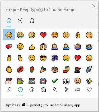
Windows Key + . (windows dot)

You will see a popup box with lots of different symbols. Just select the symbol you require. You can also type to filter or search for the one you want. Try Americanisms (such as ‘check’ for ‘tick’) if you can’t find something.

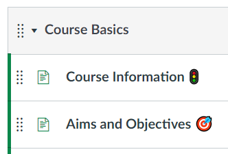
This works in Microsoft apps and some other text input areas, such as the Canvas Rich Text Editor. Screenreaders will read out the emoji’s name, so don’t put them at the start of sentences or titles. Adding emojis like this can help add a splash of colour, or you can use them to visually distinguish types of task or information.

Macs

Key codes on a Mac are a little more complex, but this guide can take you through it.

Problems with special characters

Sometimes special characters can cause issues if the document you are creating is being used as a source of data for another platform. Not everything will correctly translate the character outside MS Word. This is to do with how some datasets store the character information, older standards like ASCII do not have a wide selection of special characters available.

A real world example of this would be the uploading of core skill to the MLE (Medical Learning Environment) website. The MLE itself may choose to ignore any characters it cannot translate, which although not ideal, is not a major issue. Unfortunately those core skills are also used in a mobile app that students can record against. The app will simply refuse to display the information. Currently there are processes in place to identify and replace these characters, ideally we would update all our platforms to use Unicodes instead of the older ASCII standard.

Summary

Emojis, symbols and special characters might be needed in your content, or you might choose to use them to add extra meaning to your course pages or documents. Sometimes they will display slightly differently on different devices or in different apps. If your content is to be used as a source of data for another program, or copied to other platforms, please try to avoid using them, as sometimes they can cause issues. 🙂

FMS ❤ H5P

Below are some of our favourite uses of H5P from within the Faculty. If you have an example to share, please get in touch.

Fill in the Blanks for Click to Enlarge images

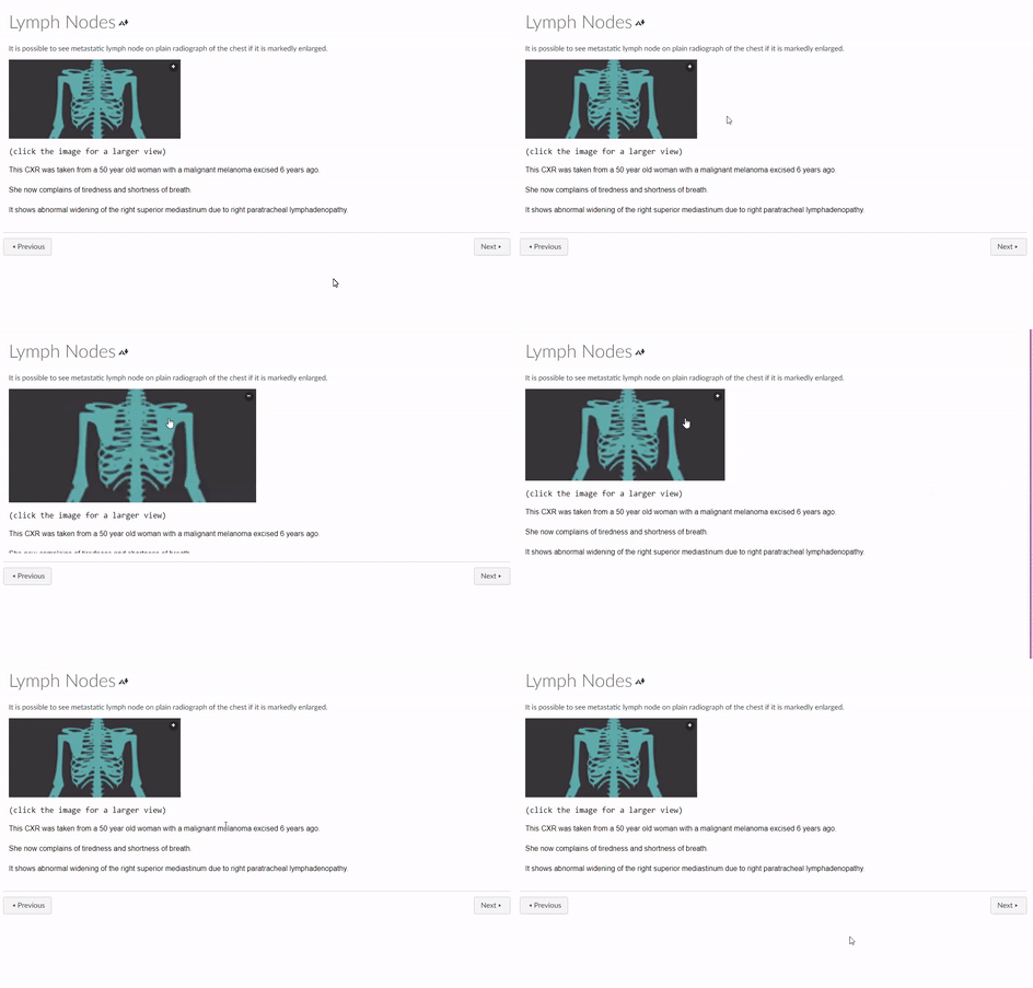
Students often complain that diagnostic images are too small to see clearly. A solution we found was to use H5P Fill in the Blank activity (without a blank).

Example from ONC8004. (Original image has been replaced to protect patient confidentiality)

Instructions

  • H5P Fill in the blanks tutorial
  • Set the Task description to say: (click the image for a larger view)
  • Use the Text blocks to describe the image
  • For behavioural settings, untick all except “automatically check answers after input”
  • LTI Settings: Set a max width of 1920 px (this will left align the content in canvas)

Branching Activity for personalised tasks

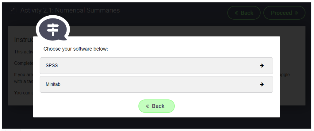
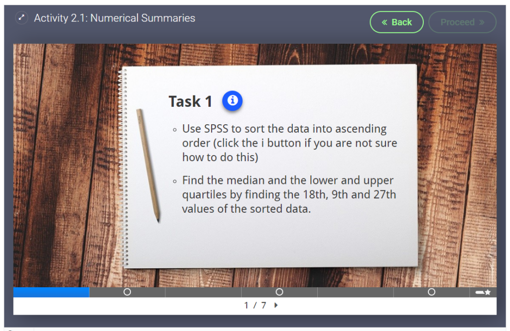
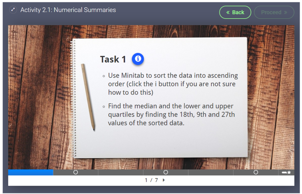
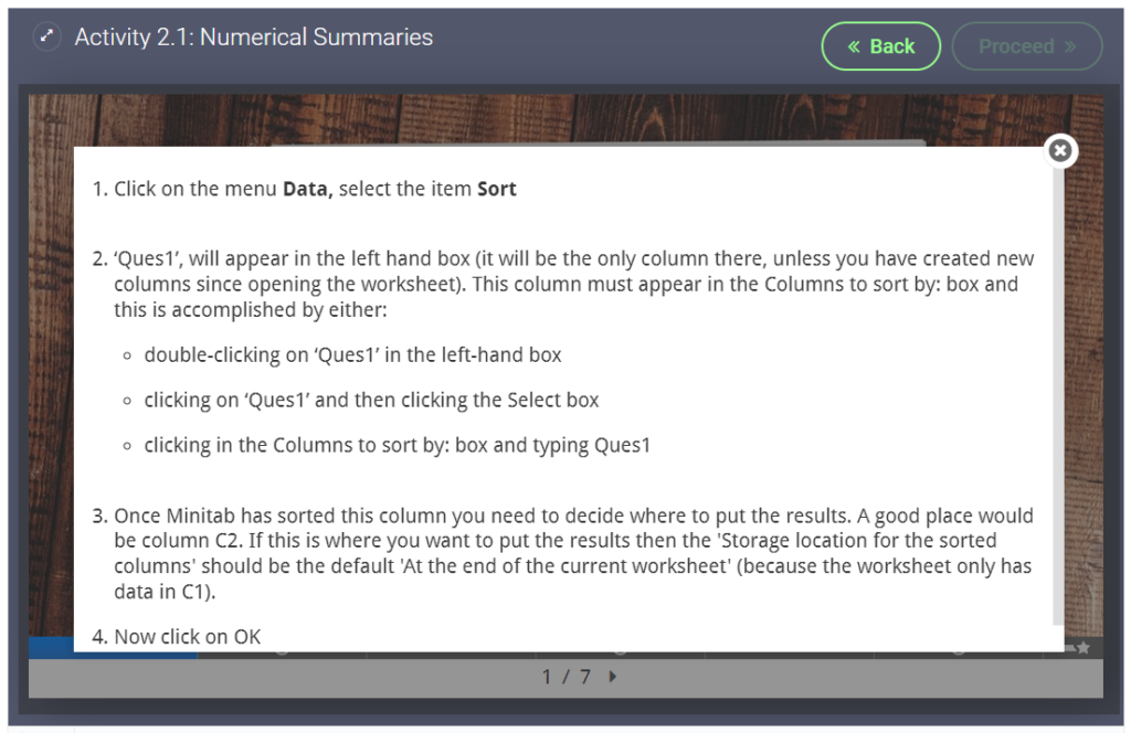
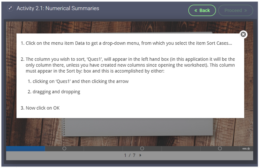
We used a branching activity for a statistics task. Students were given personalised tasks and instructions based on their software preferences.

Students choose a software

Instructions


Interactive Video to spark discussion

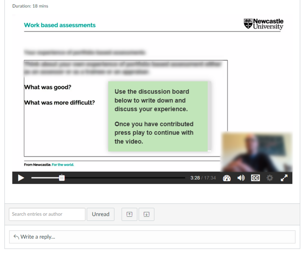
This video was originally designed to be watched in a classroom setting, where the video would be paused for an in class discussion. When the course was moved online we used H5Ps interactive video to auto pause at the right moment and we embedded the video in a discussion board.

Video auto pauses (at the white dot) and asks students to contribute to a discussion board task

Instructions


Virtual Tour (360) of a University Lab

We created a 360 tour through a large lab in the School of Biomedical and Nutritional Sciences. This was to familiarise students with the lab before attending in person, but also to show the labs to students working at a distance.

Screen capture of 360 tour in use

Instructions


Virtual Tour (360) to highlight hazards in a Lab

We created a 360 image of the new Nutrition Kitchen with hotspots highlighting some common hazards. Clicking on the hotspots will show a close up image of the hazard and/or some information on why it is a hazard.

Screen capture of hotspots in use

Instructions

Blogging: Getting Started and Keeping it Going

We were recently invited to present this blog, and our experiences running it at the Directors of Education forum. We have recorded this presentation as a video for anyone who may be interested in starting their own blog within their team.

The presentation covers:

  • Identifying needs and measuring impact
  • Things to consider before getting started
  • How to keep a blog running over a long period of time
FMS TEL Blog: A practice-sharing success story

Newcastle University staff can watch the video on Panopto.

Assessment and Marking Refresher

The January assessment period will be upon us all very soon. Why not take some time over the next few weeks to refresh your knowledge.

Below are a few resources previously delivered or created by the FMS TEL team:


? Canvas Assessment Training 

  • Setting Up Assessments
  • Creating Rubrics
  • Turnitin Plagiarism Detection
  • Marking and Moderation

? Effective Rubrics

  • Designing Effective Rubrics for Marking and Feedback
  • Best practice when deciding how to put your rubric together
  • Rubric design workflow
  • Setting up and using Rubrics in Turnitin

? Adaptive Release Feedback

  • Comments before grades
  • Technological affordances available
  • Recorded audio feedback

? Multiple Markers 

  • How to allocate students to a marker
  • How to filter Speedgrader to see only your marking section

Canvas Assessments from Start to Finish

We recently delivered a bespoke training session for the Graduate school about running assessments on Canvas. The session was aimed at Professional Services and Teaching staff, and covered the following:

  • Setting up assessments and enabling Turnitin
  • Creating Canvas rubrics
  • Monitoring submissions and managing different circumstances
  • Plagiarism checks and Marking
  • Moderation and release of grades

The resources are available on our Canvas Community to all Newcastle staff. You may need to enrol in the community if this is your first visit.

Embrace the silence: the use of timers in synchronous teaching

Learn how to use timers in your PowerPoint presentations to aid questions and answers for students and yourself.

As teachers or trainers we can often feel the pressure to fill the silence when presenting. How long should you wait for an answer? Or a better question might be, how long do you think you wait?

Research suggests that at least 3 seconds can provide positive outcomes for both teachers/trainers and students (Rowe, 1972).

Each task may require different lengths of silence, you will want to think about the time the students will need to:

  • process the question
  • think of the answer
  • formulate a response
  • (if teaching virtually) unmute or type their response

The concern is to provide the period of time that will most effectively assist nearly every student to complete the cognitive tasks needed in the particular situation.

Stahl, 1994

You may find yourself counting the 10 or 15 seconds in your head, but still the silence can feel unbearable.

PowerPoint Animations to the rescue

Using a consistent slide design with an animation will not only relieve the pressure on you to keep track of the time but also provide cues that students will become familiar with as your teaching progresses.

Below are examples and instructions for 4 different types of animations you can create in PowerPoint, ranging from super easy to slightly complex. At the bottom of this post you will find a template document of all the examples shown plus a few more complicated designs which you can download and use in your own presentations.

Example 1: Stopwatch

Example stopwatch PowerPoint animation
  1. Insert a circle and style as required (holding shift will help you draw a perfect circle)
  2. Add a “Wheel” animation to the circle and adjust to your chosen duration (max of 59 second)
  3. Add the stopwatch icon (Insert > Icons > search for “Stopwatch”)

Example 2: Progress Bar

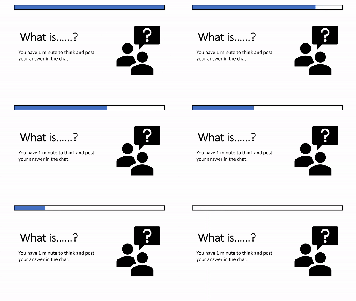
Example progress bar PowerPoint animation
  1. Insert a rectangle, remove the outline and choose a fill colour
  2. Add a “Wipe” animation to the rectangle, using the effect options drop down change the direction to “From left” or “From right”. Adjust to your chosen duration (max of 59 seconds)
  3. Insert a second rectangle on top of the first, remove the fill colour and style the outline as desired.

Example 3: Count Down

Example count down PowerPoint animation
  1. Create a text box for each number required, style as required
  2. Add the “Disappear” animation to all text boxes
  3. Set the first number to start “on click” with a 1 second delay
  4. Set all other numbers to start “after previous” with a 1 second delay
  5. Stack each text box on top of each other in the correct order, you may want to use the arrange menu or the selection pane to assist with this
  6. (optional) Add a text box at the back stating times up

Example 4: Scrolling counter

Example scrolling counter PowerPoint animation
  1. Insert a rectangle, with no fill and an outline of your choice
  2. Insert a text box and type in the required numbers, with a new number on each line
  3. Add the “Lines” animation to the text box, move your text box so your first number aligns with the green arrow and your final number aligns with the red arrow (further guidance). Adjust to your chosen duration (max of 59 seconds)
  4. Insert more rectangles above and below the first rectangle you created to hide the numbers as they scroll in and out

Resources

References

Rowe, M., 1986. Wait Time: Slowing Down May Be A Way of Speeding Up!. Journal of Teacher Education, 37(1), pp.43-50

Stahl, Robert J. & ERIC Clearinghouse for Social Studies/Social Science Education.  1994,  Using “Think-Time” and “Wait-Time” Skillfully in the Classroom [microform] / Robert J. Stahl  Distributed by ERIC Clearinghouse [Washington, D.C.]  <https://eric.ed.gov/?id=ED370885>

Designing Convertible Teaching – NULT2022

Conference Materials – Designing Convertible Teaching

All of our posts about this conference can be seen under the tag NULTConf2022.

This workshop was presented in person for the first time at the Learning and Teaching Conference 2022. Newcastle University staff wishing to access the resources and the recording of the online version can do so here.

Designing Effective Rubrics

A written summary of our training on using rubrics with links to the full webinar resources.

We have recently delivered some training for BNS (School of Biomedical, Nutritional and Sport Sciences) in collaboration with Rebecca Gill and Susan Barfield from LTDS. The two sessions covered Rubrics – both their design and how they can be implemented in Turnitin. You can access the training recordings and resources at the foot of this page.

Examples covered included:

  • a rubric with very few criteria and letter grading
  • a rubric with weighted criteria and bands
  • a very fine-grained rubric that awarded numerical points based on ten different criteria.

What are Rubrics for?

Rubrics can be used to evaluate assessments, whether you use a quantitative rubric to calculate marks, or a qualitative one with more wiggle room. Using a rubric makes it easier to identify strengths and weaknesses in a submission, and creates common framework and assessment language for staff and students to use. This in turn can help make learning expectations explicit to learners, and assist in the provision of effective feedback.

What is the best way?

There is no one way to design a perfect rubric, as assessments are very individual.

Before you begin you may want to consider how you can design your rubric to lessen the marking or feedback workload. Quantitative rubrics can reduce decision-making difficulties as this means you don’t need to consider what mark to give within a band. On the other hand, you may need this flexibility to use professional judgement. A detailed rubric with less wiggle room per descriptor also acts as detailed feedback for students, reducing the need for writing long additional comments, but also takes longer to design.

Descriptors

When writing descriptors, ensure that there is enough clear and objective difference between each band. You may find that aligning your descriptors with an external framework helps you write them. This is critical for secure marking, and is helpful for students receiving that feedback. Using positive language also helps make this feedback easier to digest, and allows students to see what they need to include to improve.

Rubric Workflow

When creating a rubric, you can follow this basic process. At every stage it is important to consult local assessment guidelines and discuss progress with your colleagues for constructive feedback.

  1. Determine your assessment criteria – ideally these should be aligned with the learning outcomes of the task.
  2. Consider the weighting of each element, if required – is presentation as important as content?
  3. Decide whether you will need defined marks or flexible ranges. This may be partly determined by your in-house guidelines.
  4. How do marks in various criteria interact with or depend upon one another? For example, if there is a very low mark in a content criterion, does that mean that the assessment can never be a pass?
  5. Try to write out individual descriptors – if you’re having difficulty discriminating between bands you may need to adjust your structure.
  6. Test your rubric against former or dummy submissions and adjust as necessary. Does it work for a lower level of mastery as well as a middle-scoring and high-scoring submission? If you had difficulty deciding between criteria, or discover a double-credit/penalty, you will need to adjust.

Technical Setup

Turnitin allows for the use of Grading Forms and Rubrics. You can watch how to implement these in the Using Turnitin video in the session resources below.

Turnitin grading forms can be created to assist with marking assignments, allowing you to add marks and feedback under various criteria. When using these forms, the highest mark entered will become the grade for the assignment. You can also use this without scoring to give feedback.

Turnitin rubrics allow for marking under multiple criteria and bands. You can have standard rubrics that calculate grades, or qualitative rubrics that do not include scoring. Custom rubrics can be used for more flexibility within a band.

An alternative to using Turnitin is to integrate a rubric into the assignment itself by using a coversheet. (see the ‘Effective Rubrics – Using Turnitin’ video at 28m25s, link in the Canvas below).

Resources