How to manage and track your downloads from Microsoft Teams.
Video content created for the e-learning modules in FMS is often shared between colleagues in Teams. A problem I have come across is the lack of a progress bar within Teams for downloads.
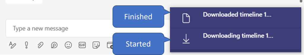
When downloading a small file, such as an image or a document, it is not really a problem. You get a pop up notification of the download starting and shortly after a similar pop up notification saying the download is complete.
Screenshot of teams download notifications
If you are downloading a larger file such as 1 hour+ videos, which may take a while to download, you are left in limbo for how long it will take and if you move away from your screen you may miss the pop up notification entirely.
One solution is to keep an eye on the files icon on the teams navigation pane. It will be blank by default, show a downward arrow when downloading and briefly show a green tick when downloads are complete.
Teams File Icons
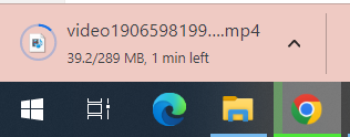
A second solution is to download the file from SharePoint instead. If you right click the file you should see an option to Open in SharePoint (this only works in teams areas, not chats). From SharePoint, select your file and click download. Your download will be controlled by your chosen browser.
In Chrome the progress bar displays the size and time limit left and the icon on the task bar turns into a progress bar as well. With this method I can get on with other tasks while the file downloads and be aware of its progress as well. I can also cancel the download if I need to.
This post covers the pros and cons of different ways to upload and manage files in Canvas
As the e-learning modules in FMS are now going live, the team have been looking at ways to manage uploaded files in Canvas.
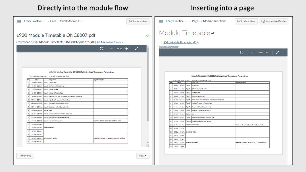
There are two main ways to add files to your module flow in Canvas:
Directly into the module flow
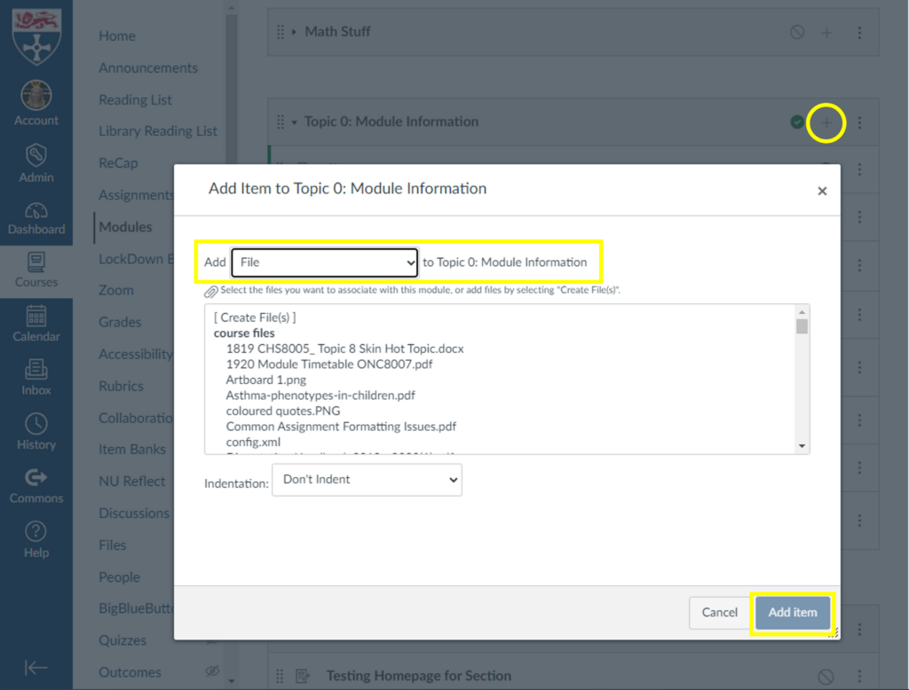
+ > Add File > Add Item
This method is by far the easiest and quickest way to add a file to your course, and is a great choice if the file will not require updates.
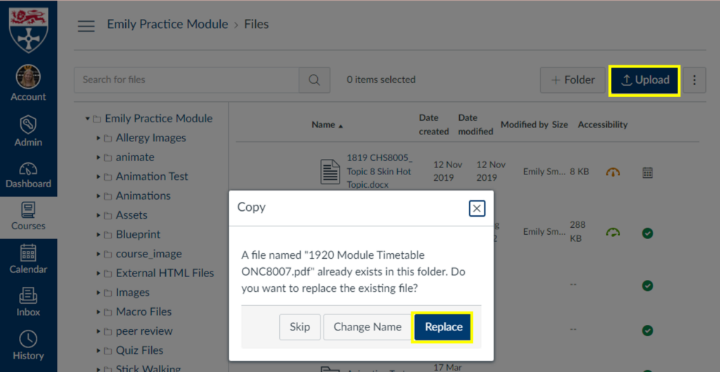
If you need to replace the file with an updated version, it is best practice to upload the new version directly to the files area and replace the original file. The file names need to be identical and uploaded to the same folder for the “replace” option to appear. Updating the file this way means any links to the file within the content will not need updated.
Upload > Replace
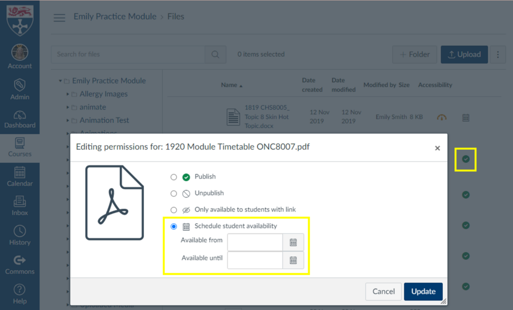
In the files area you also have the option to adjust the availability of files, including adding available from and until dates.
Click the green tick next to the file to open the availability options
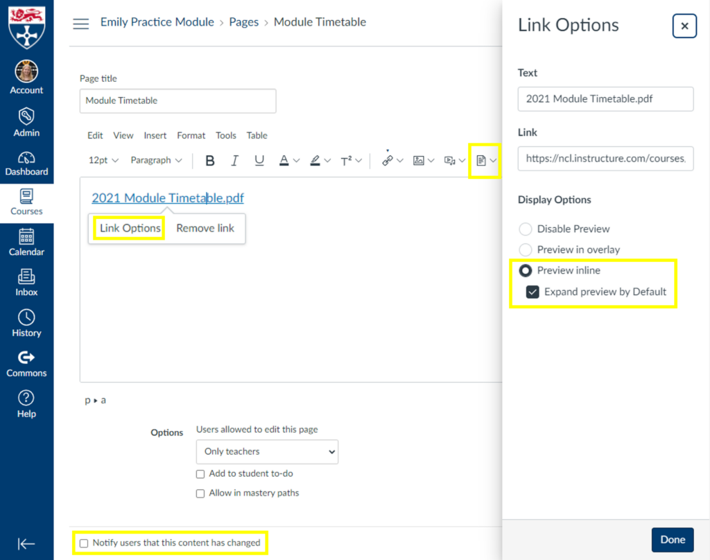
Inserted into a page
View of options available for a file inserted into a page in Canvas
This is my preferred method for adding a file to a course. You can use ‘Link Options’ to make the file open a preview by default so the page has the appearance of a directly added file but you have the following benefits over adding the file directly:
Able to add notes or comments above or below the file
The page title does not have to be the file name
Any links will be directed to this page so you can update the file/page as many times as needed and links to the content will still work
You can create an archive at the bottom of the page for previous file versions
Canvas can notify students of changes to the page/file
You have access to the page history so you can roll back to previous versions
You can add multiple files to one location
You can add a to-do deadline to the students to do lists and calendars
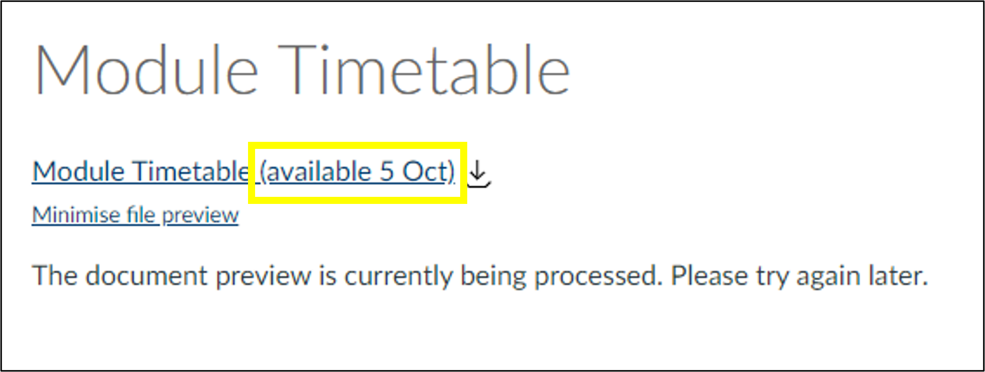
If you choose to use the file availability options mentioned in the previous method you may want to add a message on the page stating when the file will be available as the message canvas provides is not very informative:
Canvas Message: The document preview is currently being processed. Please try again later.
Keeping track of your files and file names within your module helps you save time and avoid confusion later.
Quick wins in accessibility by using Adobe Acrobat Pro’s built-in tool.
In FMS TEL we are currently working on accessibility as new module materials are being prepared for release. Did you know that Adobe Acrobat Pro has a built in Accessibility tool that not only checks your document’s accessibility, but helps you improve accessibility with the click of a few buttons?
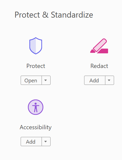
If you find that your PDFs are receiving low accessibility scores in Canvas, you can use Adobe Acrobat to improve their scores quickly and efficiently. Simply open the file in Adobe Acrobat Pro. Then select the Accessibility tool from the Tools options. (Click on More Tools then scroll down to the Protect and Standardize section.)
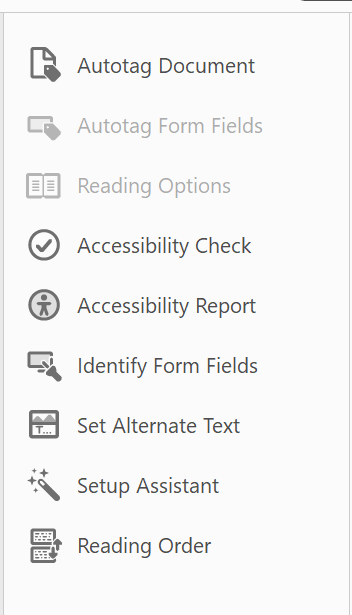
Begin by selecting the Accessibility Check. This will tell you what can be improved in your document.
Next you can use the Autotag tool if your document is missing tags such as headings.
You can choose Set Alternative Text to add alt text to your images.
If necessary use the Reading Order tool to set the order in which the document should be read by a screen reader.
With these three easy steps you have vastly improved the accessibility of your document! Try adding it back into Canvas and you will be surprised by the results you get.
If you need to produce captions and a transcript, complete the caption editing first and then use the corrected caption file as your starting point for your transcript. Creating a transcript with the method below will not give you a file that can be used for captions.
When creating a transcript, you will need to decide a few things before you start.
Are timings important, and if so, what level of accuracy do you need? Does every utterance need a time, or would it suffice to signal timing points at the start of each slide, for example?
Is it important to know who is speaking? Training videos may not need this.
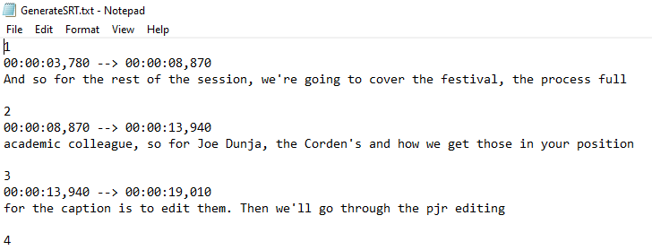
The first step is to download your caption file and copy and paste the text into Word. Then, transform your lines of text into a table using ‘convert text to table‘ and setting the number of columns to 4.
Copy your table from Word and paste it into Excel. Once this is done, you can use Excel to trim down your times and make them more human-friendly, using the MID function in a new column. Copy the formula down the whole row to quickly tidy all of the timestamps. This example trims the hours from the start time, and gets rid of the milliseconds and the end time completely.
The formula above (typed into B1) will look in A1 for the source text, and starting with the 4th character, output 5 consecutive characters into the cell, and then stop. You can change the numbers if you need a different segment or more characters, for example, if you want the hours included.
Pasting the resultant data back into Word means you can then use Word’s formatting tools to shape your transcript, adding columns as needed to denote speakers or other important information, and removing columns that contain redundant data.
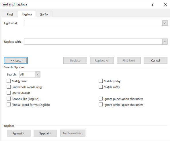
Cutting and pasting the individual cells containing speakers’ words into a single cell will help improve the look of the document. Paste without formatting to combine the cells into one. Spare rows can then be deleted. Using Find and Replace to get rid of line breaks (search for ^p) and replacing them with spaces further tidies this up. You can then delete the redundant rows.
If you like, you can then remove the borders from your table. You could also set a bottom cell margin to automatically space out each row.
It is important to check your resulting transcript’s accessibility. As this method uses a table, make sure that a screen reader can read it in the correct order. You can do this by clicking into the first cell of your table and then pressing the tab key to move between cells – this is the order most screen readers will relay the text, so check it makes sense.
You can also choose to add a header row to your table to give each column a title. After adding this, highlight the row, click ‘table properties‘ and in ‘row‘ select ‘repeat as header row’. Ally in Canvas will not give a 100% score without this.
Once your transcript is formatted correctly, you can correct your text and fix mistakes in the usual way if you have not already done so for captions. The previous post on Faster Captioning has some tips and tricks to speed this up.
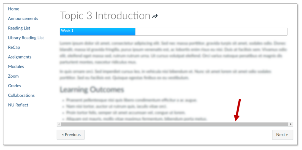
I recently noticed a few pages in my content in Canvas had developed scroll bars at the bottom. The bars were greyed out and had no function.
Scroll bar visible at the bottom of the page
I started to notice a pattern. Any content which took up the whole width of the page (100%) was triggering the scroll bars. It could be any type of content; a banner image, an embedded padlet, or like in my example progress bars.
The Fix
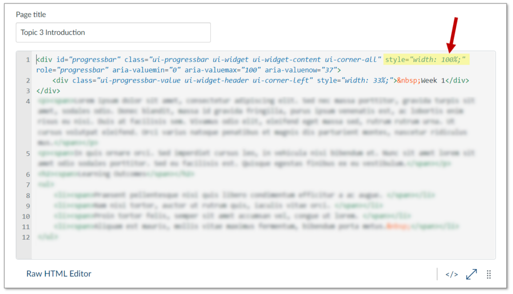
Canvas must have changed the HTML “overflow” settings somewhere on their end. An easy fix is to adjust any 100% width content to be 99% instead. This can be done in the HTML editor area accessed by this icon in the edit screen: </>
Canvas HTML editor showing width elementScroll bar has disappeared
This brief guide discusses some of tips and tricks for creating successful documentation for systems, software, or processes.
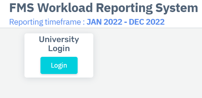
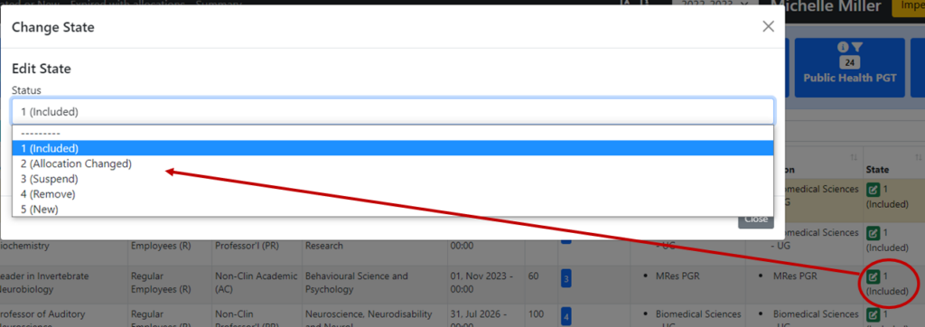
I recently had the opportunity to create some guidance packages for the new FMS Workplace Reporting System and FMS Personal Tutoring Allocation Database, and I wanted to share my insights and experience of what creating documentation entails.
Develop Knowledge
The first step in the process is to gain knowledge of the ins and outs of the software, system, or process you are documenting. In my case this required a walk-through of the WRS and PTAS led by members of the respective development teams. But it could be through experiencing the process yourself and taking notes. You should have some confidence in the process or system prior to beginning documentation. Once I had a working knowledge of the systems and was given access to them, I was ready to begin.
Logical Order
The next step is to plan out the structure of the guidance. Determine what area or process should be discussed first, next, etc. It is useful to outline these steps in a Word document or on a scrap piece of paper. This structure should give your documentation natural flow. It is the flow that will make your documentation stand out as an easy-to-use guide.
Clear and Concise
Choose language that is clear and concise to detail the steps and processes covered in your documentation. There is no need to be overly descriptive, but at the same time you want to ensure that all the necessary detail is included. For example, if a button is a specific colour this detail could help users locate it. However, if all the buttons on the page are the same colour, there is no need to specify this information.
Process
Writing documentation is all about the process. And there may be several processes covered in a single guidance. So, it is important to compartmentalise these as much as possible to avoid overwhelming your user. Approach the project in parts. Provide an introduction, themes, and a summary. This will help the user understand what is being addressed and how to work through your process or system.
Images or Video
Including images and/or video in your documentation is a great way to make useful and helpful guidance. Images and video can do in a few seconds what paragraphs of text would take to explain. However, you should always make sure your images and videos are clear and consistent. Use the same software to generate images and video and make sure the quality is high. There is not much worse in the field of documentation than an image or video that is not high enough resolution to see what exactly is being described. Also, make sure your images show the specific item or area in context. This will help the user locate what they are looking for easily. Note however, that text should always accompany an image to facilitate use by visually or otherwise limited users. The combination of text and image makes for clear guidance.
Annotations
Another great feature of images and video is that they can be annotated. Use software like PowerPoint to add arrows, circles, and even text to images. This will point out precisely what you are referring to in your guidance. You can use Adobe Animate or Camtasia to annotate videos. This increases the impact of a video or image.
Exact Language
Using precise language is necessary in creating guidance. Identifying processes and functions is critical to the reader, so you need to be very specific about what you say. For example, if a button is in the top right corner of the screen, don’t say “at the top of the screen”. Tell your user exactly where to look. At the same time, if the user needs to drag an item, click on a button, or even scroll up or down the page – make that clear in your text. Both what to do, and when to do it. Use numbered lists when possible to make the order of a process transparent.
Repetition/Highlighting Important Bits
When a specific task is important it may be worth repeating or emphasising the related information. For example, if a user needs to press a save button one or more times in a process, you can emphasis this by repeating the instructions, using bold text (Note: using only coloured text disadvantages colourblind individuals), or setting the instructions apart in a box or larger text. Making the most important tasks hard to miss in your documentation is always a good idea. You can achieve this through a combination of repetition and emphasis.
Summary
The process of creating documentation or guidance for a system or process can be a really rewarding experience. You will get practice teaching by giving clear, concise instructions. You will have the opportunity to work with colleagues when learning about the process or system – or testing your work on someone unfamiliar with the system or process. Finally, you will develop a greater understanding of the system or process itself. I really enjoy creating documentation, and I hope if you get the opportunity to create guidance – large or small – in the future, you will take it.
I only have 1 screen, can I view my notes while sharing my screen?
Whether you are creating a pre-recorded presentation or delivering live on zoom/teams, having only one screen can be quite limiting.
Delivering my FMS TEL webinars in the office was easy with my two monitor set up but when working from home I struggled with only my laptop. I prefer to have notes to keep me on track and to make sure I cover everything I want to say. I knew there must be a way to access my notes while presenting.
Below are step by step instructions on how I shared my presentation with my audience while viewing my notes, all done using only a laptop!
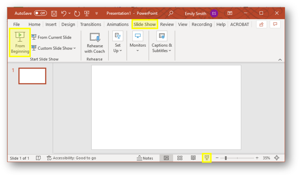
Open PowerPoint and start your slide show
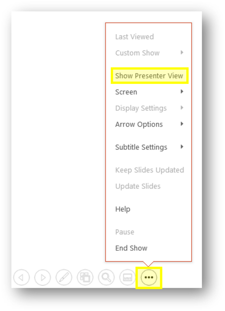
Click the Ellipsis menu, then “Show Presenter View”
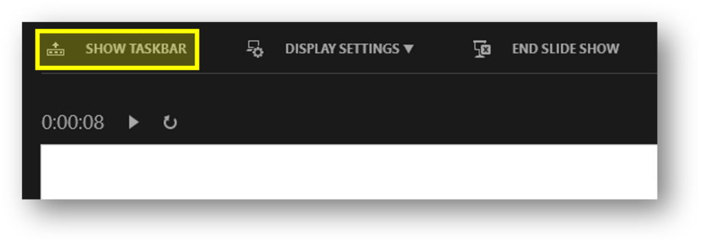
Click “Show Taskbar” or press the Windows key on your keyboard
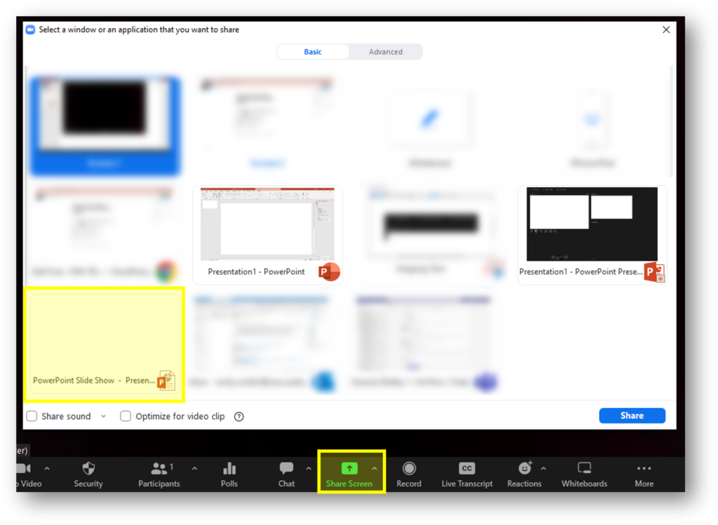
Open Zoom/Teams, Click “Share Screen”. You should see 3 options from PowerPoint, choose PowerPoint Slide Show
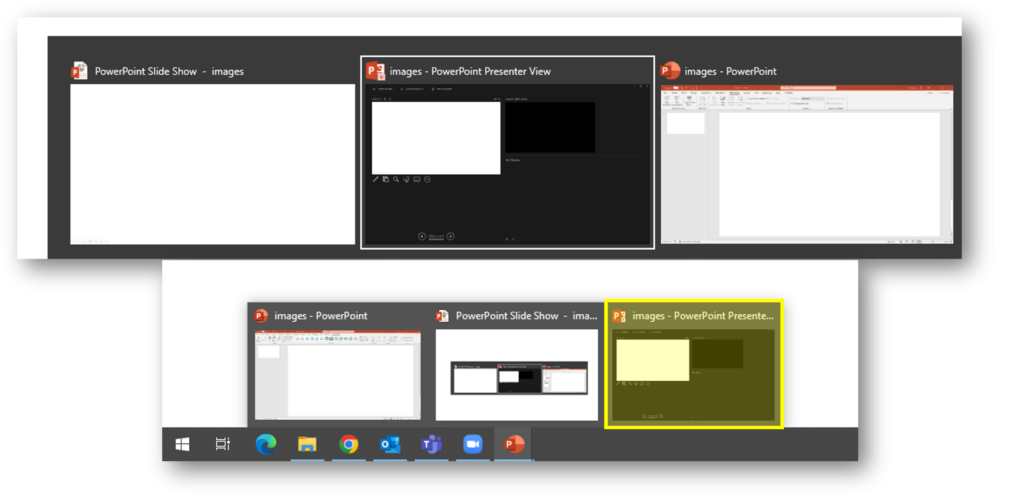
To open Presenter View, navigate using the Alt + Tab buttons on your keyboard, or press the windows key and select presenter view from the Task Bar
Tips
Practice the steps before your session (you may want to open this post on a second device so you can access the instructions while you practice)
Add a blank slide or holding slide at the start of your presentation, especially if your first slide contains animations or slide transitions
Add a finishing slide, when your presentation ends the screen will stop sharing automatically (Zoom will display a pop up message to confirm this has happened)
This post details some easy tips and tricks to speed up your caption editing process using Notepad and Word.
This post assumes users are using Panopto (ReCap), therefore Panopto guidance is linked for uploading and downloading caption files. Guidance for other products such as Streams, Vimeo and YouTube can be found on their own sites.
In FMS TEL many team members regularly work with captioning videos – whether these are our own instructional videos or webinars, or student learning materials. Recently a few of us in the team have been talking about how we caption videos – specifically, what processes we use. There are some of us in the team who use the inline caption editor in Panopto, and use speed controls to manage the flow of speech so they can correct as they go. Others prefer to download the caption files and work with them in a separate program.
Both methods have their pros and cons. Working within the online editor is often best for short videos, or those with very few corrections to be made. Sometimes, though, it is easier to manage longer or more error-prone caption files in their own window. This gives more space to see what you’re doing – as long as you can avoid messing up the file structure. You can also use proofing tools in Word to speed things along or cut out repeated mistakes.
The rest of this post details some tips you can try to speed up your own process if not using the online editor.
You may find that for the bulk of the editing you don’t even need to be listening to the video – the errors can sometimes be evident just from text.
To work with captions outside of Panopto, you’ll first need to download the caption file. If there is no file to download, you’ll need to request automatic captions first. The caption file can be opened in Notepad. From there, you can edit each line of text separately. You must not change the file structure – so do not edit any of the other lines in the file, even the empty ones.
The file repeats in structure every 4 lines. The first is the sequence number of the caption, the second is the timestamp displayed in hours, minutes, seconds and milliseconds, the third is the spoken text and the fourth is an empty line.
If you want to take advantage of some more proofing tools, try copy and pasting your entire file into Word. This will allow you to use tools such as Spelling and Grammar check to remove duplicate words or transcribed stuttering sounds, and can also draw your attention to other oddities. The Spelling and Grammar tool automatically moves you through your document, saving time scrolling and searching. As well as checking spelling, this can also help trim unnecessary words from the text, making it faster to read.
Find and Replace is useful, and can help…
If a name has been consistently misspelled – for example Jo/Joe.
If the speaker has a filler word that can be removed (I say “kind of” as filler so always search for and remove it from the captions!).
To replace key numbers or years that have been spelled out with their numerical representations (e.g. ninety-nine percent -> 99%).
Filtering out inappropriate language if it has been misheard by the auto software – if you see it once you can search the whole document quickly.
Filtering out colloquial spellings (gonna -> going to).
A good tip to ensure you only find whole words is to search them with spaces before and after the word itself. You can also use the ‘more’ option dialog and check the ‘whole words only’ box.
These extra options can help speed things up.
If you have been deleting a lot of items and adding spaces in their place, you might also want to do a find and replace for two spaces together and replace with one space. Run this a few times until there are no results. Similarly, you could look for comma-space-comma if you have removed a lot of filler.
These steps won’t fix everything, but can cut out some of the bulk and help speed up your process. After using these tools, read through the captions carefully again to fix any leftover errors.
Learn how to use timers in your PowerPoint presentations to aid questions and answers for students and yourself.
As teachers or trainers we can often feel the pressure to fill the silence when presenting. How long should you wait for an answer? Or a better question might be, how long do you think you wait?
Research suggests that at least 3 seconds can provide positive outcomes for both teachers/trainers and students (Rowe, 1972).
Each task may require different lengths of silence, you will want to think about the time the students will need to:
process the question
think of the answer
formulate a response
(if teaching virtually) unmute or type their response
The concern is to provide the period of time that will most effectively assist nearly every student to complete the cognitive tasks needed in the particular situation.
Stahl, 1994
You may find yourself counting the 10 or 15 seconds in your head, but still the silence can feel unbearable.
PowerPoint Animations to the rescue
Using a consistent slide design with an animation will not only relieve the pressure on you to keep track of the time but also provide cues that students will become familiar with as your teaching progresses.
Below are examples and instructions for 4 different types of animations you can create in PowerPoint, ranging from super easy to slightly complex. At the bottom of this post you will find a template document of all the examples shown plus a few more complicated designs which you can download and use in your own presentations.
Example 1: Stopwatch
Example stopwatch PowerPoint animation
Insert a circle and style as required (holding shift will help you draw a perfect circle)
Add a “Wheel” animation to the circle and adjust to your chosen duration (max of 59 second)
Add the stopwatch icon (Insert > Icons > search for “Stopwatch”)
Example 2: Progress Bar
Example progress bar PowerPoint animation
Insert a rectangle, remove the outline and choose a fill colour
Add a “Wipe” animation to the rectangle, using the effect options drop down change the direction to “From left” or “From right”. Adjust to your chosen duration (max of 59 seconds)
Insert a second rectangle on top of the first, remove the fill colour and style the outline as desired.
Example 3: Count Down
Example count down PowerPoint animation
Create a text box for each number required, style as required
Add the “Disappear” animation to all text boxes
Set the first number to start “on click” with a 1 second delay
Set all other numbers to start “after previous” with a 1 second delay
Stack each text box on top of each other in the correct order, you may want to use the arrange menu or the selection pane to assist with this
(optional) Add a text box at the back stating times up
Example 4: Scrolling counter
Example scrolling counter PowerPoint animation
Insert a rectangle, with no fill and an outline of your choice
Insert a text box and type in the required numbers, with a new number on each line
Add the “Lines” animation to the text box, move your text box so your first number aligns with the green arrow and your final number aligns with the red arrow (further guidance). Adjust to your chosen duration (max of 59 seconds)
Insert more rectangles above and below the first rectangle you created to hide the numbers as they scroll in and out
Rowe, M., 1986. Wait Time: Slowing Down May Be A Way of Speeding Up!. Journal of Teacher Education, 37(1), pp.43-50
Stahl, Robert J. & ERIC Clearinghouse for Social Studies/Social Science Education. 1994, Using “Think-Time” and “Wait-Time” Skillfully in the Classroom [microform] / Robert J. Stahl Distributed by ERIC Clearinghouse [Washington, D.C.] <https://eric.ed.gov/?id=ED370885>
This short guide describes how to use the Reviewing tool in Microsoft 365 apps to dynamically collaborate on files.
Would you and your students benefit from the ability to have live, in-line feedback on essays, projects, and other work products? You can provide in-time feedback to students or colleagues as they work on individual or group work using Office 365 Share and Reviewing features. We’ve recently started using this method in our TEL Team to collaborate on documents.
To start the process, author simply need to share their file with the reviewer using the Share button in the file menu bar.
This sends a link to the file to the reviewer. By clicking on the link, the file will be opened in Office 365 online. The file could be a Word document, PowerPoint presentation, or an Excel workbook.
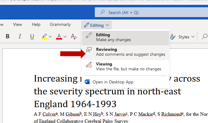
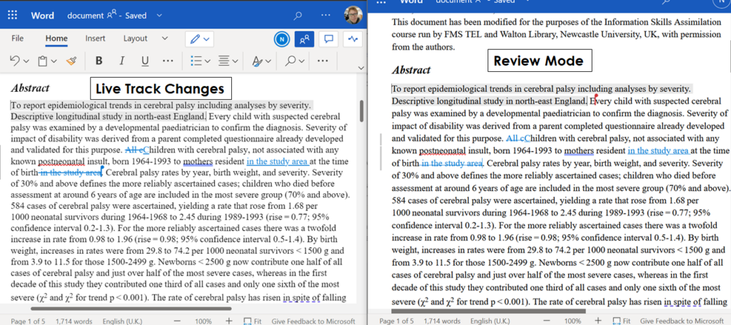
To make revisions that display to other authors/contributors enter the Reviewing setting.
This will turn on your track changes that will then be displayed to other document authors. The other authors can see mark-up and accept or reject changes in-time or asynchronously as needed. Note, the editing and viewing must take place in the Online Word App. Using the desktop app to view the changes will not show track changes.
This can greatly benefit students as they work through their assignments, as well as give reviewers with the opportunity to provide input and suggestions as work products develop. It can also allow for dynamic collaboration between colleagues by allowing a “single” author control over accepting or rejecting edits by others.
An example of this could be a group of students working on a Word document together. One student could be in charge of the ‘final’ document while the other students make additions and changes at track changes. Thus increasing the transparency of editing. The coordinating author could then choose to accept or reject the input from their fellow students.
The unique power of live track changes provides authors with the opportunity to modify and edit their work as it develops rather than only at the point of submission or finalisation. This similarly benefits the reviewer as the option to review is not time constrained in the same manner as a submission for review may be.