Today, Tracy and Eleanor gave a lightning talk as part of the Art of the Possible series. We shared our recent work with 3D and virtualising spaces, as well as using technology for interactive teaching when students can’t all be Present in Person.
Resources and links from the session are available below. Some may only be accessible to Newcastle University staff.
This post is about the use of Menti – a pretty polling tool that can show responses in real time on screen. Lindsey Ferrie used this to gather student feedback during an in-person event. Link to guides included.
In Biomedical, Nutritional and Sport Sciences this year there is a focus on improving assessment and feedback. Including student voice in this development work is key. As well as the normal routes for student voice, such as staff-student committees and module evaluation forms, there were certain questions that staff had in mind which could reveal a lot about how students were feeling about this aspect of their course.
The formal module evaluation forms don’t always capture a large sample from the student body, and as with any survey, generating a high response rate is very difficult, and can sometimes end up only revealing the most polarised responses. Informal live response tools were a potential way to gather large amounts of more representative data, as well as demonstrating that feedback is wanted, heard, and acted upon within a shorter cycle. It is also much more convenient to capture a response immediately when students are in the room.
Having seen Menti in use during the FMS TEL Conference, the decision was taken to try it out in a much bigger setting – the inductions for all programmes in the School. Overall, this includes around 1500 students.
A useful aspect of Menti in this situation was the capacity to provide a wide range of question types, as well as the ability to see answers as they are coming in. Naturally, this has some disadvantages too – students’ responses may be coloured by what they see on screen if this is displayed. Possibly due to its anonymous nature, students provided some genuinely challenging feedback which proved very useful.
When in use, Menti allowed for the sessions to be more interactive as sharing live responses is quite immersive. It also allowed for the presenters to directly react and respond to things as they came in and broke the ice between students and staff. This can be useful for quick questions about content as well as student voice activities, for example polling the level of understanding of a concept at the start and end of a teaching session.
In terms of providing evidence to share with other colleagues, or at committees, Menti retains the responses for you to review, and can generate lists of entered comments. It isn’t designed as a statistical analysis tool, so comments don’t come in a convenient format for analysis. Graphs can be screenshotted for simple sharing if needed. It is of course possible to read through the comments and type up an overview of common themes yourself if needed.
The instant feedback received highlighted that some students weren’t entirely satisfied with the feedback they were receiving on their lab reports. Based on the responses, the School was able to put on a dedicated feedback session to further explore this, and to find out what could be improved, and have already been able to implement some changes.
Tips
Consider adding a delay before sharing answers on screen
For free text answers, it may be prudent to summarise rather than share the screen
Consider numbers when selecting your question types – it’s not easy to read 30+ typed responses quickly.
Don’t overuse it – keep use to key points so the novelty doesn’t wear off
Just try it – and be prepared for the honesty in the responses!
Menti works best in the moment in a session, or when you want to gather responses instantly
Can I try it?
You can create a free account on Mentimeter.com. This free account has limits on how many individual questions you can make, but you can always make multiple presentations and switch to them when sharing your screen. The university does not have any subscription to this service. As such, do not ask students to input any personal or sensitive information as this won’t be covered by our data policies.
When presenting, simply ask the audience to visit the site and enter the provided code that you show on the screen. When you’re ready, you can display the results to your audience. See the FMS TEL Community for a full walkthrough.
Other Ideas for Use
Gauging the experience already in the room before starting a session (free text or poll)
A quick litmus test on an opinion – yes/no/not sure (could be done at the beginning and end to see how things change)
Challenging students to define a term
Choices and branching scenarios
Feeding back results on a solo exercise
Anonymous feedback / rating for an aspect of the session
Contacts
Lindsey Ferrie, Senior Lecturer, School of Biomedical, Nutritional and Sport Sciences
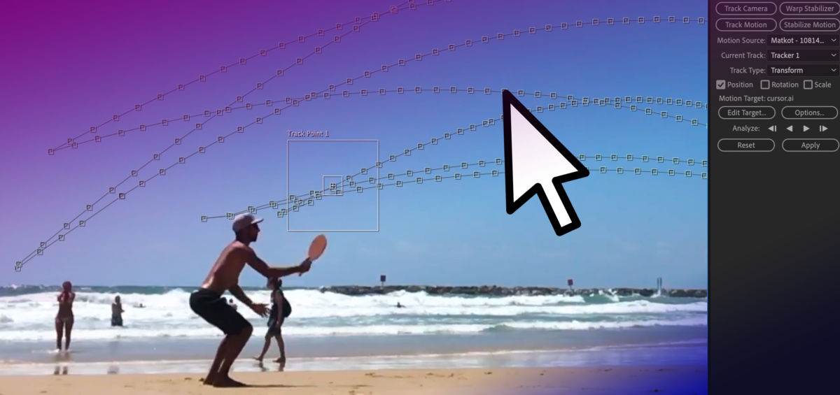
This post shows how cursor movement can be used in online presentations to show gesture, and the skills needed to add motion tracked items to video.
As part of the recently launched Exploring 3D Anatomy MOOC, two video presentations were created. These presentations involved explaining diagrams and pictures. One of these recordings had a moving cursor which the presenter had used to explain various parts of the screen, and the other was recorded without a cursor. To improve the clarity of the explanations, we had a request to display a larger cursor over the recorded material, using it to ‘point’ to the various significant areas shown.
When you’re planning a virtual presentation it’s worth checking if and how the software handles the cursor – some software will use a glowing highlight as you present, some will show and hide the cursor automatically depending on when you move it. The videos were recorded in ReCap, which automatically hides the cursor unless it is moving. The end of the post has links to various guides to help you choose your settings. The rest of this post details the animation process for how a larger cursor was added after the presentations had been recorded. This technique could be applied to other added graphical elements too if needed.
Creating the New Cursor
As the cursor is used in a lot of animations, there was already a scalable vector graphic image of a cursor available to use. This had been drawn in Adobe Illustrator. The next step was to use After Effects to add the cursor to the video and animate it.
Tracking the Cursor
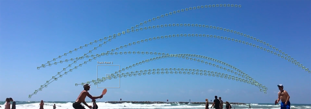
For the video with the cursor visible, the motion tracking function of After Effects was used. After identifying the original cursor, the new larger cursor was set to track it. Here and there the original cursor changed colour to remain visible over different backgrounds. It wasn’t necessary to replicate the colour change with the larger cursor, but this colour change did add extra steps when setting up the motion tracking as it needed to be started afresh each time the original cursor had changed colour. For the video without the cursor, the process was simpler as there was nothing to hide or track. As such the animations could be set up from scratch. Based on the clear explanation from the presenter, it was possible to add a cursor to trace the areas being explained.
Adding the New Cursor
The animations were set up to take place between certain moments of the video – like scenes. Key points in the video were identified and ‘key frames’ added which allow us to set up when certain animations should take place, and how long for. Simple animations such as changing size, position or rotation can be done relatively quickly using these linear key frames.
Once the start and end points are set, further customisation can be done to change the feel of the animation. For example, in this case, the speed of the cursor should somewhat mimic a natural movement rather than a precisely uniform speed. Using ‘ease in’ and ‘ease out’ (combined as ‘easy ease’) allows for the animation to look a little more natural, and less jarring, as the cursor starts to move more slowly before speeding up and gradually slowing to a stop.
When moving from point to point it’s very rare that a straight line is the best path to take, usually a slightly curved path can help add a more natural-looking movement. This might be used to instruct a viewer to click a series of buttons, for example. The ‘spatial interpolation’ in After Effects allows for the path of the moving object to be linear (a straight line) or Bezier (curved). The temporal interpolation tool allows for variations to the speed of the movement – a more customisable version of easing. Adjusting these allows for a nice natural pace and movement, and for more creative effects. For example an item moving from A to B may move slowly at first, then speed up towards the middle of its journey, then slow down again before arriving at its final destination – imagine a train travelling between stations!).
In this video the cursor was hidden from screen for most of the video so it was animated manually.
In this video the cursor was tracked (while visible), note the more erratic movement.
Approximating Gesture
The final videos allowed for a clear approximation of gesture to be added to the presentations, mimicking how a presenter might usually point to a screen or demonstrate a movement. While this is something very natural to do in person, you may need to think more about how you use and move your cursor in online presenting. Often it can be tricky to see the cursor, so you may wish to consider moving it more slowly than usual if you are using it to indicate processes or changes. Selecting some form of pointer or cursor highlighting in your chosen software can improve the visibility of the cursor during your presentation, whether recording or in person. On the other hand, you may wish to put your mouse out of reach so that random or accidental cursor movements don’t detract from your content.
Motion Tracking Demonstration
This video demonstrates the full motion tracking procedure, showing how you can track an object and then map the position of a cursor to it.
Resources
Cursors on Panopto – remember that only the slides are captured if you add a PowerPoint, so to capture your cursor, you should record your screen instead.
This post summarises posts from 2021 – thank you to all of our contributors!
The blog is now a year old! It’s been fantastic to see our readership grow over the year, and we hope you have enjoyed learning more about the work we do in FMS TEL, and have found our tips, resources and events useful and enjoyable.
We would be very grateful if you could spare a few minutes to tell us what you think about the blog, and what you would like to see more of in 2022.
The blog is edited by a different FMS TEL team member every month, and many team members have taken on this task, as well as contributing posts to the blog – thank you to all of you! Our thanks also go to those colleagues who have offered their examples of practice for us to showcase here. We look forward to working with many more of you in 2022… feel free to drop us a line if you have something to share.
This resource provides you with tips and tools for managing your email. Includes instructions and anecdotes on email management.
The FMS TEL team have developed a short course showing how you can make Outlook work for you. If your inbox is a chore and not a help, why not take a couple of minutes to tame the beast?
The short course is available on Canvas (also available in the MLE), and comes with an accompanying 9-minute audio programme which talks you through some examples of what the tools can be used to achieve.
The course is also available for you to import into your own courses via Canvas Commons, so feel free to use it!
But I haven’t got time!
10 minutes – listen to the programme for food for thought, or do a quick spring clean
20 minutes – click through the guides and listen to the programme, try some things out
1 hour – give your inbox a good spring clean using our tips and guides, and implement some rules and filters to organise your incoming email
Feel your inbox stress just melt away
6 Steps to Spring Clean your Inbox
Look at what you’re receiving and who and where it is coming from.
Decide what is important or necessary, and what is less so
Unsubscribe from unimportant or useless notifications or services. Adjust your email notification settings in Teams and Canvas to reflect what you really want to be emailed about.
Try out categorising emails from certain people, projects or services.
Use folders or search folders to move things out of your main inbox using rules based on email features like the sender, or categories you set.
Review regularly and change your system to suit what fits your needs – if a folder or rule no longer serves you, change or delete it.
This post is about using audio recordings of patient consultations in teaching. Commentary was added to the recordings by the lecturer to create a richer resource.
Introduction
This case study concerns Dietetics and Nutrition module NUT2006, Measurement and Assessment of Dietary Intake and Nutritional Status. As part of this module, dietary interview consultations are recorded so that the students can listen to these as examples. The FMS TEL Podcasting Webinar provided initial inspiration for what could be done with the recordings to enhance them. With a little more support, a new audio resource has been developed which adds audio commentary to the recorded consultations, highlighting various features.
Consultations and Recordings
The work of Dietitians and Nutritionists involves gathering information from individuals and populations on their recent or typical food intake. This enables them to analyse nutrient intake and understand dietary behaviours so that they can make suitable recommendations. Taking a diet history, or a 24-hour dietary recall, involves a structured interview with questions exploring habitual food intake, timing of meals, cooking methods and quantities. The effectiveness of the interviewers’ questioning technique impacts upon the quantity of information gathered and the quality of the nutritional analysis that can be undertaken. Students are working towards proficiency in these skills. Listening to recordings of these interviews exposes students to examples which will support in improving their skills when they perform these tasks for themselves. They can also practice analyzing the data provided from the audio recordings.
The recordings themselves are a very rich resource, which could be used in a variety of ways to help students improve their practice. The following task was developed, which required teaching staff to add audio commentary to the interviews.
The Task
Students first watched a short lecture on best practice for conducting interviews. They then listened to a recorded interview, by an anonymous peer, and made notes critiquing the effectiveness of the questioning techniques and determining if the quality of information obtained was sufficient to undertake nutritional analysis. Next, they listened to the same interview with professional commentary provided by staff, highlighting what could be improved and were asked:
Did you spot the same things?
Reflect on the comments and try to think about how you might use this knowledge to improve your own skills in gathering dietary information from service users.
This task was designed to allow students to develop their skills in conducting the interviews, and to reflect on practice and identify areas for development. The use of peer recordings meant that there would be a range of areas to comment on, making the task itself much more active than simply listening to a professional. Students were also offered more interview recordings to practice this task further.
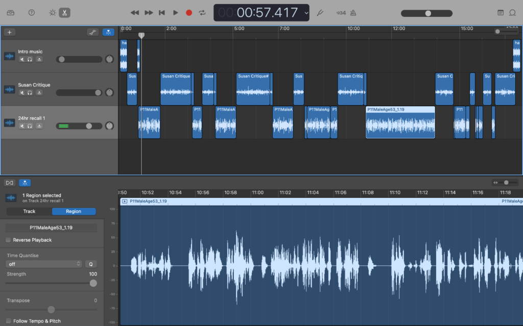
Adding Commentary with GarageBand
A recording was chosen that demonstrated a range of teaching points. Having listened to the recording and made brief notes, cuts were then made in the original recording at natural stopping points, for example, after the participant and interviewer had discussed breakfast. It was important to allow the original recording room to breathe by not interjecting too often – this makes for fewer edits too.
You can record audio with a range of devices – Windows laptops can run Audacity, and Macs come with GarageBand. It is also possible to record audio clips on a smartphone and import them. When doing any recording, make sure to do a quick test first to ensure there is no unwanted background noise – just record a few seconds and listen back. GarageBand was used in this case, but the Audacity user interface is very similar.
The first 20-minute recording took around two hours to produce, but this time included learning how to use the software. The screenshot below shows how the editing process looks in GarageBand. The top half shows the three tracks that were mixed to create the final output. By cutting and arranging the various sections, it is possible to quickly add commentary and even intro music to the basic original recording.
The project file, which contains all of the information in the top half of the screenshot such as individual tracks and cuts, can be saved for later use. This is helpful if you want the flexibility to change the content, or re-use elements. The single stream of audio can be exported separately as an audio file and embedded into Canvas or the MLE with accompanying text and other resources to build the desired task.
Style and Substance
It is natural to worry about quality when producing an audio or audiovisual resource for the first time as the content should convey a level of professionalism matching its purpose. As long as content is clear and understandable, it will serve for teaching. Making a clean recording can be done relatively simply by avoiding background noise and speaking at a measured pace and volume. You can add a touch more professionalism to your recordings by adding a little music to the intro and using some basic transitions like fading between different tracks if needed, but there is no need to go out and buy specialist equipment. The content of the recordings was linked very closely to the students’ tasks and mirrored how they may receive feedback in future by showing what practitioners look for in their interviews. This clear purpose alongside the care taken in producing the audio ensures that this resource is valuable to listeners.
Conclusion
While at first it seemed like a big undertaking, a quick YouTube search for instructions on using the software, and then having a go with the audio recordings has opened up a new avenue of teaching methodology – it was a lot easier to do than it first appeared, and in total took around 2 hours. The software has a lot of capabilities, but only the basics are really needed to produce a high-quality, rich teaching resource. Commentated practitioner interactions allow teaching staff to draw students’ attention to key moments while remaining in the flow of the interaction, signposting how students can reflect on practice and develop their own interviewing skills.
A recent case study by David Kennedy about personal tutoring in the School of Medical Sciences and its impact on student satisfaction.
Dr David Kennedy of the School of Medical Education recently shared his work on personal tutoring and academic mentorship via the LTDS blog. The case study details what changes were made, and shows the massive increase in student satisfaction that resulted.
“As a School, we had a desire to improve academic and professional development, as well as pastoral support, for all of our students to enable them to achieve their true potential and support their transition to the workplace.”
David Kennedy, SME
This case study will be of interest to anyone who is interested in mentoring and pastoral support, and student experience.
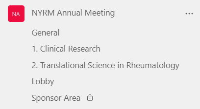
This case study covers the running of The Northern and Yorkshire Rheumatology Meeting 2021 (NYRM) using Microsoft Teams. The 170 attendees included a wide range of healthcare providers and students involved in Musculo-Skeletal disease specialisms. These included academics, clinical academics, PhD students, Allied Healthcare Professionals (AHPs) such as podiatrists, nurses and physiotherapists, and other Healthcare Professionals (HCPs), as well as corporate sponsors. The following discusses how the event was set up and run, as well as sharing reflections on the process. Technical guides for the setup are available at the end of the text.
Building Skills, Confidence and Resilience
This event has allowed for the development of skills in IT generally and specifically with running a Team and meetings. Though the initial setup may be a little technical if requirements are complex, after that it is simple to keep things running on the day.
It may seem intimidating to run this type of event as things go wrong sometimes, but this is true for live in-person events as well, it’s just that the solutions are different. It definitely helped that there was an extra pair of eyes to help manage the busier periods when a lot of people were joining sessions.
As with many things, sometimes it’s easiest just to jump in and get started! Though it was a bit of a baptism of fire running such a large and important event as a first try, with the support beforehand and the time to test, the running of the event on the day wasn’t too difficult. Time to practice with the tools and knowing who to ask for help was key in getting confidence to try out the process. Presenters and attendees were patient with the snags, and this is almost always what we find when trying something new. Confidence and resilience have now been developed, and lessons were learned that can be applied to future events.
From Offline to Online
Normally this meeting is held in York as a face-to face conference and it has been running annually since 1994. Attendees can gain CPD points from the Royal College of Physicians (RCP) for attending. As with the offline event, a registration process is undertaken to ascertain who will be joining. While this may seem less important for an online meeting, it is relevant to how roles are set up, and confidentiality.
Requirements for the Conference
Key requirements for the event were:
Persistent online space for chatting and housing resources prior to, and for 2 weeks after the event (RCP requirement)
Recording attendance (RCP requirement)
Session recording and sharing (RCP requirement)
Ability to adequately control access to and the flow of restricted information (sponsors’ requirement)
Multiple presenters in one call
Multiple simultaneous sessions
Ability to handle internal and external attendees and speakers
A Single Access Point
The requirement to have an online space outside of the meetings themselves meant that using Teams made more sense. While it would have been possible to run the live sessions via Zoom and have other information on Teams, keeping this all within one app meant the experience was smoother for both attendees and hosts, as they only needed to worry about one login. This is key for our partners in NHS trusts who may not have Zoom on their work computers and may also be dealing with multiple guest logins on multiple services. Attendees with different feature sets available were still able to access everything, as only the basic features of Teams were used. Teams also allows for attendance and session recording built into each meeting, so this requirement could be satisfied without adding Zoom.
Confidential Information
One key aspect of the conference is that the sponsors’ information needed to be kept private to HCPs only, and not be downloadable. In an online setting, access to non-contextualised information in an unmonitored fashion could quickly lead to misunderstanding. To facilitate sponsor participation, a separate SharePoint document library was created, and access was only granted to those who needed it using a SharePoint permissions group. The only people who could download any of the files were the Team owners.
Setup and Testing
The first stage was to set up a ‘sandbox’ or testing area to trial the settings and see how things would work in practice. Various solutions were trialled, including the confidential area and test meetings to try out the software. This was especially important as Janet did not have prior experience of running Teams meetings. Once the setup was decided upon, Marc and Janet built the real Team, ready to invite attendees.
Team Space
Links to individual sessions were posted in their respective areas and sent to participants via email. There was also an overview post with the full day’s agenda available in the ‘General’ channel for all attendees to see.
A test meeting with presenters was run, in which Teams features were tested out with the speakers. This allowed them to become familiar with the software, and also allowed Janet to try using the features ‘live’ – doing simple tasks such as changing speakers’ roles from guest to presenter and managing the lobby.
On the Day
The bulk of work was at session changeovers, particularly at the start of each session. While there was a short handover time to allow for people to take a quick break and join the next call, having more staggered start times for simultaneous sessions would have taken the pressure off, even if this was just 5 minutes or so of difference. It’s worth noting that while Eleanor is experienced with Teams no technical solutions were needed on the day – it was more a case of directing people and sharing links in the right places – anyone could do this with a practice run beforehand.
Some attendees didn’t log in to the meetings with their invited accounts, which meant their presenter settings hadn’t carried over. Thankfully, this could be quickly changed in the meeting itself by updating the meeting options. It’s also worth noting that people do not need to be elevated to presenter in order to respond to questions – the main difference is that presenters can share their screen. Sometimes when people entered the lobby, all of the presenters would get a notification to allow them in – making them seem to disappear from the waiting list because they had already been admitted by someone else. This caused a little confusion for us but didn’t affect the attendees’ experience. In future instances it may be easier to allow everyone into the meeting (managed by one host) and elevate the required speakers’ permissions after the bulk of attendees have entered – this is a good backstop should issues arise with logins too.
After the Event
Meeting recordings were stored automatically to Stream, and then downloaded and uploaded moved to the SharePoint space. This is currently the smoothest way for guest access to video, though Microsoft are making changes to this process for 2022.
Because the meetings were automatically recorded, there was no risk of forgetting to press record. However, because anyone entering the meeting room was able to effectively ‘start’ the meeting, a lot of meeting instances and therefore recordings and attendance lists, were created. Once this was understood, it was easy to find the correct recordings and attendance lists and download them. Next time, meeting settings could be adjusted to only allow few people to start. There is always a debate between auto and manual recording – generally auto minimises risk, but if you do want to use manual recordings, try including a “the meeting will be recorded; recording will begin now” message on an early housekeeping slide to serve as a reminder to yourself to press the record button.
Feedback and Reflections
Generally, feedback for the online event was very good. Speakers’ presentations were praised, and attendees overwhelmingly found the event useful and informative. Though many people did say they prefer to meet face-to-face, having the sessions online meant that some people were able to join when they may not have been able to travel, and some attendees mentioned this as a positive in their feedback. Some attendees did mention that a downside of the online format was the lack of networking opportunities usually associated with the meeting. On reflection, having a social lobby area didn’t quite work, as some attendees weren’t sure of its function – perhaps the online environment makes us feel that we need to have a specific ‘goal’ to join a session, rather than the more casual bumping into one another during break time at a face-to-face event. Some attendees also stayed in the social lobby for a while instead of joining their session. This was alleviated by interventions by Eleanor and Janet. As it was not well-used, and didn’t seem to add to the experience, next time this social area would be left out.
Though the meeting was running through teams, some people found it more convenient to receive email links to the meetings as they were starting. This can be set up in advance by scheduling delivery in Outlook.
As with all innovations, now that the meeting has been run once, it would be less difficult to follow the same format again as hosts and attendees have more familiarity with the process and the software and have gained skills and confidence.
If you are interested in running a similar event, you can find a range of guidance below, and contact FMS Enquiries for further advice.
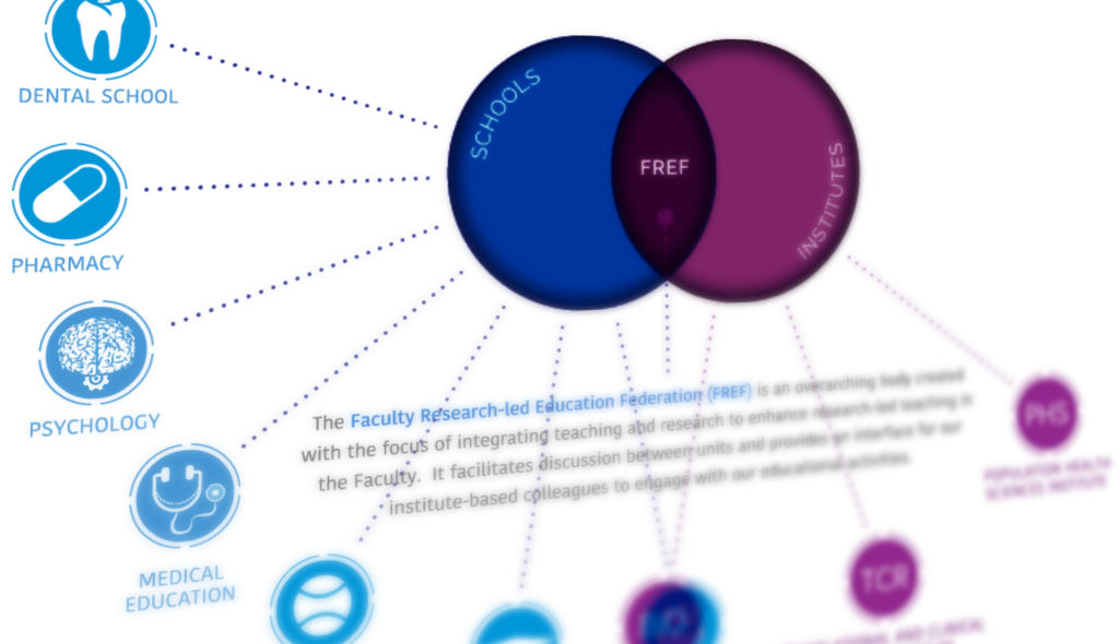
The Learning and Teaching Team contacted us to request an animated diagram showing the relationship between various areas of work, including faculty schools, institutes, and the Faculty Research-led Education Federation (FREF). The resulting page is visible to Newcastle staff here – take a look before reading the rest of the post.
The initial brief included a PowerPoint with the required information, as well as a mock-up of how the final animation could look. As this content was being built within SharePoint, there were certain technical restrictions on what could be done. For example, the site template has a fixed width, and animations cannot be created natively within it. The interactive diagram also needed buttons and links added that would both display additional item information, and also take users to different areas of the site when clicked, such as school and institute homepages.
These requirements meant that the animation needed to be created separately and then shared, and an HTML 5 canvas based animation was the best choice (not to be confused with our VLE Canvas!).
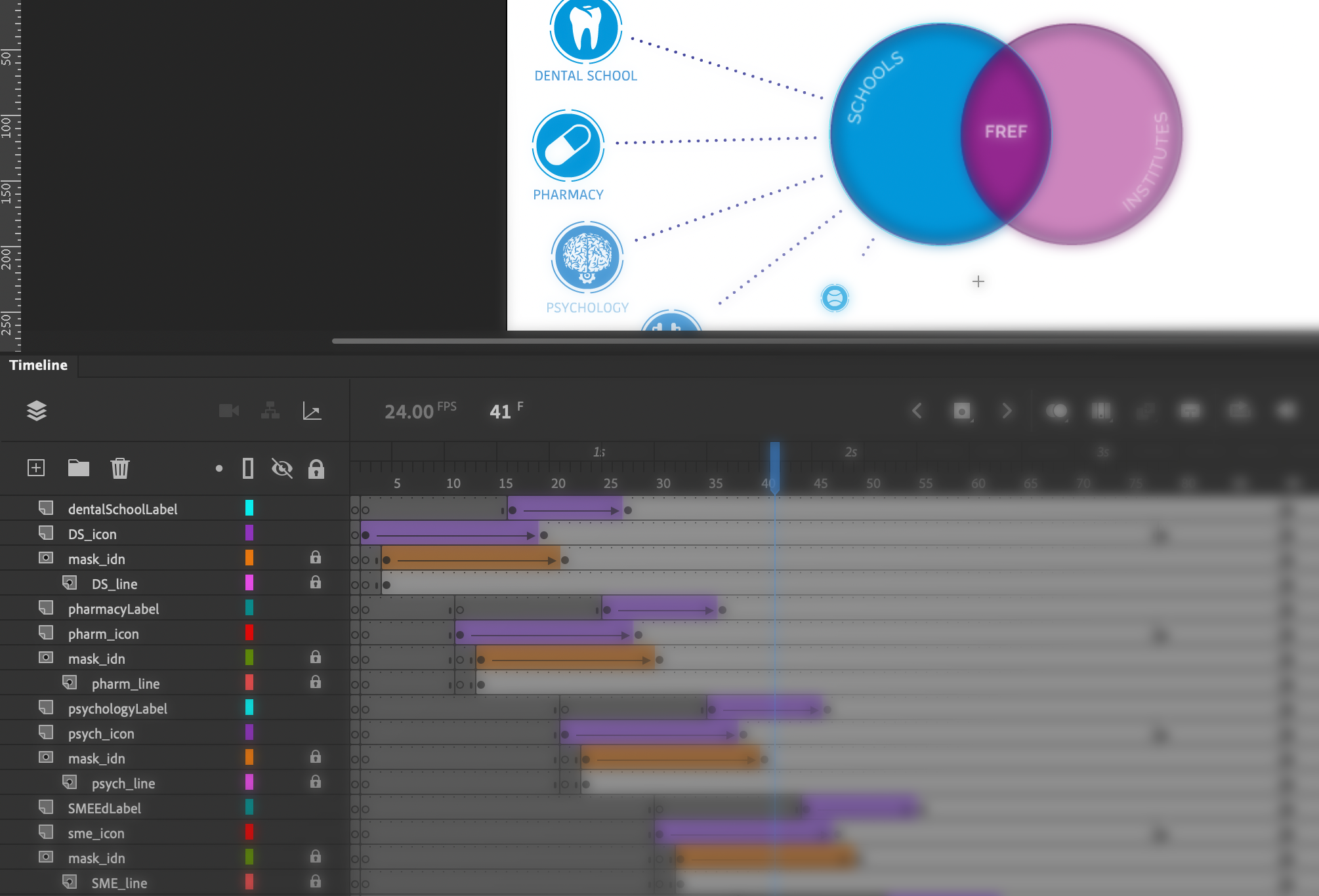
Working from the requirements for the layout, icons were designed/created to match each school and institute. These icons were designed in Adobe Illustrator. Once these had been approved, they were then imported into Adobe Animate where the animation and programming processes began.
Some elements of the animation, such as moving an object or changing its size can be done very simply in Animate with its inbuilt tools and timeline-based animation, however extra coding is needed in some cases, for example when checking variables or adding links and hotspot areas.
After a second round of consultation and changes, the final animation could be uploaded to our teams e-learning repository and then an embed code provided to enable it to be placed on the SharePoint site. The resulting diagram shows how the many organisations inter-relate and allows for a large amount of information to be shared in a relatively small space. Showing everything at once would not be practical. The animation itself cannot be easily understood by accessibility software, however the information is easily accessible via alternative menus on the page.
sample animation of interactive diagram
In this animation, the first stage shows the building of the initial stages of the diagram, and an animated cursor encourages viewers to interact with each section. Next, the three key areas of the Venn diagram become interactive (changing colour as users’ mouse over with a pointer cursor) and users can click around the diagram to explore the further information and link out to the various school/faculty pages. The use of the cursor pointer and the colour change clearly highlights the interactivity to the user.
There are a wide range of alternative uses for this type of diagram, which is commonly used for categorising. Adding the interactive hotspot elements opens up further possibilities, where each individual item can be further explored.
Over the last year or so most of us will have taken the plunge and recorded a lecture or tutorial to share with students. You may be considering reusing this content for years to come, however the date and time on your screencast will give the game away.
I don’t know if some students would have a problem with a video from last year being used again this year… I would prefer the date (which is visible at the bottom left of my laptop screen) to not be visible
FMS Module Leader
We can do this with video editing software such as Adobe Premier Pro or Final Cut Pro, but what if you do not have access to such software?
At this point most of us usually head to Google to find a free alternative. Trying to find a free online tool can be a little daunting and it’s always worth double-checking the usage terms and privacy policies are reasonable.
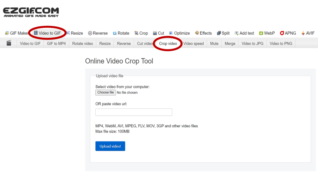
We have previously recommended ezgif.com to be used to create animated gifs for instruction and demonstrations. Ezgif don’t store your files or claim any intellectual property rights over anything you upload, and your file is removed from their servers in an hour.
This free content editing website can be used for so much more than just creating gifs. They have a designated area for editing videos, including an easy to use cropping tool.